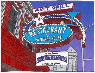
OK, still putting together some color graphics for signage on Clark. For anyone who's interested, here's the most recent process:
-Develop outline from reference photograph. In this case I made two versions, one which eliminates the background elements to focus just on the sign.
-Scan both versions to print out at slightly larger size. Decide to use the more cluttered version.
-Develop grey marker tone study.
-Develop color drawing with Prismacolor markers.
-Scan into 300 dpi tiff. Adjust edges. Add graduated background tone.
-Print scan. Create highlights and details with Prismacolor pencils.
-Rescan. Adjust colors. Create reduced size version for blog.
Not sure it was worth the effort, but I want to give a copy to the owners of the A&T Grill. It might make them hesitate if they're considering removing the sign. It's already missing quite a bit of neon.


A&T Grill & its sign used to be across the street, in the middle of the block. It's now a taqueria.
ReplyDeleteA&T used to be a different restaurant called "The Stars INN" which went out of business & A&T moved into the much larger space.