Friday, September 3, 2021


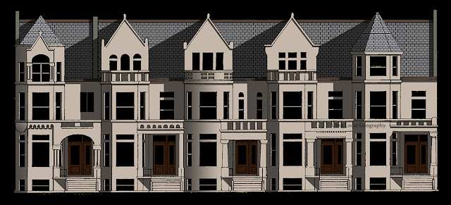
Some shoebox houses in the K-Town Historic District of Chicago on the west side.  Documenting and illustrating these buildings was one way I stayed sane during quarantine.  Dates of construction range from the 1900s through the 1920s.  

I can't help but be impressed at the level of detail lavished on homes which are  comparable in size to a 2-bedroom apartment!  It was only possible due to inexpensive land and astounding levels of readily available craftsmanship, primarily from immigrants.

Wednesday, June 13, 2018

View of the back of Mision Cristiana Elim

I'm continuing my series looking into some of the areas of the neighborhood that were never really meant to be on display.  You can't do much better than the church at Morse and Ashland.

This was originally the reform synagogue Temple Mizpah, and I've written about it a bit here.  There's a substantial parking lot on the east, which was intended to be the main sanctuary but was never built.  The result is that the building (and the block) remains forever unfinished.  

The property's unfinished nature allows for a glimpse across the parking lot and into the service areas. All of the loading and unloading spaces and mechanical accommodations are on full display. In many ways, it's more complex than the primary facade, constantly adapting to meet the owners' needs. How many more changes before it finds equilibrium? Or until the whole property converts to condos...


Friday, May 11, 2018

View from Goldberg Park

Looking up from Goldberg Pocket Park.
I'm interested in parts of buildings that were never meant to be displayed.  These are the spaces that most honestly respond to the needs of the structure and the limitations of the materials.  Sometimes these are visible when an adjacent building is demolished, but you can also walk down any alley in the city. I find pocket parks create some great viewing galleries, and sometimes even a bench.  This view from Goldberg Park is one of my favorites.  
It's really a streetscape in its own right, following a set of rules just as compelling as those which govern the finished facades. 

Friday, May 4, 2018

View at Sheridan and Pratt

View from Sheridan looking Northeast towards Pratt.
Sometimes the spaces created between buildings are just as interesting as the buildings themselves.  I'm especially drawn to taller buildings with irregular footprints and deep courtyards.  The negative space creates  complex pinwheeling shapes that most people sense, but don't consciously appreciate.

I've written about both of these buildings before.  They represent the transition of Sheridan Road from a leisurely lane lined with mansions to a more dense and urban thoroughfare.

Here are the previous posts:

6801 N. Sheridan- Rogers Park Hotel, 1922

6757-6765 N. Sheridan, 1917


Monday, March 19, 2018

Pratt Lane Hotel, 1927

Detail of terra cotta brackets
This building was designed by Koenigsburg and Westfeld in the Gothic Renaissance Revival style and constructed in 1927.  The ornament has always fascinated me-- and in particular the lion brackets supporting the twin projecting bays.  The first drawing I did of the building was back in 2006, but apparently that graphic is trapped on a obsolete Photobucket server.  But here's a link to the previous post.

This was constructed as an apartment hotel, which was basically a month-to-month furnished apartment with communal dining and socializing areas.  Apartment hotels would typically include a regular cleaning service.  This is an urban type that hasn't survived in Chicago (as far as I know).  The closest  approximation I can think of is an extended-stay hotel, and those are now mostly found out by the highways.
1246 W. Pratt

This building dwarfs its neighbors, and would have been one of the few to approach the permitted height increase established by Chicago's first zoning code in 1923.  I think the entire lakefront may have followed suit if it hadn't been hit by the Great Depression.  So for now it remains a crazy outlier, catching the sun all day with it's amazing glazed white terra cotta.


Thursday, February 15, 2018

Stucco Bungalows on Arthur, 1915

Fifty-One Stucco Bungalows on Arthur Avenue
Republishing this with a new historic image I just found!

I've written a number of posts about collections of homes planned, designed and built by early developers in the neighborhood.  These range from a few identical cottages to more complex arrangements of alternating designs.   These small scale developments are found throughout Chicago and their quiet existence probably accounts for most of the city's small-scale speculative residential development.
On the block of Arthur Avenue with Clark Street on the east and the Union Pacific Railroad embankment on the west, there's an impressive collection of modest stucco bungalows constructed in 1915. Permit records shows that these homes were designed by Edgewater architect and developer Niels Buck, who was active in the area from the 1890s through the 1920s.  Two permits were issued, the first covering the homes on the north side of the block in April of 1915, and the second on the south side in October.

According to an article in the Chicago Tribune Niels Buck, in partnership with Herman Becker, bought 12 1/2 acres in the area for $60,000 from Jacob Rehm. The cost of construction was estimated to be $230,000, which puts the cost per bungalow around $5,600.  In today's value this would be about $134,000.  Typically a developer would work with a bank to issue bonds in the value of the loan. Investors buying the bonds received a guaranteed rate of return.  But partnering with Becker may have allowed Buck to bypass this process, making the development more profitable for both.
View from the west looking towards Clark Street, 1921

This is a great photograph of the street in 1921, before any substantial changes were made. The image is available on Wikipedia, which considers it too old to be subject to copyright.  Still, I wouldn't mind knowing where it originated...

This was a high quality development, with poured concrete curbs, walkways, sidewalks and electric streetlights.  The stucco cladding addressed building code requirements for fire resistance.

Real estate developers in the city were responsible for tying their development into the street grid of the city and extending the utilities.  Quality construction was profitable to the developer, who wanted homes to sell briskly so they could move on to their next opportunity.  And in 1915 affordable homes in Rogers Park, with its strong transit ties and proximity to the lake, probably went like hotcakes.


I've identified at least seven separate types of bungalow on the block.  Although perhaps "type" is too strong a work.  Basically these are all stucco boxes with slight variations in roofline and porch design. Originally they were all about the same in size and square footage, but the changes in massing makes the repetition of designs nearly unnoticeable.  This was an advantage of having a developer who also functioned as an architect. For those who look closely the block creates an almost perfect illustration of architectural variations on a theme.


Type I Bungalow with boulder cladding
Many of the homes on the block have since departed from the original design intent.  Enclosing open porches was common, especially after the introduction of affordable air conditioning.  Rear additions and detached garages are also common. I'm guessing garages weren't included in the original development in order to keep prices low.  Sometimes homes were expanded upward, losing the shape of the original roof but adding substantial square footage.

Stucco is a surface treatment that required maintenance, repair and sometimes replacement.  It wasn't such a stretch to replace one surface treatment with another.  The bungalow above incorporates a formstone cladding.  This was popular for home repair as early as the 1930s and probably a bit cheaper than new stucco, which required specialized skills for installation.

Type II Bungalow with renovations
This home has been altered just as much as the one above, losing the open porch and extending a new covered entrance porch.  But in this case the renovations observed some of the established patterns on the block, retaining the stucco and eave brackets and incorporating more traditional window details.

This block of Arthur represents the most extensive contiguous development I've found in the neighborhood. But I know there are many more out there.

Ad for Atlas Portland Cement Company from American Builder, May-1918.  Accessed through Google Books.
Somehow I keep finding more information about this street!  Below is page from a booklet found on Archive.org.  It even includes a fuzzy floor plan and some more detail about the construction method.  And I was wrong about the cost of the homes, which are noted to be less than $3,000, which is around $54,000 converted to 2018. Wow.

Industrial Housing, National Fireproofing Company-  published 1918.


Monday, January 29, 2018

6158 N. Richmond, 1959

Ok, getting back to my profoundly unpopular mid-century multi-family project for just a bit... 

I've written some posts about the Georgian Revival single family homes in the neighborhood which you can read here and here.    Below are some some throwback graphics from 2013, when I thought colored pencils were the greatest thing in the world.  Not sure what I was going for with the blue halo...

Georgian Revival Single Family Homes in West Ridge

As the West Ridge neighborhood developed the cost of land began to increase.  To make the investment worthwhile new construction became more dense, with more units per building. Parcels that had been less desirable, particularly on busy corners, could now be combined and developed profitably.

This 3-unit building below was constructed  on a double lot which might have accommodated two single family homes.  The developer also built a detached two-car garage, something typically eliminated from single family homes in order to keep costs down.  This is designed in the same  simplified Georgian style seen above, right down to the colonial-style windows and the gently pitched hipped roof.


6158 N. Richmond, 1959

The base of the building has the random coursed stone veneer common during the period. This is also used as the surround for a slightly projecting main entrance.  A large glass block window provides light to the interior stair.

The irregular the facade along Granville is really odd, with different windows sizes, configurations and placements.  And how about that uncomfortable-looking blank area?  It's almost as if the stylistic choice is working against the internal needs of the building. This might also explain why larger buildings began to rely on more modern facade designs, where there was more flexibility in the exterior expression. 

Wednesday, January 24, 2018

East Park Apartments, 1521 W. Sherwin, detail

In case you're wondering, those are holiday ornaments in the windows!
Art Deco terra cotta ornament is unusual in Rogers Park. Actually, Art Deco is unusual throughout Chicago, although there are still some great examples to be found.

According to the Chicago Historic Resources Survey this building was permitted in 1931 and designed by architect Benjamin A. Comm.  Most private building ceased after the crash of 1929, so I expect this project was funded well in advance.

What became the Art Deco style made its official appearance at the 1925 Paris Exposition.  It reflected contemporary movements in fine art, such as Cubism and Futurism, emphasizing pure geometric form and rejecting historic ornamentation.  So it's a bit ironic that same ornament has now become historic in its own right...

In 1927 the officers of the Northwestern Terra Cotta Company brought over six French sculptors to supply new designs for the company.  These became popular with architects and builders and soon the new style of ornament could be found at other terra cotta companies as well.  The use of color helped to emphasize the forms and lines of the design, which typically had a lower relief than  traditional ornament.

Some buildings designed by Benjamin A. Comm showing various styles.
Benjamin A. Comm designed a number of buildings recognized in the Chicago Historic Resources Survey.  His most interesting design (as far as I know) was the Union Park Hotel at 1519 W. Warren Boulevard.  This was designated as a Chicago Landmark in 2010, and the designation report has an nice discussion about Art Deco in Chicago, which I've cribbed from shamelessly.  But you should read it yourself!  Seriously, read it.

B.A. Comm didn't really make the cut as a "significant" architect in the report, but his work is notable from a neighborhood character standpoint.  Here are some examples using photos I swiped from the Cook County Assessor's website.  At least the Assessor is still good for something...


Thursday, December 14, 2017

Sign for the A&T Restaurant, 7030 N. Clark

7030 N. Clark, Detail from A&T Diner Sign
I've been doing some drawings of building details in the neighborhood, so I thought I would take another look at my favorite sign on Greenleaf and Clark.  I've been worried about the condition of this sign since I moved to the neighborhood more than 15 years ago.  Some of the bulbs still light, but the neon looks to be damaged beyond repair.  I really hope this will be fixed, but it's more likely to disappear along with so many others of the period.

I'm trying to visualize the cost of repair, which would include a crane for removal and reinstallation,  replacing rusted sheet metal, replicating the neon, rewiring and refinishing. Not cheap.  Probably above $50,000. On top of that there's a good possibility it doesn't meet current sign code.

These signs were really scaled to auto traffic more than the neighborhood pedestrian.  Which is odd, since Clark was (and is) better suited for walking.  And just attaching this massive sign to the delicate 1913 brick and terracotta building must have been an amazing effort.

I've drawn this building and sign a lot.  Here are few I've posted previously, from large to small:

Southwest Corner of Clark and Greenleaf.  Grey tone added with marker.
A&T Sign. Colored pencil over a xerox with a digital gradient background.

Detail in colored pencil.


Friday, December 1, 2017

6151-6159 N. Fairfield, 1957

This building contains five units with separate entrances, private backyards, full basements and alley access.  It provides many of the amenities of a detached single family home but at a lower cost. Now these are condos, but many of these mid-sized buildings were originally constructed as co-ops.  At around 1,300 square feet these rival the size of the ranch homes built around the time time further to the west.

Construction is concrete block with a face brick veneer  Which really isn't that different from modern masonry construction.  Because the structural needs are provided by concrete block the exterior could be clad in a variety of ways.  Brick was the most traditional, but why not mix it up with wood, glass and stone?  Because these were speculative construction they tended towards a more traditional design, which was seen as desirable to more potential buyers.  And that's really what you see here, with a couple of interesting design exceptions.

6151-6159 N. Fairfield, 1957

The large glass blocks on the second floor likely provide light to the stairwells and give a slightly space-age look to the facade.  Glass block, which is load-bearing, was an inexpensive way to add light to a building without the expense of a window.  But because they provided light without a view they were more suited to secondary spaces, or areas where a view wouldn't have been possible or desirable.

Maybe the most ornamental treatment are the two entrance canopies supported by flaring central walls of random coursed limestone.  These cover two entrances each, and suggest outstretched wings.  Because there's an odd number of units the last one has a sad-looking half-canopy that makes you feel like the designer grumbled "good enough" and went on to the next project.  To be fair, maybe it's been altered from the original design...


Thursday, November 9, 2017

6956 N. Clark, ornamental detail

I've always admired this building, with its projecting bay and round-top windows.  Standard
rectangular windows have been inserted into those great arched openings, but that's not unusual.  The brick work is amazing.  The mason must have honed the brick by hand to get the correct wedge shapes for the window arches.  Silvered roofing material has been used to waterproof the area between the parapet and the cornice.  Not ideal,  but at least the cornice hasn't been ripped off and parged with concrete like so many others.  I'm also impressed that the bay hasn't been reclad with vinyl or aluminum.  There are plenty of examples of that on Clark Street.

6969 N. Clark, ornamental detail

Here's another illustrated detail of two adjacent rooflines on Clark Street.  This type of stepped gable is a bit unusual in Chicago.  And it's in really poor shape.  I rendered the joints as black not because that's the appropriate color, but because all of the mortar has been washed out.  The black is just a shadow line.    I don't expect them to be repaired until they start to crumble onto pedestrians below...But I have to admit, there's a certain satisfaction in restoring the parapet, even if it's just with pixels.

The building next to it has these great rough-textured bricks, but has been so poorly re-pointed as to lose the elegance of the joint patterns.  If you ever see someone re-pointing masonry without carefully grinding out the old mortar you're witnessing a ridiculous waste of time and money.

Friday, September 22, 2017

6800 N. Sheridan, ornamental detail

6800 N. Sheridan, Stanleigh Hotel, Ralph C. Harris (1917)
One of my first Ultra Local Geography projects was documenting the decorative stone door surrounds in Rogers Park.  Another project was tracking down some of the neighborhood buildings that had been published in various journals.  So when I decided to get some more experience with digital colorization I thought it would be interesting to combine two old projects.

To the right is a detail from the door surround at the former Stanleigh Hotel, which I wrote about back in 2011 (Click here to read that entry.)

Anyway, I've been playing around with digital color for a couple of years as a way to emphasize my own drawings.  But once the lines are left behind even more information can be conveyed with color.  This image depended on skills I hadn't really acquired, so it was a nightmare to develop.  If I ever do a similar treatment it should go a heck of a lot faster.


Wednesday, September 13, 2017

Every Lot Chicago

I've been fascinated with the Every Lot Chicago Twitter feed.  This is basically just an algorithm that looks up tax ID numbers and pairs it with an image, typically from Google Streetscape.  New posts are generated about every 20 minutes. I find the randomness really interesting.   These are my monochromatic studies of a few of my favorites.   I'm using markers so as not to overthink the details.

Thursday, August 3, 2017

Broadway and E. 20th Street, Lorain, OH

This strip of buildings is on Broadway in my hometown, Lorain, Ohio. These were constructed in the 1880s and 1890s, and although they've been altered they still retain distinctive features.   The  parapets of the red brick buidings are ornamented with elaborate corbelled brick, and the sills and lintels are a golden sandstone quarried from nearby Amherst, OH.


What especially caught my eye is the great mid-century slip-cover applied to a portion of the corner building.  These façade treatments were meant to update and revive old commercial buildings but they've become historic artifacts in their own right.

The design of these slipcovers had more in common with the graphic design popular in the 1950s and 60s, often with a nod to the high-style modernist towers going up. And because they weren't doing much structural work they could look like anything. A covered building could instantly transform from a pedestrian scale to an auto-oriented scale, and this was one way historic downtowns competed with the postwar suburban expansion.  It didn't really work, so now these architectural treatments are often reversed to reveal the original character of a building.

Clear aluminum mullions and turquoise spandrels were applied to the façade, along with new windows and storefronts. There was enough flexibility in the system to adapt it to the size and configuration of the original facade, although it wasn't unusual to have to chip off projecting masonry that interfered with the new system.   Finally, a wide band of stainless steel framed the entire composition.  I believe those three stubs above the storefront supported a large vertical sign which has since been removed.

This is a great example for its pure geometric design, but also because it serves as a clear visual lesson in how buildings change over time.
 
A few blocks north at Broadway and 16th Street.
Bars along 28th Street in South Lorain

Wednesday, June 28, 2017

2901-2909 W. Granville, 1958

This building contains five duplexes ranging in size from 1,080 to 1,250 square feet (2 and 3 bedrooms).  Construction is concrete block with brick and stone veneer.   At the back are small private outdoor areas.  There is no garage, but five deeded parking spaces are to the side.


In early Chicago attached housing often took the form of 2 or 3-story rowhouses with shared party walls.  There were really two main design solutions for these:  (1) Design the building to look like one large building with consistent materials, windows, cornices, etc. or (2) Differentiate the individual units by varying the cladding materials and massing to provide a unique architectural identity.
2901-2909 W. Granville, 1958
This design takes a consistent approach, unifying five homes of slightly varying sizes with a regular facade. This is the path taken by many mid-century buildings in the neighborhood.  I think of this configuration as "battleship" mid-century modern.

Note how the windows for different units on the first floor are connected visually with limestone frames and rectangular stone panels laid in an ashlar pattern.  On the second floor the decorative stone panels and continuous limestone sill create a solid band linking the units even more strongly.  A heavy canopy caps the building, with reduced-scale versions emphasizing the main entrances.

Only a few elements break the boxlike appearance, including two angled wing walls and a projecting rectangular stair enclosure.  As the stair enclosure moves forward the adjacent corner shifts back, creating a more generous landing and entrance for the largest unit. So there actually is a slight bit of variety to the treatment of individual units.

The stair enclosure provides an opportunity for some ornamentation in the former of projecting horizontal rows of bricks.  I have this urge to climb them like a ladder...

Tuesday, June 13, 2017

Backstage Spaces #4, Greenleaf Alley

Alley West of Clark between Greenleaf and Estes (2017)
I've been working periodically on some drawings of alleys and other service spaces in the neighborhood.  Sometimes it's a relief to go behind the geometry and ornament of a  facade to admire the more functional aspects of a building--  electrical connections, trash receptacles, parking, circulation... all of messy vitality that makes life in a dense city possible.  And then you see the real value of the alley.  It allows the illusion of order to step forward, no matter how much garbage might be stacked up in back.


Friday, June 2, 2017

Mid-Century Multi-Family Buildings in West Ridge- Part 1

There's been some interesting discussion in Chicago about how residents perceive their neighborhood and how that shapes their response to new development. For a great introduction read this piece by Daniel Kay Hertz, "How Bungalow-y is the Bungalow Belt?
3001-3330 W. Granville, 1956.
To summarize, if you live on a block of predominantly single family homes it's easy to overlook scattered multi-family buildings nearby, which easily outnumber single family homes in regard to unit counts.  So when new multi-family housing is proposed it's seen as uncharacteristic by a comparatively small proportion of neighborhood residents who are guided more by their intuitive understanding of the area rather than actual demographics.

2250 Single-Family Homes and 946 Multi-Family Homes (1945-1965)
Those who see new development as threatening to the character of their neighborhood may be successful in opposing and blocking these projects, particularly if they require a zoning change, which is subject to  review through the local alderman. These opponents often appropriate the language of planning to justify that opposition--  not enough parking, too much density, incompatible in scale... Although these may be valid concerns they often stem from a qualitative understanding of the neighborhood and don't acknowledge the complex interweaving of different types of land use.

So I thought it might be interesting to look at multi-family housing in the West Ridge neighborhood.  In particular I'm focusing on  mid-century development which is often overlooked by housing advocates and architectural historians. What exactly are the proportions of multi-family buildings to single family during this period?  How did development change over time?  To answer some of these questions I used the Building Footprints data provided by the City of Chicago.  This is the information the city uses in their Geographic Information System, and includes construction date, unit counts and number of floors.  Full disclosure--  I have no idea if this information is accurate.  I assume much of it was taken from the Cook County Tax Assessor.  But it was the best building-level information I could identify, so I'm going with it.

2250 Single Family Units and 4653 Multi Family Units
Between 1945 and 1965 there were 2550 single family homes constructed in West Ridge. Not surprising, since much of the neighborhood participated in the post-war building boom.   In the same time period there were 946 multi-family homes built.  In comparison the  total number of single family households remain at 2550 but the multi-family buildings contain 4653 households-- nearly twice as many.  (My crummy graphs are meant to represent this visually, although you'll have to click on them before they become legible.) So the real weight of opinion in the neighborhood should really be with the residents of the multi-family buildings.

6158 N. Richmond, 1959
In the next few weeks I'll be taking a closer look at some of these mid-century multi-family buildings.  I find this era to be a very creative period in housing history, and one that hasn't really received enough attention from a developmental or architectural standpoint.  The West Ridge neighborhood is practically an encyclopedia of mid-century design, and I hope to plot out a small part of it.


I also want to talk a bit about what's becoming known as the "missing middle" of the housing market- developments which are similar in scale to single family homes but create a denser neighborhood, permitting greater diversity, walkability and affordability.  I believe these mid-century buildings are good examples and can provide some lessons on adding density in established urban neighborhoods.


Friday, April 21, 2017

Rogers Park Station

One of the best things about my work day is the ease of the commute.  I walk one block east to the Metra station and ride south to the terminus at Ogilvie Station, which takes about 20 minutes.  Then I walk a few blocks east to City Hall.  In the evening I usually doze on the way home, waking up just before Rogers Park (a skill I perfected in graduate school on the Red Line).  With a few changes in technology my route is pretty much the same one used by commuters when the neighborhood began as an independent suburb in the 1870s.  Back then the commercial development clustered around the station Ravenswood between Lunt and Greenleaf.  The early frame homes were just far enough away from the tracks to avoid the noise and smoke. But despite the similarities there have been a number of changes in the experience of commuting.
Rogers Park Station At-Grade, looking Northeast.


This rail line began passenger service in 1854, when it was extended to Waukegan.  By 1869 there were seven trains each way daily.  But because the tracks were at-grade crossings were dangerous and frequently interrupted city traffic.  In 1896 work began to elevate the tracks in compliance with a Chicago ordinance. (The information above is taken from the Metra website, which has some history on each of their lines.)

Photos of the station show that it was elevated after 1905. This wasn't a moment too soon according to these Chicago Tribune articles (accessed through the Chicago Public Library):

At-Grade Station
August 20, 1885 -  Frank Zwiener apparently commits suicide between the Rogers Park and Calvary station.  His lower limbs were found at some distance from the rest of his body. 

December 15, 1887 - Charles Hemmings and his wife were struck and by the train while crossing the tracks in a heavy lumber wagon. Mr. Hemmings survived but his wife was killed.  Their horses were also killed.

May 8, 1896 - Six occupants of a surrey hurled as far as 75 feet when stuck by the Milwaukee train at Touhy.  No one was killed,  miraculously.

January 23, 1897 - Arthur Steen injured at Rogers Park crossing by the Milwaukee train.  His companion, Frederick Buhr, was uninjured although their wagon was destroyed.

June 11, 1903 - Patrick McLaughlin, a flagman for the railroad, loses his life trying to save 16 year old George Brackle, who was driving a laundry wagon across the tracks.

Anyway, I don't want to get too morbid.  Let's just say that at-grade crossings could be hazardous.   Pressure was brought to bear on the Chicago Northwestern Railway to expedite the elevation of the tracks at Rogers Park.
View looking southeast , c. 1913.  Did I mention these were steam trains?

By 1910 the tracks had been elevated, but what about the station?  It wasn't unusual to reconstruct a train station at the new grade, but I believe the entire station was raised to align with the new track level.  I'm basing this on the design of the building (as shown in historic photos in the collection of the Rogers Park/West Ridge Historical Society) and the identical footprints found in the consecutive Sanborn Fire Insurance Maps. The combination of open bays and enclosed areas for ticket sales was common, and can still be seen in stations along the North Shore.  In particular I'm thinking of the 1891 station in Glencoe, which has a slightly more elaborate massing but the same brick and stone trim combinations.

View from West of the Embankment Looking South
Moving buildings in Chicago has a long tradition.  In the 1850s and 1860s water and sewer lines were constructed under a new raised street system.  Many buildings, large and small, were lifted and placed atop new foundations to align with the new street level. And commonly property owners would move old homes to the rear of their lot to allow construction of a new residence along the street.  You can find this pattern in many of the older neighborhoods and the skilled labor to do this safely would have been readily available.

After Elevation with West Depot
With the elevation of the tracks the railroad also built a depot on the west side of the line.   It appears to have had a concrete foundation and a frame second floor.  I'm not sure if this functioned as a storage building or a shelter.  Or perhaps both.  But the primary station remained on the east (inbound) which is still the case on the Union Pacific North line.   Folks waiting to go downtown were always accorded the more elaborate facilities.

Note the access lane on the west side of the embankment.  This was within the railroad right-of-way and provided easy pickup and loading for passengers and goods.  This lane was later vacated by the railroad and sold off for condo development in the 1960s.

By the 1950s the commuter lines has become less profitable, perhaps because of decreasing density in the neighborhoods.  In 1958 twenty-two stations were closed, both in Chicago and outlying areas.  At this time Edgewater (directly south) lost all three of their commuter stations.  Based on dated photos provided by generous readers of the blog I can confirm that the Rogers Park Station existed at least until 1965, and it's demolition is estimated to have occurred in 1966 or 1967..

View looking North from Lunt down Ravenswood
The current Rogers Park Metra stop has a small at-grade waiting room and open canopies on the narrow train platforms.  Where the old station once stood there are a few awkward parking spaces.  The hefty limestone foundation is still visible from Ravenswood.


This post is an adaptation of a project I put together for the "Property" exhibit at the Rogers Park West Ridge Historical Society, curated by the Roman Susan Artspace.   Although that has a few more maps and some snarky comments... And there's still time to see the exhibit exhibit at the society's storefront at 7363 N. Greenview!.

My exhibit at the RP/WRHS "Property"


Wednesday, February 1, 2017

Devon and Artesian - Moderne in West Ridge


North intersection of Devon and Artesian
This image is the colorized version of a drawing I'll be offering for bid at the Stone Academy Silent Auction.  It's actually just a few blocks from the school, so I thought it might be a good subject for those with a strong investment in the neighborhood.

As West Ridge developed Devon became a high-end commercial strip with a number of impressive terra cotta buildings constructed in the 1920s.  This district served an explosion of new homeowners attracted by the development of affordable bungalows.  At the time the area still had some of the open agricultural character which marked the first development of the neighborhood.

These two buildings represent the second wave of architectural development,  with a more streamlined appearance and less ornamentation.  Both are clad with Indiana limestone, similar to the Moderne-style skyscrapers going up in the Loop around the same time.  The building on the left, originally Hillman's Grocery, was designed by the firm of Leichenko & Esser in 1942.  It's unusual to find commercial construction built during WWII, when most materials were shunted to the military or to housing.  The building on the right was designed by Albert Hecht and constructed in 1939.  It was originally a Rusnak Brother's Furniture, an early franchise with outlets throughout Chicago.

And here's the black and white version, which will be offered for bid.  Although there have been a few improvements since this scan was taken.