Wednesday, October 14, 2015

6952-6964 N. Clark (c.1905 - c.1925)

L. Shure, 2015
From the 1870s through the 1930s nearly everyone agreed on the best way to construct a local commercial district.  The buildings should be 2 or three stories in height, they should come right up to the sidewalk, and there should be commercial space on the first floor and residential or office space above. Buildings should be tightly spaced to maximize square footage.  High quality materials and ornamentation were reserved for the street elevations, which were the only portions of the building readily visible.   Above is a fairly intact stretch of buildings in Rogers Park constructed between 1905 and 1925.


Storefronts are basically large panes of fixed glass supported by wood or metal mullions with a center or side entrance.  Storefront technologies have changed dramatically over the years, but if you're selling something it's better to let people see into the store.

The upper floors were accessed through a front door adjacent to the storefronts.  Typically this would be a solid door to convey the more private nature of the space above. Most of these on this stretch are apartments.
Projecting bays were common.  These would allow additional light into the upper floors and offset some of the limitations of the minimal front and side setbacks.  These were typically covered with elaborate pressed metal ornamentation, which was inexpensive and readily available. The bays often utilize the steel beam above the storefront to cantilever over the street.


Cornices were used to emphasize the termination of the building, and were often stone or pressed metal, built up from stock pieces available though a catalog or a local supplier. Corbelled brick cornices often depended on the abundance of inexpensive skilled labor available at the time.


Decorative parapets often add additional interest to the top of the building.  As different styles became popular the parapet offered a good location for their expression.  On the far right the parapet has a castellated profile and is inset with Sullivanesque terracotta ornament. 

Modern signage, even with strict code regulations, doesn't have a consistent methodology. It often blocks storefronts or interferes with the underlying ornamentation of the building. This is nothing new, can be seen even in historic photos.


The other major type of commercial development in Rogers Park is the strip mall.  That might take a broader analysis.


Tuesday, September 29, 2015

6924-6928 N. Clark, Then and Now

I've been impressed with the "Images of Change" digital photo archive of UIC.  Many of these photos were developed to document building violations for the City of Chicago in the 1950s, which is a great way to show the guts of the city.  But it also includes a large number of streetscapes.  The 1950s was at the very beginning of a long decline and disinvestment in urban areas.  You can really sense the desperation as signage becomes larger and more strident on buildings that look increasingly shabby.  At least that's my take on it...


The gothic revival building on the right is long gone (replaced with a drive-through bank), and the central building has been mostly rebuilt. With the loss of the corner building that feeling of enclosure has been lost on this block.

Thursday, September 24, 2015

7354-74 N. Clark, c.1925

This 1-story brick and terra cotta commercial building was designed by architect Maurice L. Bein and constructed some time around 1925.  Bein designed a number of Rogers Park buildings, and I'll be investigating some more as I'm able to get out and take current photos.


SW Corner of Clark and Rogers


I was lucky to find two historic photos, one from the Digital Archives of the Art Institute of Chicago, and the other in a UIC collection called Images of Change.  Both are great sources for overlooked neighborhood buildings.

Originally the storefront at the corner was pulled back to allow a generous entrance flanked by display windows.  By the time the middle photo was taken that area had been enclosed by a homemade wall insert.  In the bottom photo a new storefront has made the transformation permanent.  Porches that become enclosed over time often have the same progression.

People generally tend to idealize signage on historic buildings, but by the 1950s the era of tasteful gold stenciled lettering in the windows was long gone.

Friday, September 11, 2015

Morse Avenue Walking Tour

The graphic below is the culmination of the work I've done on Morse Avenue since last February. Some history and analysis was written for each of the illustrations, and can be found on this blog.  These were intended to be thumbnail images, but some of the subjects required a more detailed treatment.  You'll probably need to click on the image to see it at a decent resolution.

The point of the project was to take a single street and show it as a microcosm of Chicago architecture and history.  Not sure if it succeeded entirely, but I still think the idea is a good one.  I might try it again on another street... 

L. Shure, 2015


Tuesday, September 8, 2015

1130-1142 W. Morse (1907-1917)

Morse Avenue dead-ends at the lakefront, and, as you approach the lake, you find a wide variety of building types.  These three buildings, all built between 1907 and 1917, illustrate the rapid change in density that occurred along Morse Avenue.

Looking North

According to the Assessor, the frame building in the center was built in 1907.  The building to its left followed in 1912, and the one on its right in 1917.  Chicago's  1924 Zoning Code anticipated greater density along the city's lakefront, a development that was already happening by the time the Code was adopted. In the early 20th century, just like today, there was a strong desire to be close to Lake Michigan, even if you were sharing your lakefront real estate with several other families.

All of the frame houses on this block originally had generous porches to capture cool breezes from the lake.  The one above lost its porch and wood siding some time after 1937.  It's looked a little bit blank ever since, but it makes up for it with an amazing roofline!  The six-flat on the left side of our frame house has classical details, with limestone lintels and a pressed metal cornice with dentils.  The one to its right has a sort of Craftsman appearance with very restrained ornamentation.

One final note: You'll notice that there's a hill in front of these buildings.  It's a good bet these were built atop a low sand dune. 

Saturday, August 29, 2015

Former Rogers Park National Bank, Clark and Lunt

The building at the southeast corner of Lunt and Clark is a 1917 Classical Revival bank with an Art Moderne facade along Clark Street.   Your first thought should probably be "What the heck?" But why this happened is interesting. 

Most of the historic info below can be found in articles published by the Chicago Tribune, accessed through the website of the Chicago Public Library.  Some information about neighborhood banks is taken from the Neighborhood Bank Buildings Landmark Designation Report published in 2007 by Chicago's Historic Preservation Division in the Department of Planning and Development. The postcard image of the Rogers Park National Bank prior to renovations was taken from the Illinois Digital Archives.

This view is looking South.
In the winter of 1917 the new home for the Rogers Park National Bank was under construction. It was designed by firm of Vitzthum and Teich in the Beaux Arts tradition.  Its cladding was polished granite and grey Indiana limestone.  Beaux Arts-style buildings generally relied on the Classical Revival architectural vocabulary, which was selected to convey an image of permanence and stability.   There was a surge of buildings designed in this style after publication of the 1909 Plan of Chicago, which used the same vocabulary to illustrate recommended improvements to Chicago.  The Rogers Park National Bank observed the massing of other nearby commercial development, but it's use of monumental columns and expensive materials placed it an entirely different class.  The bank was constructed at a cost of $75,000, which would translate to roughly $1.3 million today.

As Chicago expanded it became a city of neighborhoods, each with its own commercial and economic life.  At the time Illinois law prohibited banks from opening multiple branches in an attempt to prevent monopolies.  Instead, independent neighborhood banks were developed to address local needs for financial services, building and business loans.

Neighborhood banks were typically sited at the key intersections of commercial districts, and became prominent landmarks.  Clark and Lunt was adjacent some of the earliest commercial and civic development both before and after Roger Park's 1893 annexation to City of Chicago.  Later the new Phillip State Bank and Trust (of a similar monumental design) would locate at the northeast corner of the same intersection.

Apparently the last good photo I took of this corner was in 2008.  It hasn't changed much.
 The Great Depression led to the end of the Rogers Park National Bank, as it did for many other banks.  In September of 1931 the bank was ordered closed by the board of directors.  Heavy withdrawals were given as the reason.  The bank had nearly $400,000 in deposits, but that  wasn't enough to reassure their depositors that their money was safe.  A receiver took over the bank, and was responsible for distributing its assets to depositors and stock holders.  In February of 1939 the bank building was offered for sale.  It was purchased later that year by Simon Simanski, who went about maximizing the value of his new bargain property.  

By December of 1940 the building had been drastically renovated, incorporating the adjacent building to the south under a new Clark Street facade designed by the firm of Lowenberg and Lowenberg.  This was a comprised of cream and turquoise terra cotta tiles.  The former separation between the buildings can be seen above as a wide band between the two groups of second floor windows.  Originally this contained a vertical strip of glass blocks, which has since been infilled.    The detailing is a streamlined version of the Art Moderne style, with minimal references to historic ornament.  This was seen as a good way to modernize a building, and was probably fairly inexpensive.  The portion of the building along Lunt had its windows reduced in size or infilled, but was mostly left alone.  An additional 1-story storefront was added to the east, completely filling the lot.

I wonder if there are any remaining interior details related to its banking history.  If so they may be buried deep underneath the alterations.  In 1940 the building looked pretty much as it does today.   In 1945 it was the site of a double murder, but that will have to wait for a different post...

You can find another post about the Rogers Park National Bank at the Forgotten Chicago website.


Monday, August 24, 2015

7528-7532 N. Greenview, 1927

It's kind of a surprise to find that one of the crummiest buildings in Rogers Park used to be one of the most attractive.  But that's what I discovered while digging through the American Terra Cotta Collection digital archives at the University of Minnesota. I walked past that convenience store a dozen times and never imagined it was once so tasteful and carefully composed.

It only looked like the 1927 photo for perhaps 10 years.  By 1937 half of the Spanish baroque-style building, designed by Zimmerman, Saxe and Zimmerman, had been demolished to create a gas station, retaining only the five bays on the west seen in the lower photo.  And then the gas station was converted into a convenience store, with a breathtaking use of 1970s-style mansard roofs. 
Terra cotta bay with infill
The "L" was extended to Howard Street about 1908, feeding into a burgeoning commercial and entertainment district.  By the mid 20's the area was well-established.   Choosing to construct a 1-story commercial building in 1927 seems a bit out-of-character for the area, but it was located at the edge of the commercial district and perhaps it was felt that upper floors wouldn't be utilized.  As business dropped off in the 1930s retooling the building into a gas station must have seemed like a reasonable idea.  But it would have hurt to see the historic entrance torn off... And in the long run the site was still too small to function as a gas station. Now it's a weirdly-shaped neighborhood convenience store.


Thursday, August 20, 2015

1218-1220 W. Morse, c. 1925

I was surprised to find this photo in a scrapbook digitized by the Art Institute of Chicago found in the collection of architect B. Leo Steif. 

Steif's scrapbook is the sort of document biographers pray for, but seldom find.  Whenever he had a project mentioned in the media or one of his designs published he snipped it out and pasted it down.  Unfortunately, the resolution of the scans don't always make it easy to read the text, but at least I know where to find the original.  The historic photo to the right was used as a advertisement by the Northwestern Terra Cotta Company. 

The building has aged pretty well.  It's lost some of the decorative urns at the parapet, and all of the terra cotta balustrades.  The storefronts and operable awnings have been replaced, but the building has come through the past 80 plus years nearly unscathed.  I have no idea about structural issues, but being vacant for so long certainly doesn't help.

If you'd like to view the scrapbook (and who wouldn't?) click here.

Tuesday, July 28, 2015

Tenement Conditions in Chicago, 1901

Some editorializing here... "Gloomy"?
I've always been fascinated with the work done by early progressives in addressing social problems
of the city.  I'm especially interested in the graphic tools they used to analyze the issues and illustrate their recommendations.   Before digitization these reports were often hard to access for non-academics, but now they're available to anyone with a computer.

In 1901 the Investigating Committee of the City Homes Association submitted a report titled, "Tenement Conditions in Chicago, which examined three study areas in the city. The text was written by the chairman, Robert Hunter, but the committee included the redoubtable Jane Addams.  I've re-drawn a diagram form that report, which relates to the lack of light and ventilation that was characteristic of tenement housing in Chicago, as outlined in Chapter IV.

The report focuses on a number of interconnected issues, from overcrowding and unsanitary conditions to defective (or non-existent) plumbing and the spread of disease.  In the process it slams city government for having inadequate housing regulations and failing to enforce those requirements already on the books.

Chapter IV, Page 89.
In this chapter the report uses maps and diagrams to analyze inadequate light and ventilation.  This was not a qualitative analysis, but an in-depth investigation into floor area, window access, and light penetration on a building-by-building and floor-by-floor basis.  Thorough investigations like this are practically unheard of today, especially when private property is involved.  The diagram above examines the third floors of two adjacent properties, one of which contains a rear structure.  I tried my best to replicate the original shading scheme while making the graphic a bit more screen-friendly and easier to read.

Documents like these eventually led to the adoption of new building and development regulations.  Local governments received the resources to review and inspect over-crowded and unsafe conditions. But as usual, reasonable ideas were taken too far, and similar reports were used to justify the wholesale housing clearance of Urban Renewal in the 1950s.

Looking at the character of the study areas I'm surprised to see that they resemble some of the more historic (and pricey) neighborhoods still existing in Chicago, such as the Old Town Triangle area.  One of the study areas survives, and is an increasingly trendy section of Bucktown.  But a wood frame cottage which housed four families in 1901 might now accommodate a single family and a BMW, so I don't think this can be considered a victory for affordable housing.  But perhaps it does show that the housing itself wasn't the primary problem, but rather overcrowding and outdated infrastructure. 

So I may be rescuing and redrawing more of these early planning diagrams. With the increasing number of digitized text and reports I'm guessing there are plenty of interesting ones out there. And if you know of an under-appreciated example please drop me a line in the comments section...

Tuesday, July 21, 2015

Some More Lorain, Ohio Stuff

E. 21st and Access Rd.
Whenever I return to my hometown I find an infinite number of things that I would like to draw.  I left Lorain before I really became aware of its architecture and history, so everything looks both familiar and strange.


I believe the building to the right is a facility management office for the local school district.  In the background is a recycling plant.

NE Corner of Grove and E. 30th
This building in South Lorain used to be El Patio.  And probably many other businesses, judging by its age and the layers of architectural accretions.  I remember coming here to pick up goat dinners bought by my dad as part of some church fund-raiser.   Looks like it's been vacant for years.
E. 28th Street and Seneca


Thanks to the comment below that calls out these buildings as former trolley barns. The corbelled brick and classical details remain, but are deteriorating.  


Many of the buildings on 28th Street have converted into garages and car services.  But many are simply gone.

Thursday, July 2, 2015

1412 W. Morse, c.1915

The assessor estimates the date of this building to be 1910, but according to the Sanborn Fire Insurance Maps it didn't appear on the block until some time after 1914.  This is a perfect example of some of the design trends that impact small commercial buildings.

L. Shure, 2015

The original portion of the facade is the terracotta band above the storefronts.  Back when it was popular terracotta was considered a perfect building material.  It could be molded in any style and could take a variety of finishes, from gloss or matte to speckled or marbled.  Maintenance and cleaning was anticipated to be simple.  Experience soon showed terracotta needed repairs just like any other material.  And the construction detailing was often too complex to be justified for small structures. It's prime period of use was really in the 1910s, when stock storefronts could be ordered right from a catalog.

Image I found online, which I have no right to use. 1950s?
Below the terracotta is a sign band of artificial stucco.  Typically this is a foam panel covered with a thin layer of cement.  It's cheap, looks OK when new, and is easy to pierce for signage and awnings.  Although this isn't a terrible material, it's often detailed incorrectly, allowing water to penetrate and destroy it from the inside.

Below the stucco are brick storefronts, probably from the 1980s.  I don't really understand why
commercial renovations close up storefronts or decrease the size of their windows.  If I can't see inside I'm not likely to go inside.  And many businesses then block those smaller windows with signage.  But I have to admit, pasting big rocks on storefronts has almost become a classic treatment.

A portion of this building was cut off to allow the new condo to the east to develop. That's why the coping on the east doesn't curve up, like the one on the west.  I also remember strange green shrubs at the parapet...  Were they real, or some kind of weird ornament?

OK, finally found a better photo of this building from 1982.  So that shrub was some kind of ornament... And much better image of the central medallion.
Better photo from the C. William Brubaker Collection at UIC- 1982

Tuesday, June 16, 2015

Temple Mizpah, 1923

1615 W. Morse,  Former Temple Mizpah
The former Temple Mizpah is a remnant from the neighborhood when it was home to a number of Jewish congregations.  In fact, Reform Judaism originated in Rogers Park, and this building was one of its first permanent expressions. Most of the temples have been converted into churches, and this one is no exception.  It's designed in the Byzantine style, with arched leaded glass windows which resemble tablets.  The brickwork is remarkable, but has seen better days.  And it doesn't look like the leaded glass windows are doing too well.

The building was designed by the firm of
Spitzer and Popkin, and constructed at a cost of $150,000, according to the Chicago Historic Resources Survey.

To the east of the building is  a large parking lot which had been intended to accommodate the main portion of the synagogue. For some reason only the community house was constructed.  Perhaps they intended to build it in phases but ran out of funding.  An illustration from 1922 shows how splendid it could have been.  The structure on the far right is the only one which was built. This does explain the odd termination on the east end of the facade.

Accessed through Google Books

Wednesday, June 3, 2015

1425 W. Morse, 1963

1425 W. Morse
This is one of the worst buildings that can happen to a dense neighborhood commercial district.  It's one-story tall and and the parcel is equally split between the building and parking.  I would say it's a good thing that one side of the building aligns with the sidewalk, but it basically presented a huge blank wall until some storefronts were cut into it a few years back. And it's mid-block, so you can only enter from Morse.   Cars can park right up to the fence along the sidewalk, which is massive and unfriendly.

I expect this was built as a large grocery store and was then superseded by even larger stores with more parking at at the edge of the neighborhood.  Which is really where they belong.  It looks as though this building is struggling for tenants, despite its half-hearted renovation.

This is located on what was basically four separate parcels which originally contained two single family homes and connected two-flats. Lots which don't redevelop to match the predominant density of a commercial area typically redevelop later at a higher intensity.

But even in 1963 why did this seem like a good idea?  I wouldn't be surprised to see this replaced at some point.  It's perfect for a large transit-oriented development.

Sunday, May 31, 2015

Morse and Paulina (1905-1914)

1700-1712 W. Morse
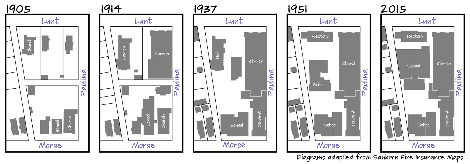
The Morse Avenue project is to take a quick look at the the variety of buildings on the street and use illustrations to make some points about its architecture and development.  So I won't going into depth about this block, and how St. Jerome's Catholic Church eventually expanded to fill it entirely.  I won't be discussing the establishment of the Catholic parishes in Rogers Park, and how they managed to break the grid of the city to allow for development better suited to their needs.  Or their importance to early Rogers Park as major social institutions.

The convent building on the right is in the same location as the original (wood) St. Jerome's Church, which was built in the 1890s.  In 1914 the congregants hired architect Charles Prindeville to design the Italian Renaissance Revival Church to the north, which was completed in 1916.  It's likely that the convent was added around that same time, since the congregation still owned that parcel. The church was substantially lengthened in the 1930s, requiring an abandonment of the alley right-of-way and opening up the property for additional development.  A rectory with distinct Art Deco touches was built along Lunt in 1939, replacing the wooden St. Paul's by the Lake, which had been on the NW corner of the site since the 1890s.

Even with good fire insurance maps it's still difficult to tell exactly what was built when, and how the buildings changed as they grew together.  The center of the block filled up with additional school buildings in the 1940s and 50s, although it seems portions of older buildings remained to anchor the new development.  The school buildings along Morse were the temporary home of the Chicago Math and Sciences Charter School, but I don't know if they currently function as a school.

This block really deserves an in-depth treatment of its own, but that will have to wait for a future post.  Or series of posts. If any old-time Roger Parkers want to clarify what was built when please feel free to comment below.


Tuesday, May 19, 2015

1523-1529 W. Morse, c. 1910

These brick two-flats were constructed between1905 and 1914. Previous development along this section of Morse had been largely single family homes, but the extension of the elevated train to Howard Street in 1908 touched off a steady increase in density that would continue through the 1920s. In the 1910s and 1920s many of the single family homes were demolished in favor of larger apartment buildings and commercial spaces.  These two-flats survived in the slot between these two trends.

1523-1529 W. Morse
When an area shifted from residential to commercial owners sometimes realized that they could add
commercial space while avoiding the cost of a complete rebuild.  Both of these 1-story commercial portions were constructed after 1951 in the postwar boom.

The drawback of this type of alteration is that it makes the original building less appealing as a residence. Views to the street are obstructed, and good luck getting light into the house. Although the second floor can enjoy an enormous roof deck....

Friday, May 8, 2015

1818-1826 W. Morse Avenue

I always enjoy seeing these frame houses on Morse, especially in the winter when their colors stand out against the snow.  I suppose that's why I kept the snow in this illustration, even though it overtaxed my modest coloring skills.

1818-1826 W. Morse (north side)

These frame homes were built after Rogers Park was annexed to Chicago in 1893.  Their construction dates range from 1894 through 1901.  These strike me as custom built homes rather than standard builder models.  They're located on very generous lots, with 50' frontages and 170' in depth.  Not a bad size for a city home.

The stucco house in the middle is particularly interesting.  The assessor dates it as 1896, but it has a distict English cottage appearance, which was popular in the 20s.  A narrow side porch leads to the main entrance, where the overhang is supported by slender round columns.  The same columns are installed in the front yard, each (for some reason) with a chicken statue on top. Sanborn Maps show that this home originally had a wrap-around porch, and those columns might represent the remnants of that porch. This would have made the home more of a Queen Anne style, which would be consistent with other nearby homes of the same period.  So I'm guessing there was a major renovation in the 1920s.

Monday, April 27, 2015

1326-1342 W. Morse

North side of Morse, looking Northwest.
Morse Avenue east of the el tracks has experienced something of a renaissance in the past few years.  The 4 plus 1 on the far left was built in 1971 and has been heavily renovated.  It's unusual for these buildings to get more than a cursory renovation (carpet, windows, fixtures), so that indicates a fairly strong market.  And a unit with a parking space can't be dismissed in a dense area like this.  It's also a signal to other owners of 4 plus 1s that the time may be right for major improvements. 

East of the alley is a brand new condo building built by the development arm of the Pritzker family.  This 5-story building replaced a much smaller one and probably maxed out the zoning envelope for the site.  This was built after the renovation of the adjacent Mayne Stage and reflects some of the design characteristics of that older building.

The most notable change on this portion of Morse is the elaborate restoration and reconstruction of the 1913 brick and terracotta Morse Theater into the Mayne Stage music venue.  Originally this building functioned as a 750 seat nickelodeon, but it's had a long and varied history, including a stint as a synagogue and an indoor mall.  In 2009 the building was gutted and rebuilt, with a new, sunken performance space in back and a bar in the front. It's brought back some of the earlier charm of the street.
And of course, on the far right you can see J.B. Alberto's, which has served pizza on the North Side for over 45 years.  Not sure if they've been using this building for that long, but it's been unpleasantly mansardized from its original 1930 appearance.


Monday, April 6, 2015

1441-1515 W. Morse (1917-1972)

Looking Southeast at Morse and Greenview
Here are three buildings on the south side of Morse at Greenview that represent a range of common  buildings types found in neighborhood commercial districts.

On the far left is a courtyard apartment building constructed in 1917.  The courtyard isn't visible here, but opens on to Greenview. Commercial storefronts are on the first floor along Morse.  Courtyard apartments were common in Rogers Park, with a spike in construction in the mid 1920s. When located on a corner lot they often took the form of an S, with one inner access court hidden from the street.


The center building is a concrete-framed brick and terracotta apartment building designed by prolific architect Maurice L. Bein and constructed in 1928-1929.  This received an "orange" rating is the Chicago Historic Resources Survey, indicating architectural significance at the local level.  Bein was a Russian-born architect who received his education at Hull House, the Art Institute of Chicago, and the Armour Institute of Technology.  The Art Institute has a solid collection of his work from 1920 to 1936, including many digitized photos.  Bein is another unsung architect whose work was so in-tune with its time that it's become nearly invisible.  The Spanish Baroque style utilized for this building is unusually elaborate, including a polychromed terracotta entrance, terracotta spandrels and projecting balconettes at the top of the building.  And the massive green tile mansard roofs can't be overlooked.

In the foreground is a Four-plus-One, which describes four floors of apartments above one floor of below-grade parking.  These were primarily built in the 1960s, although the assessor pins this one at 1972.  Hundreds of these were constructed throughout Chicago, and established neighborhoods were not impressed.  These buildings often replaced single family homes with dozens of 1 bedroom and efficiency apartments. My biggest issue with these is that they tend to interrupt the pedestrian experience with blank walls and dark parking lots.  They also rarely incorporate commercial spaces, since that would have chipped away at their required parking.  Eventually the zoning code was modified to make these less attractive to builders.  It's worth looking into the lobby of this building.  The interior can perhaps be described as a modernist offshoot of the Tudor Revival style.


Thursday, April 2, 2015

The Seville Apartments, 1263 W. Pratt, 1919

Every now and then I'll come across a historic photo of a building in Rogers Park.  If it still exists I try to get a recent image at a similar angle for comparison.  For some reason apartment buildings in Rogers Park have been very well documented, usually through real estate publications.  The 9-story Seville at Pratt and Lakewood was included in "A Portfolio of Fine Apartment Homes," compiled by Baird & Warner and printed in 1928.  The building itself was built in 1919 according to the assessor.  I believe there's a cornerstone with the exact date, if anyone is nearby...

This building looks pretty much the same, although it lost the decorative stone urns along the parapet.  It was designed in a restrained version of Italian Renaissance Revival, with rusticated limestone on the first floor, decorative balconies at the 9th floor, and a modest cornice. Apartment rentals included "ice-less" refrigeration, gas and electricity.  And maid service was optional.  A large light court on the east provided light and ventilation to the units set back from the street.

In the 1920s neighborhoods along the lakefront saw a rapid increase in density.  This was bolstered by the 1923 Zoning Code, which allowed a maximum height of 198' (this building is only 98').  Large apartment buildings were becoming more common in Rogers Park before the stock market crashed in 1929.  Had development continued Rogers Park might have come to resemble some of the built-up areas in Uptown and Lakeview to the south.  Instead this building still shares the block with single family homes.

The Seville was designed by the firm of Rissman and Hirschfeld, which was responsible for many large hotels and apartment buildings in the 1910s and 1920s.  Their work includes the Knickerbocker Hotel at 163-188 E. Walton (next to the Palmolive Building) ,the Surfway Apartment Hotel at 553-555 W. Surf and the massive buildings at 2440 N. Lakeview and 3520-3530 N. Lake Shore Drive.

Information for this post was provided by "A Portfolio of Fine Apartment Houses" (1928), the online Chicago Historic Resources Survey, and the "Surf-Pine Grove Landmark Designation Report" (2006), which can be found on Archive.org. 


Monday, March 30, 2015

Morse and Glenwood, 1921

Strong transit connections are one of the reasons Rogers Park looks the way it does today.  In the center of the neighborhood are the Metra tracks (Union Pacific North), which were instrumental in early suburban development of the area (1870s through the 1890s).  But the urbanization of Rogers Park really began with the extension of the "L."  In 1908 the train was extended from Uptown to Howard, and around 1916 the tracks were elevated on a temporary trestle.

Northwest corner of Morse and Glenwood, 2015
Station Diagram
The Northwestern Elevated Railroad Company built the Morse Station on right-of-way owned by the Milwaukee Road Railway in 1921.  The red brick and limestone station house was designed by Charles Rawson, and was originally identical to those at Jarvis, Argyle, and Thorndale, which were built under the same contract.  Rawson designed the stations to include a number of commercial rental spaces, and these added to the rapid commercial development of the area. The railroad had the benefit of rental income, and tenants benefited from a steady stream of potential customers.

Unfortunately, this hasn't worked out exactly as intended.  The storefront spaces are generally dark and undesirable, with trains rumbling overhead every few minutes.  And I'm not sure the Chicago Transit Authority (which bought the right-of-way in 1953) relishes their role in marketing and maintaining these spaces.  One of the storefronts on Lunt was in such poor condition that it needed to be demolished during the recent renovation of the Morse station.  Another former commercial space on Morse was used to expand the existing station.  But a few businesses remain, perhaps against the odds.

This simplified diagram of the CTA station was adapted from the 1951 Sanborn Fire Insurance map of the area:  1. Main Entrance; 2. Platform; 3. Commercial spaces; and 4. Overpass. Access onto Lunt remains (and it's pretty darn useful) but the one on the south side of Morse has been blocked.

Original Morse CTA Station, 1960 (updated to 1985)

Some of the historic information in this post was taken from  the "Historic Properties Review CTA Rapid Transit System, Part 3," which was published in 1986.  Additional information was provided by Chicago "L".org at http://www.chicago-l.org/history/4line.html#Northwestern, accessed on March 30, 2015.