Monday, April 25, 2011

Directory to Apartments of the Better Class- 1133 W. Columbia

I'm going to be posting some entries documenting modest apartment buildings in Rogers Park, all of which are taken from Directory to Apartments of the Better Class along the North Side of Chicago, published in 1917 by A.J. Pardridge and Harold Bradley.  This bound pamphlet was intended to help rent these properties, which ranged from exclusive flats on East Lake Shore Drive to more affordable dwellings in Lakeview, Uptown and Rogers Park.  Entries included photos or renderings of the buildings, typical floor plans, a brief description, and an estimate of the monthly rent. 

I'm focusing on seven buildings in Rogers Park including 1133 W. Columbia, 7614-7616 N. Eastlake, 7210-7212 N. Paulina, 1252-1262 W. Pratt, 6757-6765 N. Sheridan, and 7600-7602 N. Sheridan.   It's good that all of these are still around.  Rogers Park managed to preserve much of its housing stock and is one of the last affordable north side neighborhoods along the lakefront. 

If these buildings were considered luxurious apartments in 1917 there's something reassuring about their current, generally run-down, appearance.  It gives me hope that today's luxury condos may devolve into affordable housing.  In the current economic climate this may be much sooner than the developer would have preferred...


1133 W. Columbia
 This 1913 craftsman-style building hasn't changed much on the outside, except for the unfortunate removal of the casement windows on the sun porches. It's also lost the clay tile roof above the side entry. The cornice appears pretty much as it did.

Full disclosure- Part of my job is helping people restore buildings which have been severely altered over the years.  A photo like this is a gift for someone who owns a modest building.  These are always harder to document than the more architecturally significant buildings.  Window replacement is one of the cheapest ways to make a major improvement in the appearance of a building.  And of course it's also the cheapest way to ruin a building.

Click for a larger version.
Floor plans are another great thing to find when looking at these  apartment buildings.  Especially for those which have since been subdivided or undergone extensive renovations.  A maid's room with a bathroom is simple to convert to a one-bedroom apartment, effectively doubling the number of units in a building. Floor plans allow a reader to imagine the spatial experience.  These apartments are commonly broken up into numerous rooms with a certain amount of space reserved for hallways.  Circulation is carefully orchestrated.  Modern apartments tend to remove the separating partitions, creating spaces which flow into one another. 

Looking at this layout I can imagine a household set up rigidly, where each room is strictly dedicated to a particular use.  While this limits the feeling of spaciousness, it may have provided a variety of experiences beyond what you might expect with the limited square footage. 

Click for larger version.


The description above mentions my favorite apartment amenity, central vacuuming.  I'm still a bit fuzzy on how this worked, but apparently a number of vacuum sockets were provided for each unit.   Tubes were hooked up to a central vacuum which was activated when the socket was opened.  This way no one had to push around a bulky vacuum cleaner or provide the storage space it would have needed.  Systems like this were eventually found to be difficult to maintain while improved technology made the portable vacuum more attractive.

Without odd publications like this it would be even harder to get a handle on buildings which are important more for their typical nature rather than their outstanding design or important associations.   The more I look at small-scale Chicago apartment buildings, the more I think they're deserving of some closer attention.

Below is a thumbnail that takes you to the overall page layout.  
Click for a larger version.

Wednesday, April 20, 2011

Courtyard Apartments in Rogers Park- Parapet Details

If you want categorize the ornament on a courtyard building (and who doesn't?) look at the rear parapet at the back of the court.  A building may have a variety of bays and window treatments, but it's really the decorative parapets that give it character and establishes the stylistic theme and rhythm of the facade.  The parapet is outlined against the sky, which emphasizes each curve and castellation. In some cases a false gable or mansard roof is used in place of the masonry parapet, but the effect is similar.


7405-7415 N. Damen, 1927


The most common treatment is a face brick with stone sills, lintels, coping and medallions.  In the case above stone urns are used to emphasize corners and provide additional focal points. I'm a particular fan of cartouches and coats-of-arms, as if the builder raided some ancestral mansion.

6901-6917 N. Ashland, 1923


Here the castellated parapet is offset against glazed roof tiles, which provide additional texture and rhythm. When I see parapets like this I always imagine tiny people pouring tiny buckets of boiling oil down onto the mailman.

2100-2110 W. Fargo, 1927


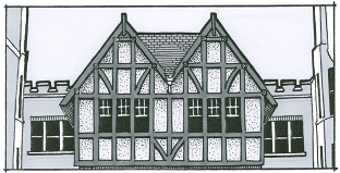
The Tudor Revival style is regularly adapted for large courtyard buildings.  Sawn lengths of wood approximate the look of heavy timbers.  In this case, the interstices are covered with stucco, creating a variety of geometric shapes contrasting with the dark wood timbers.

1622-1630 W. Farwell, 1927


This is another parapet that takes its cues from the Classical Revival style, but also makes use of stones panels with inset pointed arches common to a more Gothic style.  It's not unusual to see these buildings mix and match their ornament, creating a unique fusion of eclectic styles. 

1519-1527 W. Farwell, 1929


This is a more simplified version of the Tudor Revival, with multi-colored slate shingles on a false mansard roof.  The half-timbering is fairly complex, including small quatrefoils.  In this case both stucco and brick were used as infill elements.  The slate shingles still gives these buildings a touch of class.

I have a few dozen more of these to document, but those above will have to serve as a representative sample for the moment.

Thursday, April 7, 2011

Stanleigh Apartment Hotel, 6800 N. Sheridan

I found this building while tracking down sources for my project on courtyard apartment buildings.  Thanks to various scanning projects you can suddenly find rare books and journals online that few people have the patience or leisure to track down at a conventional library.   I was suprised to discover this illustration of a Rogers Park apartment hotel from 1917.  And yes, it's still there at the northwest corner of Pratt and Sheridan...

At first glance apartment hotels have a lot in common with courtyard apartments, but there are some notable differences.  Apartment hotels are generally taller and of fireproof construction (steel-reinforced concrete frame).  Most of them make use of an interior corridor to access the units and therefore need fewer stairs (see plan below).  They often have generous areas on the first floor which could be used for communal activities.  


You can view the original 1917 publication here.

I wanted to get the exact same angle, but I would have had to stand in the middle of Sheridan Road.  I try not to risk death when taking photographs.

Not much has been written about the apartment hotel in Chicago.  They were intended to function as a step between a full-service hotel and a long-term rental apartment. They came fully furnished complete with maid service.  Most units had kitchenettes and shared facilities for dining and recreation.  It's worth reading the description:

Click for a larger version.

I like that they had a "special" wing for bachelors. Wouldn't want them mixing with the normal residents.  These buildings required use of the Murphy bed, which folded up into a cabinet or closet when not in use.  This idea still sounds brilliant, but perhaps reading about a Murphy bed and sleeping on one is an entirely different experience.
Stanleigh floor plan.  Click for larger version.


It seems to me these buildings were instantly converted into Single Room Occupancy apartments as soon as the rental market heated up after the second World War.  Perhaps earlier.  I once lived in one of these former apartment hotels in Edgewater for a year.  It was my first apartment without a roommate, which nearly made up for being able to touch every wall from the center of the living room.  And finally I understand why my closet was insanely enormous-- it was a dressing closet, as if that makes any sense.

The Stanleigh was designed by Chicago architect Ralph C. Harris.  A quick search of the Chicago Tribune online archives shows that he was responsible for many buildings in the 20s and 30s, some of which are still around.  He then became the Illinois highway architect for 10 years, returning to private practice in 1944.  None of his buildings were highly rated in the Chicago Historic Resources Survey, but The Aquitania was placed on the National Register of Historic Places in 2001. Most of the photos below are photos from the Cook County Assessor.


1356 E. Madison Park, 1925

The Antone, 1926
7. E. Ohio
  
5819 W. Roosevelt, 1927

     
1220 N. State, 1927
  
60 homes at 5800-5900 N. Ottawa and N. Oriole, 1947
This is a representive example.

1350 N. Astor, 1949

The Aquitania
5000 N. Marine, 1923
Photo from Wikipedia
It's worth mentioning that the building at 1350 N. Astor is smack in the middle of the Astor Street Historic District.  I'm trying not to hold a grudge.  After all, this building probably helped convince the neighborhood of the need for a district.

Want to see some more apartment hotels in Chicago?  Click here.