Showing posts with label neon. Show all posts

Monday, January 13, 2014

P & S Restaurant at Touhy and Western

Originally posted August 11, 2010.  New updated sign graphic added 9/30/22!
___________________________________________________________________________

In general, there's always been a lot of interest in old neon signs.  But writers and photographers tend to treat them as if they're works of art, picking and choosing the most interesting and intact examples.  But for some reason, I'm always drawn to the crummiest, most deteriorated signs.  In that vein, I'd like to focus on just one.
Western and Touhy is a busy intersection in West Ridge.  As a pedestrian, you feel distinctly second-rate to the cars whizzing past.  On the southeast corner is Baker's Square, on the northwest is Lakeshore Surgery, and on the southwest corner is a Marathon gas station.  All three have their own attached parking and auto-oriented circulation.

But on the northeast corner is a sad-looking 2-story yellow-brick building with apartments above and commercial spaces below.  The assessor dates it to 1928.  It has a vaguely English look, castellated, with few gothic stone ornaments.  Many of the storefronts along Western have been infilled with artificial stucco.  The commercial tenants are typical storefront businesses-- a cell phone store, grocery, computer service, hair salon, etc.


In the 1920s, a burst of optimism flung buildings like this to cheap land at the edge of the city and beyond, with the expectation that more development would fill the gaps in between.  Of course, it didn't work out that way due to an inconvenience known as The Great Depression.  Most of the nearby lots didn't develop until the 50s and 60s.  And even then, Western never achieved the density common to older commercial corridors in Chicago.

The sign for the P&S Restaurant has seen better days.  Most of the neon has cracked off and the letters haven't been repainted in decades.  Rusting chains keep it from swaying in the wind.  It's only a matter of time until the steel supports fail and the sign will have to come down.  I would like to say that it might be repaired, but I'm guessing that won't be likely. [The sign came down just a few years after this post.]


It's a relatively simple combination of oval, trapezoid, and scalloped bands.  It wouldn't surprise me if there had been an arrow at the termination of the band pointing to the restaurant.  The organization of the information is fairly typical-- name, function, and amenities.  If I had to date the sign, I would guess early 1950s.  The signs in the 40s were generally simple boxes, and the signs in the late 50s became progressively more exuberant.  But this is not an exuberant sign.

In general, signs like this are evidence of the growing car culture.  On the highway, it makes sense to have a large, illuminated sign.  The speed of the experience and the viewing angles require a sign large enough to interest the driver and give them time to pull over and park.  However, this format is not particularly functional for a corner building with zero setback to the street and no associated parking. 

Initially I thought that this sign may be a relic of a time when the surrounding development allowed this building to operate as an auto-oriented strip.  A glance at the Sanborn Fire Insurance Maps of the area (1937, 1941, 1950, and 1951), showing mostly greenhouses and gas stations, seems to support this.  Only as the surrounding areas became built-up with apartments and businesses did the 1920s typology of the building limit the effectiveness of the sign to attract drivers who could actually take advantage of a quick stop at a diner. 

But that can't be the entire story since so many of these signs can be found in areas that have always been densely urban.  Auto-oriented development and advertising permeated the commercial landscape after WWII, and there are many good examples of this in Chicago.  For my purposes, it's not much of a jump to suspect that the old main street businesses would have attempted to present a more modern image to the customers they were afraid of losing.  When it came time to modernize, they didn't choose to paste up gold leaf letters on glass.

While the stand-alone auto-oriented businesses could place their sign on a pole out front and go as crazy as they wanted, the traditional buildings were stuck with slapping these signs onto aging structures with a variety of steel connections.  Some of these attachments are reminiscent of a torture chamber and aren't particularly sensitive to existing ornament.  As much as I like these signs, they typically contrast with the original scale of the building.  That said, I would still be sad to see it removed.  As fewer remain, they've become kind of precious.

I don't normally reference books in this blog, but I have to nod to Lisa Mahar's fantastic book, "American Signs:  Form and Meaning on Route 66."  This is a brilliant graphic manual for understanding, categorizing, and dating this type of signage.

Tuesday, January 24, 2012

New York Kosher, 2900 W. Devon (originally posted 2/18/10)

Just realized that this sign has been removed!  Sad. According to Jewish News Online it was sold on Ebay and a documentary crew filmed the removal.  The owner received a letter from the city requiring that he get a permit for it.  It had only been hanging there for 40 years... Instead he chose to get rid of it.

The West Ridge neighborhood (also called West Rogers Park) has the unusual distinction of being the center of two types of Jewish communties at different times.  Back in the 50s and 60s this was a heavily conservative/reform Jewish neighborhood.  Now it's the center of an orthodox Jewish community.  But there are a few remnants from the old neighborhood that have remained and seem to function just as they did.  This kosher deli is one of them.  On the opposite corner is Levinson's bakery, which falls into the same category.

It's hard to see with this scan, but there's a number 48 in the oval sign on top. I believe it refers to USDA Establishment 48, which is Best's Kosher inspection designation.  Oddly, Best's Kosher is now owned by Sara Lee.

Wednesday, February 17, 2010

The Fish Keg, 2233 W.Howard

Here's a sign that I actually remember from my childhood visits to Chicago.  I can't help but wonder, when did fish served from a keg invoke a feeling of fresh deliciousness?  But this place is always busy, so they must be doing something right.  The building was built in 1953, and I suspect the sign didn't come too much later.  Could this business have been there for 50 years under the same name?  Worth checking out...

Angela leaves for North Carolina tonight.  It'll just be me and Felix until Saturday.  I found the perfect $2.99 DVD for us at Walgreens- "The Big Plane Show!"  There was also one that featured different kinds of explosions, but I didn't want to go too crazy.

Friday, February 5, 2010

Some Signage on Clark

6404 N. Clark

This old sign now hangs above a taqueria, which I think is a good symbol for the demographics of my neighborhood.  I'm pretty sure you can't get chili or hamburgers there.  Why don't they take it down?  First of all, it's massive.  It's probably been attached directly to the structure of the buildling.  Those little chains you can see just keep it from swaying in the wind.  Also, I'm not sure zoning will allow a sign like this anymore.  It projects maybe six feet into the public right-of-way.  The owner may have decided that they can repair and reface it more easily than apply for a new sign.  Unfortunately, most of the old neon has cracked off.

6701 N. Clark

This storefront used to be Dennis' Place for Games, a video arcade. Now it's a liquor and convenience store.  I can't say I'm a big fan of the internally illuminated cabinet sign, but the amount of lighting on this one approachs theater marquee status. 

We have an amazingly open weekend. Felix has his swim class at the YMCA on Saturday, but as far as I know there are no other commitments.  That's a very nice feeling after the last few weekends. Maybe we'll go to the Shedd Aquarium, or something. 

Tuesday, March 24, 2009

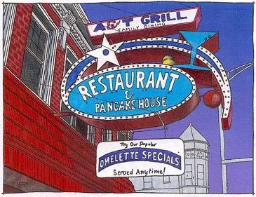
Clark and Greenleaf- A&T Grill Signage

OK, still putting together some color graphics for signage on Clark. For anyone who's interested, here's the most recent process:

-Develop outline from reference photograph. In this case I made two versions, one which eliminates the background elements to focus just on the sign.
-Scan both versions to print out at slightly larger size. Decide to use the more cluttered version.

-Develop grey marker tone study.
-Develop color drawing with Prismacolor markers.
-Scan into 300 dpi tiff. Adjust edges. Add graduated background tone.
-Print scan. Create highlights and details with Prismacolor pencils.
-Rescan. Adjust colors. Create reduced size version for blog.

Not sure it was worth the effort, but I want to give a copy to the owners of the A&T Grill. It might make them hesitate if they're considering removing the sign. It's already missing quite a bit of neon.

Saturday, January 31, 2009

43rd and Cottage Grove

OK, I've ventured out of Rogers Park for this drawing. This is kind of on the edge of Bronzeville on the south side. Had it been a bit warmer it would've been a great area to explore better. There's a historic district (Oakland) near the east terminus of 43rd, and I was intent on making a site visit without a car. One advantage is that you can meander a bit on the way back to the El. This sign is still in front of a furniture store, although probably not the original tenant that put it up.