Friday, May 13, 2011

7210-7212 N. Paulina- Apartments of the Better Class #2

Northwest corner of Touhy and Paulina
This buiding is at the northwest corner of Touhy and Paulina in Rogers Park.  It's one of my favorites from the Directory to Apartments of the Better Class, as referenced in my previous post.  I remember admiring the arched brick and stone entrance on Touhy, and wondering why it was called "The Kenilworth," which I thought was pretentious.  It's still kind of pretentious, but it's because Kenilworth Avenue was the original name for Touhy.

I like that this building has retained it's original windows and the Italian tile roofs. 

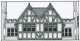
This is also one of the few entries which uses a rendering of the building rather than a photograph.  It was fairly common to have a perspective rendering made for a speculative building in order to attract investors and tenants.  The real estate section of the Chicago Tribune would publish these, even for small buildings. The drawing above is pretty much dead-on, a testament to the skills of the draftsman.  I wonder if the original drawing is hanging on a wall somewhere.  Or more likely, long gone.

Click for larger version.
I'm impressed at how efficiently the architect has arranged this building to maximize the number of units on the lot.  Narrow light courts bring in air and provide alley access to the rear stairs.  Some of the larger units have space for maid's rooms, but most do not.  The design generally depends on the front bays to bring in light. 

This building features one of my favorite awkward realities of many Chicago apartments-- a wall of windows on the narrow interior court perfectly aligned with a neighbor's wall of windows.  In this case it occurs between the two dining rooms of the middle units fronting on Touhy.  I hope whoever lives there are on good terms.

It advertised close proximity to the Birchwood Elevated Station. I think this is now the Jarvis Station, unless Birchwood was another stop that was later removed.

Click for larger version.
Apartments offered the most modern amenities.  Changes and improvements in technology were rapidly incorporated into apartment construction.  This was a good way to attract high-class tenants who might otherwise look for a single-family home.  Gas heat, electricity, and refrigeration were all used the same way solid marble counter tops and sub-zero freezers are used today.

Showing overall page layout.
As usual, click for larger version.

I don't know much about the architect, Percy Johnstone, but I can at least share a couple more of his buildings identified in the Chicago Historic Resources Survey.  Photos are taken from the Cook County Assessor:
2200 W. Granville

1527 W. Touhy


Monday, May 9, 2011

L-Court Apartments in Rogers Park

 
"Tendencies in Apartment House Design: Part VII - Courtyard Plans,"
Frank Choteau Brown, The Architectural Record, Vol. LI, 1922, p.64.
I'm not the first to look at apartment buildings in a systematic manner.  Architect Frank Chouteau Brown illustrated his own categorization of open court buildings in the chart to the right.  He put together a remarkable series of articles dealing with various types of apartments from a space planning and development perspective.  These were published in The Architectural Record in 1921 and 1922.  Given Brown's proximity to the apartment boom of the 1920s these are useful in understanding why these buildings took particular forms.  Much of the analysis below uses his observations as a starting point.
6414-6416 N. Paulina, 1931
What Brown calls Open Half Court I've labeled L-Court. An L-Court can occupy a long, narrow lot, but there isn't really enough space to allow for landscaping, or even to secure sufficient light and views for the units created.  They typically have three entrances, each of which serves 6 units. In some instances developers would add another L-Court to create a U-Court, but if that wasn't the case adjacent construction would often block them in.

To the left are some typical L-Courts in Rogers Park.  (For some reason these examples are all on Estes, but this is just a weird coincidence.)  You can see they all have narrow courts with projecting bays (rectangular, hexagonal or rounded) to take advantage of available light and views. The grey rectangles indicate interior and exterior stairs, which are commonly grouped together to simplify construction.  A narrower secondary court services the back stairs and provides access to the alley.  These all have small front yards which provide a minimal separation from the street. 

A lot with a 170 foot depth and a 50 foot width provides sufficient area to construct one of these buildings.  With 5 or 6 units per floor these buildings generally have 15 to18 units.  If basement units were constructed this adds a few more.  Generally there are no more than 21 units in a building like this. 
 

I found an  unusual L-Court building at 1059-1103 W. North Shore sited on a larger than typical lot.  In this case the amount of green space really does function like a larger central court.  The lack of complete enclosure gives the property a park-like appearance which is emphasized by a remarkable number of mature trees.

It makes sense to me that the building to the right was constructed in 1916 and the four examples above were all built in the late 1920s and early 1930s.  As the neighborhood became more urbanized, property values increased and developers squeezed more value from each lot.  You can sense a certain balancing process in action, where lot coverage, unit counts, and land costs play against each other.

One of the things that I'm interested in investigating relates to the Chicago Zoning Code of 1923, which regulated the size and type of buildings permitted in various areas.  It seems to me that once minimum standards were established buildings were designed to meet them, rather then exceed them.  I believe courtyard apartments pre-dating the zoning code provided larger units and more green space for their tenants. But it's difficult to prove this.  I don't always trust the building data provided by the Cook County Assessor, which may or may not have accurate construction dates and square footage calculations.


While a perfectly rectilinear lot makes an L-Court easy to plan, there are many irregular lots which were also adapted to the L-Court.  In particular, there are a number of lots adjacent to Clark Street and Sheridan Road, both streets which run at a slight diagonal through the neighborhood.  This often created skewed and tapered lots.  A skewed lot (as seen at 1666-1670 W. Farwell) isn't too difficult to adapt.  In this case the units align with Clark rather than Farwell.  A lot which widens towards the rear is a natural opportunity for an L-Court.  While a typical L-court can normally fit only one unit at the rear, a tapered lot often has enough space for two units.


To the right are two examples of  L-Court combinations.  On the left is the building at 6810-6814 N. Lakewood, with two distinct side courts.  The lot is both wider and shallower than those of the typical L-court buildings.  Rather than providing additional green space for the tenants the design has used a double-loading technique to create 32 units with narrow courts.  Without a way to easily provide secondary exits the architect had to run corridors from the central stairwells to the exterior.  These interior courts accommodate light wells, but the lack of rear exposure probably impacts their air flow and limits their light.

The examples above on Sherwin are the best I found showing how an L-Court becomes a U-Court. The building on the right (1413-1415 W. Sherwin) was built in 1917.  The building on the left (1407-1411 W. Sherwin) was built in 1926.  Even in plan you can see the difference in design and configuration.  Nevertheless, the architect of the later building carefully matched the size and ornamentation of the curved bays of the interior court to create a consistent character for both buildings.  They now appear to be under common ownership.  There are other examples in the neighborhood which were constructed closer in time.  These are difficult to identify if you don't have access to a map showing property lines.  Commonly the two L-Courts are identical in design but with different colors of face brick.

I almost skipped the L-Court building when I was organizing this project.  They really don't create the outdoor space I imagine when I think of a courtyard building.  But I'm glad I didn't.  They have some important qualities, and they help to understand the organizing principles of the larger courtyard buildings.  The next entry in this series will focus on the U-Court, which is what most people think of as a true courtyard building.

As a final note, the building footprints were re-drawn from Sanborn Fire Insurance Maps.  The lot sizes were derived from the City of Chicago 80-acre maps, which are available through the online Chicago Zoning Map.  Dates of construction are taken from the Cook County Assessor's website.


Monday, April 25, 2011

Directory to Apartments of the Better Class- 1133 W. Columbia

I'm going to be posting some entries documenting modest apartment buildings in Rogers Park, all of which are taken from Directory to Apartments of the Better Class along the North Side of Chicago, published in 1917 by A.J. Pardridge and Harold Bradley.  This bound pamphlet was intended to help rent these properties, which ranged from exclusive flats on East Lake Shore Drive to more affordable dwellings in Lakeview, Uptown and Rogers Park.  Entries included photos or renderings of the buildings, typical floor plans, a brief description, and an estimate of the monthly rent. 

I'm focusing on seven buildings in Rogers Park including 1133 W. Columbia, 7614-7616 N. Eastlake, 7210-7212 N. Paulina, 1252-1262 W. Pratt, 6757-6765 N. Sheridan, and 7600-7602 N. Sheridan.   It's good that all of these are still around.  Rogers Park managed to preserve much of its housing stock and is one of the last affordable north side neighborhoods along the lakefront. 

If these buildings were considered luxurious apartments in 1917 there's something reassuring about their current, generally run-down, appearance.  It gives me hope that today's luxury condos may devolve into affordable housing.  In the current economic climate this may be much sooner than the developer would have preferred...


1133 W. Columbia
 This 1913 craftsman-style building hasn't changed much on the outside, except for the unfortunate removal of the casement windows on the sun porches. It's also lost the clay tile roof above the side entry. The cornice appears pretty much as it did.

Full disclosure- Part of my job is helping people restore buildings which have been severely altered over the years.  A photo like this is a gift for someone who owns a modest building.  These are always harder to document than the more architecturally significant buildings.  Window replacement is one of the cheapest ways to make a major improvement in the appearance of a building.  And of course it's also the cheapest way to ruin a building.

Click for a larger version.
Floor plans are another great thing to find when looking at these  apartment buildings.  Especially for those which have since been subdivided or undergone extensive renovations.  A maid's room with a bathroom is simple to convert to a one-bedroom apartment, effectively doubling the number of units in a building. Floor plans allow a reader to imagine the spatial experience.  These apartments are commonly broken up into numerous rooms with a certain amount of space reserved for hallways.  Circulation is carefully orchestrated.  Modern apartments tend to remove the separating partitions, creating spaces which flow into one another. 

Looking at this layout I can imagine a household set up rigidly, where each room is strictly dedicated to a particular use.  While this limits the feeling of spaciousness, it may have provided a variety of experiences beyond what you might expect with the limited square footage. 

Click for larger version.


The description above mentions my favorite apartment amenity, central vacuuming.  I'm still a bit fuzzy on how this worked, but apparently a number of vacuum sockets were provided for each unit.   Tubes were hooked up to a central vacuum which was activated when the socket was opened.  This way no one had to push around a bulky vacuum cleaner or provide the storage space it would have needed.  Systems like this were eventually found to be difficult to maintain while improved technology made the portable vacuum more attractive.

Without odd publications like this it would be even harder to get a handle on buildings which are important more for their typical nature rather than their outstanding design or important associations.   The more I look at small-scale Chicago apartment buildings, the more I think they're deserving of some closer attention.

Below is a thumbnail that takes you to the overall page layout.  
Click for a larger version.

Wednesday, April 20, 2011

Courtyard Apartments in Rogers Park- Parapet Details

If you want categorize the ornament on a courtyard building (and who doesn't?) look at the rear parapet at the back of the court.  A building may have a variety of bays and window treatments, but it's really the decorative parapets that give it character and establishes the stylistic theme and rhythm of the facade.  The parapet is outlined against the sky, which emphasizes each curve and castellation. In some cases a false gable or mansard roof is used in place of the masonry parapet, but the effect is similar.


7405-7415 N. Damen, 1927


The most common treatment is a face brick with stone sills, lintels, coping and medallions.  In the case above stone urns are used to emphasize corners and provide additional focal points. I'm a particular fan of cartouches and coats-of-arms, as if the builder raided some ancestral mansion.

6901-6917 N. Ashland, 1923


Here the castellated parapet is offset against glazed roof tiles, which provide additional texture and rhythm. When I see parapets like this I always imagine tiny people pouring tiny buckets of boiling oil down onto the mailman.

2100-2110 W. Fargo, 1927


The Tudor Revival style is regularly adapted for large courtyard buildings.  Sawn lengths of wood approximate the look of heavy timbers.  In this case, the interstices are covered with stucco, creating a variety of geometric shapes contrasting with the dark wood timbers.

1622-1630 W. Farwell, 1927


This is another parapet that takes its cues from the Classical Revival style, but also makes use of stones panels with inset pointed arches common to a more Gothic style.  It's not unusual to see these buildings mix and match their ornament, creating a unique fusion of eclectic styles. 

1519-1527 W. Farwell, 1929


This is a more simplified version of the Tudor Revival, with multi-colored slate shingles on a false mansard roof.  The half-timbering is fairly complex, including small quatrefoils.  In this case both stucco and brick were used as infill elements.  The slate shingles still gives these buildings a touch of class.

I have a few dozen more of these to document, but those above will have to serve as a representative sample for the moment.

Thursday, April 7, 2011

Stanleigh Apartment Hotel, 6800 N. Sheridan

I found this building while tracking down sources for my project on courtyard apartment buildings.  Thanks to various scanning projects you can suddenly find rare books and journals online that few people have the patience or leisure to track down at a conventional library.   I was suprised to discover this illustration of a Rogers Park apartment hotel from 1917.  And yes, it's still there at the northwest corner of Pratt and Sheridan...

At first glance apartment hotels have a lot in common with courtyard apartments, but there are some notable differences.  Apartment hotels are generally taller and of fireproof construction (steel-reinforced concrete frame).  Most of them make use of an interior corridor to access the units and therefore need fewer stairs (see plan below).  They often have generous areas on the first floor which could be used for communal activities.  


You can view the original 1917 publication here.

I wanted to get the exact same angle, but I would have had to stand in the middle of Sheridan Road.  I try not to risk death when taking photographs.

Not much has been written about the apartment hotel in Chicago.  They were intended to function as a step between a full-service hotel and a long-term rental apartment. They came fully furnished complete with maid service.  Most units had kitchenettes and shared facilities for dining and recreation.  It's worth reading the description:

Click for a larger version.

I like that they had a "special" wing for bachelors. Wouldn't want them mixing with the normal residents.  These buildings required use of the Murphy bed, which folded up into a cabinet or closet when not in use.  This idea still sounds brilliant, but perhaps reading about a Murphy bed and sleeping on one is an entirely different experience.
Stanleigh floor plan.  Click for larger version.


It seems to me these buildings were instantly converted into Single Room Occupancy apartments as soon as the rental market heated up after the second World War.  Perhaps earlier.  I once lived in one of these former apartment hotels in Edgewater for a year.  It was my first apartment without a roommate, which nearly made up for being able to touch every wall from the center of the living room.  And finally I understand why my closet was insanely enormous-- it was a dressing closet, as if that makes any sense.

The Stanleigh was designed by Chicago architect Ralph C. Harris.  A quick search of the Chicago Tribune online archives shows that he was responsible for many buildings in the 20s and 30s, some of which are still around.  He then became the Illinois highway architect for 10 years, returning to private practice in 1944.  None of his buildings were highly rated in the Chicago Historic Resources Survey, but The Aquitania was placed on the National Register of Historic Places in 2001. Most of the photos below are photos from the Cook County Assessor.


1356 E. Madison Park, 1925

The Antone, 1926
7. E. Ohio
  
5819 W. Roosevelt, 1927

     
1220 N. State, 1927
  
60 homes at 5800-5900 N. Ottawa and N. Oriole, 1947
This is a representive example.

1350 N. Astor, 1949

The Aquitania
5000 N. Marine, 1923
Photo from Wikipedia
It's worth mentioning that the building at 1350 N. Astor is smack in the middle of the Astor Street Historic District.  I'm trying not to hold a grudge.  After all, this building probably helped convince the neighborhood of the need for a district.

Want to see some more apartment hotels in Chicago?  Click here.

Friday, March 25, 2011

Typology of Courtyard Apartments in Rogers Park

Early Courtyard Building
Pattington Apartments, Chicago
660-700 W. Irving Park Rd.
Published in the Inland Architect, 1903
So recently I've been looking at courtyard apartment buildings. They're surprisingly easy to overlook.  After all, it's the things we see every day that are the easiest to ignore.  But when I say I've been looking at them what I really mean is I've been making detailed lists, taking photos, and digging through old copies of The Architectural Record.

Specifically, I'm looking at buildings in Rogers Park built between 1910 and 1929.  This covers their earliest appearance in the neighborhood through the building boom of the 1920s.  And I've limited myself to walk-ups no higher than 3-stories.  Or 3 1/2 if you count the raised basement.  Even with these limitations there are still over 200 buildings in the neighborhood which would meet these conditions.

Thanks to Google, Bing, and the City of Chicago online zoning map it's been relatively simple to put together a list.  I've been augmenting it with information from the County Assessor's website.  And I've started to collect building footprints using Sanborn Fire Insurance Maps (available online through the Chicago Public Library).  Although I'm sure this will evolve as I uncover more information, I've put together some graphics to help define and categorize these buildings.

Courtyard apartments are mainly a collection of L-shaped modules.  The simplest is a single module oriented to create a side court open to the street.  Two linked modules create a U-court, which seems to be the most common type.  Three modules can create an S-court, which is a narrow court open to the street in combination with a hidden interior court.  And four L-modules can create a multi-court building.
[I apologize for the candy coloring, but it seemed like a good idea at the time.]


As I define them, a courtyard building must create at least a partial sense of enclosure while providing some green space which remains visible from the street. These four types cover the majority of these buildings, but the variety among each individual type is surprising, and will require separate posts.

The axonometric views above give some sense of the massing created from the different module combinations.  It also suggests how the different configurations could be chosen to fit on various sizes of city lots.  But the graphics themselves start to raise additional questions.  How many standard city lots are needed to accommodate the different types of courtyard buildings, and how much of the lot can the building cover?  Can formulas be derived for each of the types which predict the size and configuration of the buildings?  How much green space is there per unit?  All questions I can't yet answer, although I have high hopes for my evolving Excel table.

Above are building footprints taken from Sanborn Fire Insurance maps.  I've used a variety of colors to better illustrate the configuration of the individual units.  Small rectangles indicate stairs-- yellow for exterior or open stairs and color-coded for interior.  By code, each unit needs two egresses and natural light and ventilation for all living spaces.   These units represent an evolution from the typical narrow Chicago apartment to a wider, more rectangular configuration with increased cross-ventilation.

Courtyard apartments are partly characterized by the number of entrances on the buildings.  While earlier apartments commonly made use of interior corridors, courtyard apartments will generally have one entrance and stair for every six units (two units per floor).  The space that would have been used for corridors is then incorporated into the units.  As a side-note, stairs which served a limited number of units helped give the impression of a smaller, more intimate building.  But in some ways even the largest of these buildings function collections of six-flats.

Click for slightly larger version
The height of these buildings is also significant.  If they were any taller than 3 stories they would have been required to be fire-proof, which would have bitten into the profits of the developer.  And at 3 stories there was no need to install elevators, another good measure to cut costs. And of course, any taller than 3 stories and people are genereally less willing to climb the stairs.

These courtyard types first appeared as luxury housing.  They could be seen as scaled-down versions of the  French-style flats on East Lake Shore Drive.  As such they were widely published in architectural literature (see the plan for the Pattington Apartments above).  Some early critics saw these as a distinctly Chicago form, although examples can be found widely.  In the 1920s a simplified version, with less frills but better suited to middle-class incomes, spread throughout the city.  They embody many systems of architectural ornament, most often Classical Revival, Tudor Revival, and Italian Renaissance Revival.  These same styles were common for other buildings of the era, both commerical and residential. 

So I don't want to get bogged down in this initial post, but I'll be taking a closer look at each of the four variations as well as identifying some of the less typical types of courtyard buildings.  And maybe a brief jog into financing, social history, and the Chicago Zoning Code of 1923...

And finally, here's a link to a blog posting from A Chicago Sojourn, which I think is a good photographic introduction to the variety of the form.

6414 N. Paulina, 6960 N. Ashland, 7001 N. Wolcott, 1414 W. Lunt

Wednesday, March 2, 2011

Charlie Daily's Home, 2206 W. Lunt

When the photo archives of the old Chicago Daily News went online it was pretty exciting, even though the photos were small and didn't have much background information.  During a trial search I came across a model home built in Rogers Park in 1924.  Below are photos from construction of the foundation to near-completion.  It was solidly built of tile blocks and finished with stucco. But where was it, exactly?  And is it still there?
Click to see slightly larger version
According to the photo descriptions, it was built near the intersection of Lunt and Pingree.  But for some reason there is no Pingree Street any more. It took a quick internet search to find out that Pingree became Bell.  And sure enough, the house is still there.

2206 W. Lunt-   Photo taken a few days after our big blizzard.

So this was a good discovery, if you're into that sort of thing.  But there was something about this building that looked familiar.  It took a while for me to realize that I had seen this design before.  And I didn't have look further than my bookcase:


Sure, the windows above the entrance were different, the roof was asphalt shingles instead of Italian tile, and the porch was around back.  Other than that, it was pretty darn close.   The image on the left is from a Dover reprint, "Authentic Small Houses of the Twenties," originally published in 1929  as "Small Homes of Architectural Distinction:  A Book of Suggested Plans Designed by the Architects' Small House Service Bureau, Inc."

All told, the Chicago Daily News built three model homes--  one in West Rogers Park, one in Jackson Park Highlands (6847 S. Cregier), and one in River Forest, IL (250 Lathrop).  I couldn't find the one in River Forest, but the one on Cregier is still there, and looking good.  Apparently their readers were updated on the progress of the work in the Saturday edition of the newspaper.  It took a quick microfilm search at the Harold Washington Library to confirm that the Rogers Park house was taken directly from plans from the Architect's Small House Service Bureau.  As modest as they seem now, these must have been very famous homes in their time.

One of the strangest things about these projects was that the newspaper concocted fictional backgrounds for all three homes.  For instance, the home in River Forest was identified as "The Home of Tom News."  The one in Jackson Park, "The Home of John Daily News, Jr."  And in Rogers Park, "The Home of Charlie News."  And of course their fictional wives and children were identified as well.  


I'm fascinated by these old pattern books.  They catered to middle-class buyers looking for traditional, single-family homes.  The most famous were from Sears-Roebuck, where you could not only pick a house but have all of the materials delivered to your site.  But there were also homes available from Aladdin, Gordon Van Tine, Lewis, Sterling, and many other, lesser-known companies.  These were advertised as a good option for people who couldn't afford architects but still wanted the benefit of an efficiently designed and attractive house.  If you look carefully you can still find them in outlying areas and suburbs. 

These books mostly disappeared after the 1940s.  During the post-war boom home construction took off in ways that left the small neighborhood builder far behind.  New development took advantage of economies of scale, new materials, and a greater level of standardization.  As alleys disappeared garages migrated to the front of the homes and the character and scale of neighborhoods changed.  Only recently have architects and developers realized that there's still a market for the traditional, pedestrian-oriented neighborhoods memorialized in the pattern books of the early 20th century.  Here in Chicago we're lucky to still have the real thing.

Wednesday, February 23, 2011

Mirrored Courtyards on Farwell


Parapet Detail, 1425-1433 W. Farwell
 A few years ago I found an amazing book called "The Concise Townscape" by Gordon Cullen. This
is a collection of essays published in 1961 and adapted from a series of articles printed in The Architectural Review after WWII.  Cullen was English, and worked as an illustrator, townscape consultant and planner.  His book is an extended exercise in documenting built environments and drawing out urban design principles which could inform the work of planners and architects.  Knowing these studies were created in the aftermath of the war gives a certain intensity to his work. Just to give a quick impression, his photos and graphics illustrate unusual concepts, including viscosity, insubstantial space, thereness, and deflection.  And there are many many more.

When I finished the book I wanted to recreate it using examples from my neighborhood to illustrate the dozens of principles Cullen identified.  It was a stretch.  Actually, it was impossible.  There's a big difference between a 120 year-old Chicago neighborhood built on a grid and a medieval English town (OK, multiple towns) which developed over hundreds of years.  But the exercise itself had some value, and it affected how I looked at the neighborhood.  I began to identify some interesting things I had never noticed before. 

Often  in a gridded city with rectilinear lots it's the negative space which creates unique effects.  This is never more true than with courtyard buildings, which create their own landscape and interior plaza, typically in densely developed neighborhoods.  Rogers Park is a mecca of courtyard buildings, with nearly 200 scattered throughout the neighborhood (yes, I've counted).  As far as I know, no one has done a definitive study of this building type.  While this is on my drawing board for the future, I want to take a closer look at a condition that's relatively rare--  two courtyard buildings of comparable size and character mirroring each other across a street, creating a secondary, axial path in the center of a block. This takes us to Farwell Avenue, directly west of the Red Line elevated train.

You can appreciate these courtyards best while standing in the middle of the street (briefly please).  Suddenly you're in a different city, where the streets are narrow and the buildings loom above.  There's a sense of enclosure and intricacy not usually found in Rogers Park (note the Cullenesque reference words!). I imagine the most interesting views would be from the third floor from the back of the buildings, where you can appreciate the entire 380 foot combined courtyard. 

Was this alignment accidental, or were larger forces of design and organization  at work within the grid? But first maybe a closer look at the spaces defined by the buildings.

The buildings themselves are so similar that it makes sense to talk about both of them at the same time.  Both are built on lots with 100' frontages and 175' in depth, and are 3 stories with a raised basement.  Both use a combination of face brick and stone (or cast stone) ornamental surrounds and accents.  They make use of false mansard roofs with Italian tile and have castellated bays that project into the courtyard, providing additional light as well as views to the street.   Both were built within a year of each other, 1422-1430 in 1927 and 1425-1433 in 1926.  And the final argument for intent rather than accident, both were designed by architect Anthony H. Quitsow. 

Some cursory online research (mostly the Chicago Tribune) shows that Quitsow was basically a specialist in the design of large, multi-unit buildings with eclectic details.  There are several in Rogers Park, and a number remaining in Evanston, just to the north. He's an architect who might be identified as typical of  the period, someone who worked with builders and developers to provide solid, predictable results with good curb appeal.  Not much information about him, except that he had offices downtown and at some point became a developer himself. 
Parapet Detail 1422-1430 W. Farwell

Why this block went from entirely single family homes in 1914 to accomodating several large, multi-unit buildings by 1937 (dates of the Sanborn Fire Insurance Maps) is difficult to say precisely, but it would make sense in the larger context of the neighborhood.  The 1920s saw Rogers Park develop from a suburban enclave to an urban neighborhood due to improved transportation (especially the elevated train) and an influx of new residents.  And there was an increasing acceptability of living in large multi-unit buildings, which had been considered "anti-family" by the previous generation.  A larger scale of residential development had become possible due to improved financial instruments, more standardized construction, and plenty of skilled (and cheap) labor.

But did Quitsow anticipate that combining courtyards (at least perceptually) would create a unique design feature?  Or did he just draw up the buildings based on the most profitable use of the lots permitted by city codes?  I like to think that both were considered and had their impact on the final result.  But it hardly matters.  Even in a neighborhood with limited history and tighly controlled development there will still be fortunate (and sometimes unfortunate) accidents.  I intend to explore a few more of these in the coming months.


Friday, February 4, 2011

Monumental Lighting #3- 212 W. Washington

This 1911 building has a lot in common with the one at 311 W. Washington.  Both were commissioned by the Chicago Telephone Company and both were designed in the historicist mode by their favorite architects, Holabird & Roche.  And of course, both have huge metal lanterns flanking their main entrance.  While 311 Washington was used for switchboards and mechanicals, this 20-story building was the administrative headquarters.  It has the same quasi-public feel that all of these phone company buildings assumed.

This view is a little narrower than I would have preferred (reference photo taken from the 12th floor of a nearby parking garage),but you can see that it's in keeping with the classic skyscraper formula of base, shaft and capital.  This has been somewhat obscured by hanging metal balconies along Washington, which accompanied the 1990s condo conversion.  It was a pleasure to eliminate these from the sketch.  Several of the lower floors were hollowed out to provide indoor parking, which they've made no attempt to hide.  It looks pretty odd from the street, although probably most people don't notice.
The main entrance to the building is indicated by these two story arched openings with decorative keystones.  Above are stone balconies hung with stone festoons.  The 3-story base is capped with a substantial projecting cornice.  The rusticated stone blocks really give the building a distinct identity.  The ornamentation is best described as a combination of Classical and Rennaissance Revival. 

Looking at this drawing I realize how much I've let this project get out of hand.  My first intention was just to focus on the decorative entrance lanterns in the Loop.  Then I thought, "Wouldn't it be nice if a reader could place these in context with the rest of the building?"  So I decided to include a couple of rough sketches.  This rough sketch took a week and a half to finish.

Of course the whole point was to look at the lanterns, and these are particularly good ones, weathered to a noble green patina.  Leave it to Holabird & Roche to get the details right, from the dome decorated with a leaf pattern (similar to the keystone design) to the acanthus patterns and scrollwork.  And the brackets that support the lights are works of art in themselves.  I'm also impressed that they accomodated the lantern attachment by eliminating a portion of the rustication to create a unbroken area of flat stone.  It also points out how artificial (a modernist might say unnecessary) the ornamental scheme is to the structure of the building. 

I think this will be the last entry in this series.  I have reference photos for one more building (on Washington, of course), but it's probably time to move on to some other things.


Thursday, January 13, 2011

Monumental Lighting #2, 311 W. Washington

311-27 W. Washington
This is the outline of the Franklin Exchange, built in 1915 and designed by the legendary Chicago firm of Holabird & Roche.  Their involvement in designing telephone exchanges is examined in Robert Bruegmann's excellent book, "The Architects and the City."  Holabird & Roche were responsible for dozens of these moderately-scaled exchanges, many of which can still be found in various neighborhoods, now retrofit for automated operations.  They're notable for their quality as well as their tendency to resemble public buildings, which must have been a branding choice made by the Chicago Telephone Company.  But in this case the design pretty much resembles a typical speculative office building in the Loop, built in a Venetian Gothic historicist mode.
Main entrance on Washington


To the right is the main entry on Washington, with its pointed arch and trefoil cornice.  The first floor  is clad with Bedford stone (granite), and the upper stories are mainly red brick.  The blocked windows suggest huge banks of computers at work.  Not much resemblance to the switchboards of 1915, but probably more delicate.  And of course, the entrance is flanked by a couple of huge copper lanterns.
Lantern flanking entrance


These lanterns are mounted below the spring point of the arch, and appear to be oxidized copper (maybe brass?) ornamented with cast leaves, rosettes and finials.  Many of these elements are cast in shapes to suggest wrought ornament. I must associate Gothic with church architecture, because these looks vaguely ecclesiastical to me.  The temple of the telephone?  Interestingly, the glass panes are prism glass, which was commonly used in storefront transoms to redirect and intensify light for retail spaces. Once again, these lanterns are in scale with the 2-story entry rather than the pedestrians.  I'm guessing they're about 5 feet high, from top to bottom. 

Just like 35 E. Wacker, I've never seen these lit.  I'm sure they were never intended to shed much useful light, but it would be nice to see them glowing in the evening.  Especially at this time of year, when it's dark at 4:30. 


Monday, January 3, 2011

1246 W. Pratt, 1927 (originally posted 3/28/06)


Since my series on monumental lighting is moving slowly I thought I would post some older blog entries.  This one is from my old MySpace account, viewed by at least half a dozen people.

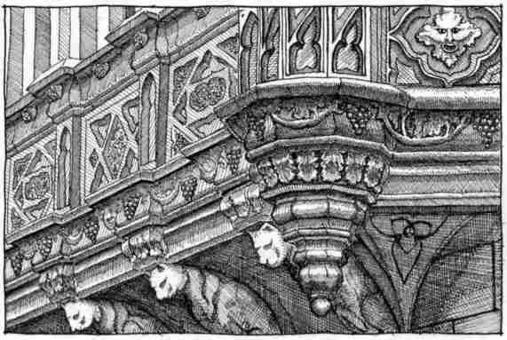
This is a detail of a projecting terra cotta bay on a strange late Gothic Rennaisance Revival building in Rogers Park. Somehow the builders took a lot with a 50 foot frontage and dropped a 13 story building on it. To be fair, it's pretty nice looking, with some exceptional terra cotta details. And how about those cat brackets supporting the bays? Maybe they're supposed to be lions, but they look too lean. According to the Chicago Historic Resources Survey, the architects were Koenigsburg & Westfeld.  Every hear of them?  I'm guessing probably not.  This used to be the Pratt Lane Hotel.

I was thinking about people in the Lakeview neighborhood upset about new buildings next to them that are 2 or 3 stories taller. Imagine living in the single family home next this building in 1927 and seeing steel columns being sunk 6 inches from the property line. And construction continued for 3 years... Maybe the whole neighborhood would have followed suit if the Depression hadn't hit.

Looking at this again I realize that the scan is pretty crummy.  I may have to dig up the original and rescan. Or perhaps the original drawing is crummy. If that's the case, I'm out of luck.