Wednesday, March 28, 2012

Clark, Greenleaf, Ravenswood and Estes, Part 1

The biggest property disaster that I know of in Rogers Park was a fire that burned down nearly the entire block bounded by Clark, Greenleaf, Ravenswood and Estes.   It was documented in the Chicago Tribune with a map of the burned area and a line drawing showing the destruction.  I recreated the map in order to add labels, but I can't improve on the drawing, which somehow came through microfilming (and then scanning) with a good amount of its detail intact.  Welcome to Rogers Park, 1894.

Looking Northeast through the burned area. From the August 9th, 1894 Chicago Tribune.

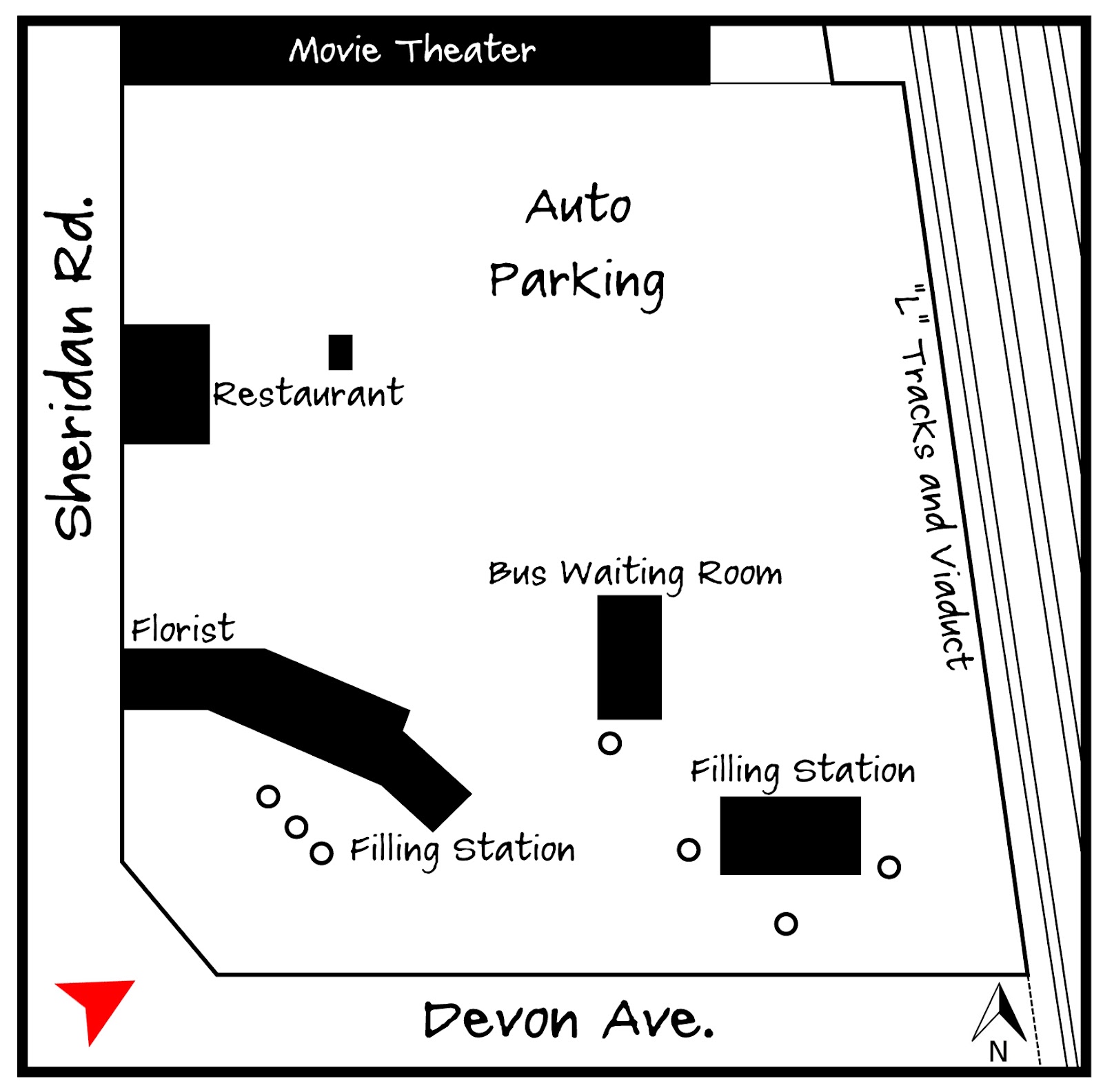
The article mentions that 14 buildings were lost, including stores, factories and dwellings.   It even provided a table itemizing the losses.  I've done my best go through the description and map out where I believe everything was located, but I'm only about 70% sure of my accuracy.

But so what? There was a big fire in Rogers Park over a hundred years ago and a bunch of people lost their homes and businesses.  How does that impact the neighborhood today? To investigate this maybe we need to go back another Chicago fire that's become a defining element in the conception of the modern Chicago.

After the fire of 1871 Chicago didn't rise from the ashes with dozens of skyscrapers stretching upward. The first steel frame skyscraper wasn't even constructed until 1884.  Instead Chicago rebuilt itself much as it had been, except that the city government scrambled to adopt new building codes and regulations to minimize the chances of another catastrophic fire.

It took years to adopt the regulations for new fire-resistant and fireproof construction and property owners and builders screamed the entire way.  (I definitely recommend Margaret Garb's "City of American Dreams" which describes this era vividly.)  One outcome of this assertion of governmental responsibility was an overall strengthening of the administrative policies of Chicago related to building.  This came to influence the look of the city far more than any fire.  Height limits, minimum construction standards, setbacks,  exiting requirements, etc. all became a part of the modern Chicago.

Rogers Park was annexed to Chicago a year before the fire, in 1893.  This meant that any new development on the damaged block had to conform to the new construction standards.  So this disaster provides me with something useful-- a clean slate.  Periodically I'm going to be taking a closer look at how this block developed post-fire, and what it might reveal about Rogers Park in particular and about Chicago in general.


Sunday, March 25, 2012

2200 block of Estes, 1916

To the right is a very nicely maintained Craftsman-style home on Estes, between Ridge and Western.  I'm not giving an exact address because this is a commissioned home portrait and I don't want to freak out the owners. Although with a little investigation you could figure it out.

I don't usually do commissions of any sort, but now and then I'll donate a drawing for a good cause. In this case there was silent auction to benefit my son's new school, Stone Academy.  Stone does an amazing job supplementing its curriculum in technology and the fine arts, and much of that is through parent-led fundraising.  So this is my small contribution to that effort.  The winner of the bid got to choose whatever they wanted to include in the drawing.

It's been a while since I've focused on a single building.  It makes me think about technical issues rather than historical ones.  For instance, what's the best way to match the scale of the drawing to the level of detail needed? What's the correct balance of black and white?  What's the proper relationship between realistic and impressionistic detail? What's the best way to focus attention on the house while still suggesting street context? All of these are important to the overall effect, and I haven't even touched on the distribution pattern of Craftmen-style homes throughout the West Ridge neighborhood.  Maybe next time.

Tuesday, March 20, 2012

Sheridan and Albion, 1937

OK, here's the last of my images adapted from the IDOT photo archive of Chicago intersections.  This filling station at the Northeast corner of Sheridan and Albion was a particularly solid design, and I'm struck  by how similar it is to modern gas stations.  There are drive-through pumps accessible on either side for motorists who just need a fill-up,  and garage bays for more in-depth servicing.
This is one of those images that benefits from the site plan (courtesy of the Sanborn Fire Insurance Map of 1937).  The sales area and the service bays sort of pinwheel against each other, with the underground gas tanks at the rear.  I imagine the space behind was for storing cars.

If you look in the drawing you can see the outline of the adjacent house to the North, along with two huge billboards angled towards the street.  These were located on the vacant lot between the house and the filling station.  Compared to the 1930s we get off easy when it comes to signage.  Anyone with plot of land could apparently erect an enormous sign if they could find someone willing to pay for it.  Now you can't put up a sign larger than 100 sq.ft. without an order from City Council.  But I'm not a huge fan of billboards, so I'm not complaining.

It makes sense to place filling stations on the corner, where it can have access to two streets.  But why did the station itself have to be located in the center of the lot?  If I could go back in time and make a few suggestions it would be to locate gas stations on the corner of the lot and have the pumps and service areas in the back.  This would be an especially good treatment in dense urban areas, where the service station disrupts the streetscape.  This gas station was on the corner of a residential block and at least tried to retain a little grassy area near the sidewalk. 

So this might be the last gas station for a bit, although I found another good one on Clark and a tiny one on Sheridan.  I'm trying to limit thematic postings to three.  For now.  Until I return to Sheridan Road please enjoy this great pictorial  that makes use of the same IDOT photos I've been admiring.

Thursday, March 15, 2012

Monopoly Houses in Evanston, #2

A few months back I posted about some mid-century Evanston homes on Crawford designed to evoke the traditional housing form (a box with a gable roof) while giving a nod to popular mid-century design.  So in keeping with that investigation here's another grouping of minimal traditional homes on Main and Dewey.


From the 1950 Sanborn Map
My first thought was that these homes represented an early planned development, which would have allowed them to be arranged around a single parcel of land.  But in fact they're all located on individual lots.  The central houses have been pushed back to provide large front yards, while the houses at the ends are rotated and moved forward to create a sort of communal courtyard. One front fence would pretty much spoil the effect, but perhaps there are agreements in place to avoid this. There are two distinct groupings, but for clarity I only drew the one on the east.

The Cook County Assessor estimates the construction date as 1952 for all of these homes, but I found their footprints in the 1950 Sanborn Map of Evanston.  No insult to the assessor, but I'm going to go with the Sanborn Map.  Upon construction all of these homes were nearly identitical, but they've been altered and enlarged differently over time.  Still, even the largest is only around 1,100 sq.ft. 

Friday, March 9, 2012

The Gage House, 1251 W. Farwell

Last Spring I started to document various buildings in Rogers Park that had been included in historic journals, brochures, and other publications. Every time I think I've found them all I come across a digitized source that proves me wrong.  That's the case with the Gage House, at the southeast corner of Farwell and Lakewood.  It was built in 1903 and published in the 1912 edition (Vol. 2) of the Cyclopedia of Architecture, Carpentry and Building
No address was given in the encyclopedia, but I've walked by this building often enough to recognize it.  It looks mostly unchanged, although there are some window alterations and the side porch was enclosed at some point.  It still has the original stucco at the first floor and wood siding above.  And it hasn't lost the distinctive pent roof that divides the first and second floors.

Every now and then I run into a building with a pedigree.  This house was designed by John B. Fischer, chief draftsman for the Chicago offices of Shepley, Rutan and Coolidge, perhaps best known here for their 1897 Chicago Public Library (now the Chicago Cultural Center).  Fischer is credited with designing the Harper Memorial Library as well as many gothic buildings on the campus of the University of Chicago.  The Ryerson Burnham Library at the Chicago Art Institute contains his papers.  After 1910 he was affiliated with the firm Postle and Fischer.  Below are some of John Fischer's designs identified in the Chicago Historic Resources Survey.  I'm especially impressed by the design to the far right, which reminds me of a previous post.

Photos from the Cook County Assessor
But getting back to the 3-bedroom house on Farwell,  it's a very compact design and reminds me of the affordable house plans popular in the 1920s.  The two big-ticket items for modern houses, kitchen and bathroom, were miniscule.  And there's only the one bathroom for both floors.  Still, the use of bays to bring in additional light and the living-room chimney that doubles as the master bedroom chimney are nice touches.

Both sides of the living room
The enclopedia provides something else uncommon when looking at modest homes of this vintage-- interior photos. 

Adapted from Sanborn Maps
I think of these interiors as "Craftman Light" making use of decorative timbers and contrasting colors and textures.  The living room almost has a rustic feel, which was probably appropriate in Rogers Park in 1903.  I especially like the change in level between the dining room and the living room.  It makes the space feel a bit more private.  And the diamond pane bay windows are essential to establishing the protected character of the space.  The photos have reproduced poorly, but it still more information than I would have expected outside of an architectural journal.

I put together a simplified map chronology to show how the character of the block changed over time, the home eventually being hedged-in by larger multi-family buildings.  While many streets of single family homes survived in Rogers Park (especially west of Clark), what you see here is more typical.  By 1964 this home became yet another remnant of an earlier era in the neighborhood. 

Monday, March 5, 2012

Sheridan and Devon, 1938

Detail of Mobilgas Station at Sheridan and Devon, 1938
To the right is another image adapted from the IDOT photos of Chicago intersections of the 1930s, accessed through the CARLI collection.  These photos have an amazing amount of detail, and someone could spend years sifting through them.  The intent was to document existing traffic conditions in order to plan for future improvements, but the information contained in them goes far beyond that.  For now I'm focusing on another auto-related image.

Sheridan is probably the most irregular road in Chicago, and definitely along the North Shore.  It zigs and zags, primarily running North-South, but sometime jogging East or West.  My impression is that it was cobbled together from various existing roads as it was extended North. So it's not unusual to have an intersection at Sheridan and Sheridan.  This location is at the Northeast intersection of Sheridan and Sheridan in Rogers Park.  But it's also the origin of Devon Avenue, so that's how I'll refer to it.

Adapted from the 1937 Sanborn Fire Insurance Map

You can see the old Mobilgas sign with the  Pegasus, which was the company's symbol through the early 1960s.  The station itself keys into the cottage styles that had been popular since the 1920s, complete with a small canopy over the entrance  and carved timber lintels.  In the background a portion of a gable roof is visible.  Luckily there was a Sanborn Map created for 1937, so I can tell that this is a waiting room for the bus.

There was quite a bit going on in this lot.   This filling station actually had two similar portions with hipped roofs on either end, and a flat-roofed area in the middle for the service bays.  Interestingly, a florist located in the portion closest the road.

Within a hundred feet is another competing filling station, similar to the conditions at Sheridan and Juneway.  These auto services tended to cluster close to each other.  To the north is a small restaurant, and behind that tons and tons of parking.  Not really sure about the small structure behind the restaurant.  Perhaps it was a kiosk to collect fees for the parking lot?  The late (and lamented) Grenada Theater was located to the north, and I'm sure the parking helped to accommodate their crowd.  Do you see the little jog in the "L" viaduct behind the theater?  I wondered about that, but it makes sense given the history of the property.
Click for a larger version.
As late as 1914 this area was a depot for the Waukesha Lime & Stone Company.  I'm used to seeing evidence of the old industrial rail connections on the Metra tracks to the west, but not along the North Side elevated. Perhaps I just didn't know where to look.  The commuter rails had been extended to Howard in 1908, but they weren't elevated until 1914 or 1915  (There's a good photo of this happening in Chicago's Far North Side, dated around 1915.)  I wonder how many other spur lines were in use before the commercial or residential value of the area won out.  The Waukesha Lime & Stone Company is still around (well, in Wisconsin), although I think they mainly supply material for road construction projects.  They probably established this depot to sell to local contractors.  Anyway, the little jutting out portion of the viaduct was constructed for these spur lines, although I'm not sure how long they were needed before giving way to the structures shown in 1937.  Regardless, the irregularity remains.
Bird's-eye view looking North

In 1965 and 1966 the entire property was redeveloped with large concrete and brick apartment buildings with commercial uses on the first floors. These buildings can be best described as aggressively unattractive.  The little buildings along Sheridan are one-story commercial buildings added recently, which have helped to make the stretch a little less alienating.