Wednesday, June 22, 2011

111 W. Washington, Conway Building, 1913

I've always admired the Conway Building's richly molded terra cotta facade.  Sure, there were some awful things done to the lobby rotunda and the Washington entrance in the 1980s, but the exterior of the building is still impressive.  Last month I found myself on the roof of City Hall, and I had an amazing view of the ornament at the top of the building, including the band of lion and gargoyle heads.  The gargoyles are probably intended to be Green Men, but let's not split hairs. 


The building was designed by Frederick P. Dinkelberg of D.H. Burhman and Co., and reflects the Beaux Arts inclination of the firm following the World's Columbian Exposition (also found in the 1909 Plan of Chicago).  This was their last building before Daniel Burnham's death in 1912.  In many ways it resembles the more elaborate Flatiron Building in New York (1902) which was also primarily designed by Dinkelberg.  The building follows the typical skyscraper configuration of a base, shaft, and capital.  But somehow the Conway Building lost its terminating cornice... It leaves it looking somewhat unfinished. Not sure if this was a part of the 1980s renovation.

Anyway, in this drawing I wanted to show the texture of the ornament rather than the architectural characteristics of the building.  Anything more than a narrow strip, and I would have spent a couple of weeks frantically crosshatching.  Seeing it on-screen I realize that I could have pushed the lights and darks further.  Sometimes it's good to post these images just to find out if they're done.

Tuesday, June 7, 2011

Entrances to Courtyard Apartments

I'm going to try and do what I normally do with these courtyard apartments, which is take a complex element, distill some of the best examples, and try and draw some conclusions.  But first I thought it might be useful to create a simple social space map of a courtyard apartment to help illustrate how they differentiate various levels between public and private space.  (My apologies to Adrian Tomine for stealing one of his color schemes from a New Yorker cover.)

The grey tones represent the public areas, including the street, the parkway, the sidewalk, and the alley.  Everything outside of the public right-of-way is private.  But there are levels of privacy.  In practice, the front yard functions as a semi-public zone, where it's unlikely you'll be arrested if your dog wanders over to the rose bushes. 

But as the courtyard establishes itself the character of the space changes, and you may find yourself more reluctant to enter deeply without a good reason.  This is very natural, and reflects the growing social control of the space as conveyed by the landscaped features, easy visual proximity to living spaces, and increasingly obscured views of the street.  By the time you get to the end of a particularly deep courtyard you feel fairly conspicuous. 

The element that divides the semi-public space from the increasingly private is the gate, or entryway.  Sometimes this is only suggested by the shape of the building, but often there's a designed element intended emphasize and formalize this division.  The location, materials, design, and visual permeability of the gate are all messages which the architect (and later, owners) wanted to convey to those that pass by or inhabit the building.

7405-7415 N. Damen, 1927
 
This brick and stone arcade is a good example of a substantial entrance element in the Classical Revival style.  A broken pediment with central urn is supported by paired pilasters.  The round arches are spaced with circular stone elements (called tondi).  The bottom portions of the arched openings are partially filled with wrought iron.  Despite the level of detail this screen is less than one foot thick. The open arches invite views into the court, but don't necessarily encourage visitors.  The central stone entrance reflects the design used for the main entrances into the building.

1637-1642 W. Estes, 1929
 
This gate is a bit more traditional. The brick and stone piers with decorative ironwork is a time-honored way to say, "Hey, we live here!"  This is for a side-court building, which has less of a span to fill between the building and the side property line.  On the left you can see that there's a half-column.  This is where it attaches to the building. It looks a bit odd in isolation, but by cutting the column in half they were able to maintain the scale without making it seem cramped.

2014-2018 W. Estes, 1931

This is one of my favorite entrances of an L-court building.  While it presents a substantial appearance the central piers are lowered, becoming more welcoming.  I haven't seen these octagonal ornaments before, but they provide the perfect emphasis for the gate.


1919-1923 W. Estes, 1928

This is one of the more modest entrances I documented.  The low wall invites you to have a seat.  The built-in urns are intended for seasonal plantings, but could also be adapted for Halloween candy.  The limited size puts this squarely in the symbolic category.

6414-6420 N. Newgard, 1932

This is another fairly elaborate arched screen for a central court building.  While this approaches the look of a gatehouse, it's not quite there.  It's designed in the Italian Rennaissance Revival mode, just like the main building.  Again, the arches carefully frame views into the courtyard while conveying a sense of exclusivity. But the detail goes a bit far in this case, almost giving the entrance a toylike quality. 


Although these gates weren't primarily intended to function as actual security elements, many have been adapted for that purpose.  It doesn't take much to fill an arched opening with an iron fence and add an electronic security door.  Frequently there are fences installed right at the sidewalk in addition to beefing up the security of the historic entryways.  This creates almost an "airlock" feel on the street, as if the building is under seige.  The most peculiar treatment I've seen uses airlock fences as well as individual fences along the walkways leading to the first floor doors.  How those fenced areas are mowed, I have no idea.

The social space map above is really a best-case scenario.  As entrances are modified to address real or perceived security concerns the semi-public space and the sense of permeability disappears, giving a fortified look to the street.  The green spaces which are so much a part of the courtyard design give way to a less rich sensory experience, where only visual access is maintained.

I have about 5 more of these entrances to document in a future post.  But maybe time for a break from courtyard apartments...

Monday, May 30, 2011

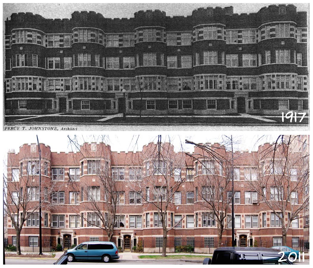
Pratt Manor (1252-1262 W. Pratt) - Apartments of the Better Class #3

1252-1262 W. Pratt- South Elevation
This is a big one.  Either the original photographer used a fish-eye lens, or they were able to take their photograph from a vacant lot across the street.  I had to stitch together several shots to approximate the image from 1917.  This is still a fairly attractive building, although it's lost the original windows and filled in others with glass block.

This building was designed (and owned) by our friend Percy T. Johnstone, who was also responsible for the apartment at Touhy and Paulina as described in a previous post.

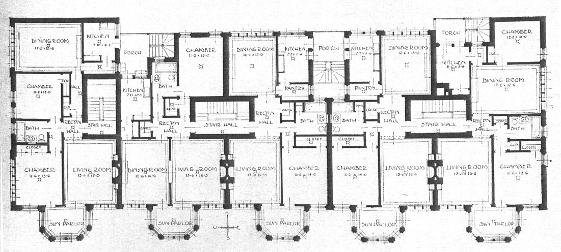
Units on the end had two bedrooms, while those in the middle had one. Bays front on Pratt.

The plan above illustrates the difficulty of squeezing numerous units (15 of them) on to a small lot.  Well, it's not really that small.  It's 57' along Lakewood and 134' along Pratt but the architect wants to squeeze out every inch.   The units on the end receive the best light.  The ones sandwiched in between have to make do with what they can capture with their projecting bays and the windows on the alley.  There are skylights to help illuminate the stairway and halls, but no light courts were incorporated into this building. At least they all have south exposures.

All living spaces were (and are) required by code to have a minimum of natural light and ventilation.  But when light only comes from one direction it has the effect of making objects seem flatter.  If you want a comfortable living space try to find rooms that provide light from at least two directions.  This is one of those things that registers on people subconsciously, but they may have a tough time articulating why one space feels so much better than another.


Vacuum cleaning system included!  And I like that recessed tubs are also a selling point.  Ivory enamel and mahogany still sounds kind of appealing.


I think the architect, Percy T. Johnstone, must have been a interesting guy in his day.  A quick search through the Chicago Tribune online archives shows that he was an owner and developer of buildings as often as he designed them.  His most ambitious project seems to have been a large hospital which was to have been built in West Ridge at about 6500 N. Ridge.  It never happened.  He had some other spectacular misfires in Uptown, where he planned a large hotel which also never came to fruition.

But below are interesting "before and after" images for an auto sales building he designed on Broadway south of Devon.  Special thanks to my wife for calling this to my attention.  At least one of us knows how to use Google correctly.


6335 N. Broadway, 1922.  "Architectural Record," Dec. 20, 1922.


6335 N. Broadway, 2011(?) Google Maps.
 The above image is from an ad for Northwestern Terra Cotta Co.  Sadly, it hasn't retained any of its amazing storefronts and entry.  But you can still see the griffins on the freize panel.

If you want to know more about auto showrooms in Chicago (you do, right?) you should read the designation report for the Riviera Motor Sales Building, which is located just a few blocks south.  And of course you should read the report for the Motor Row District on the near south side.  That one isn't posted, but I can email it if anyone requests it.

Anyway, if someone tracks down Percy Johnstone's obituary please drop me a line.

Saturday, May 21, 2011

Rear Parapets in Rogers Park #2

As warned, I have a number of these rear parapets to include in my courtyard apartment series.  For those of you who missed the triumphant first entry here's a link to it.
7345-7355 N. Damen, 1940

I'm not sure I trust the construction date for this property.  Not much building was going on in 1940, and the style seems wrong.  But there was quite a bit of construction in the northwest corner of Rogers Park in the 1930s, so maybe this is possible.   If I ever get over to the ancient building permit files (conveniently located on microfilm at the Harold Washington Library) I'll check.  The design itself is fairly minimal, with some basic castellations trimmed in stone.


7424-7436 N. Damen, 1928
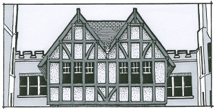
This is another version of the Tudor Revival with twin-gables and half-timbering.  In this case the timbers are painted white and the bound areas are decorative brick patterns rather than the more common stucco panels.  Simple brackets  support the eaves.  These are the shallowest decorative gables I've ever seen.  And spanning the space between the peaks with brick really undercuts the illusion of a pitched roof.

7400-7410 N. Damen, 1932


Here's a Classical Revival design combined  with an Italian tile mansard roof.  I especially like the square hood molding around the large window, complete with little projecting ears.

So many of these buildings make use of decorative clay tile.  When it comes time for a major repair I always expect it to disappear.  We need a Chicago non-profit called "Save the Mansards." Any volunteers?

1409-1415 W. Farwell, 1927

The architect of this one went a bit crazy with the stone quoins.  If a little looks good a lot should look great, right?  Nice decorative stone panel that suggests iron work (scrolls and curves connected with straps).


1638-1645 W. Farwell, 1929

This is one of the simpler rear parapets, but the use of multi-colored clay tiles really gives it distinction.  The central windows probably held French doors at some point, but now only aluminum double-hung.  There's a building almost identical to this a few blocks north on Greenleaf. Same architect, same date of construction.


OK, I've got about 8 more of these, but maybe time to give the rear parapets a rest.
Friday, May 13, 2011

7210-7212 N. Paulina- Apartments of the Better Class #2

Northwest corner of Touhy and Paulina
This buiding is at the northwest corner of Touhy and Paulina in Rogers Park.  It's one of my favorites from the Directory to Apartments of the Better Class, as referenced in my previous post.  I remember admiring the arched brick and stone entrance on Touhy, and wondering why it was called "The Kenilworth," which I thought was pretentious.  It's still kind of pretentious, but it's because Kenilworth Avenue was the original name for Touhy.

I like that this building has retained it's original windows and the Italian tile roofs. 

This is also one of the few entries which uses a rendering of the building rather than a photograph.  It was fairly common to have a perspective rendering made for a speculative building in order to attract investors and tenants.  The real estate section of the Chicago Tribune would publish these, even for small buildings. The drawing above is pretty much dead-on, a testament to the skills of the draftsman.  I wonder if the original drawing is hanging on a wall somewhere.  Or more likely, long gone.

Click for larger version.
I'm impressed at how efficiently the architect has arranged this building to maximize the number of units on the lot.  Narrow light courts bring in air and provide alley access to the rear stairs.  Some of the larger units have space for maid's rooms, but most do not.  The design generally depends on the front bays to bring in light. 

This building features one of my favorite awkward realities of many Chicago apartments-- a wall of windows on the narrow interior court perfectly aligned with a neighbor's wall of windows.  In this case it occurs between the two dining rooms of the middle units fronting on Touhy.  I hope whoever lives there are on good terms.

It advertised close proximity to the Birchwood Elevated Station. I think this is now the Jarvis Station, unless Birchwood was another stop that was later removed.

Click for larger version.
Apartments offered the most modern amenities.  Changes and improvements in technology were rapidly incorporated into apartment construction.  This was a good way to attract high-class tenants who might otherwise look for a single-family home.  Gas heat, electricity, and refrigeration were all used the same way solid marble counter tops and sub-zero freezers are used today.

Showing overall page layout.
As usual, click for larger version.

I don't know much about the architect, Percy Johnstone, but I can at least share a couple more of his buildings identified in the Chicago Historic Resources Survey.  Photos are taken from the Cook County Assessor:
2200 W. Granville

1527 W. Touhy


Monday, May 9, 2011

L-Court Apartments in Rogers Park

 
"Tendencies in Apartment House Design: Part VII - Courtyard Plans,"
Frank Choteau Brown, The Architectural Record, Vol. LI, 1922, p.64.
I'm not the first to look at apartment buildings in a systematic manner.  Architect Frank Chouteau Brown illustrated his own categorization of open court buildings in the chart to the right.  He put together a remarkable series of articles dealing with various types of apartments from a space planning and development perspective.  These were published in The Architectural Record in 1921 and 1922.  Given Brown's proximity to the apartment boom of the 1920s these are useful in understanding why these buildings took particular forms.  Much of the analysis below uses his observations as a starting point.
6414-6416 N. Paulina, 1931
What Brown calls Open Half Court I've labeled L-Court. An L-Court can occupy a long, narrow lot, but there isn't really enough space to allow for landscaping, or even to secure sufficient light and views for the units created.  They typically have three entrances, each of which serves 6 units. In some instances developers would add another L-Court to create a U-Court, but if that wasn't the case adjacent construction would often block them in.

To the left are some typical L-Courts in Rogers Park.  (For some reason these examples are all on Estes, but this is just a weird coincidence.)  You can see they all have narrow courts with projecting bays (rectangular, hexagonal or rounded) to take advantage of available light and views. The grey rectangles indicate interior and exterior stairs, which are commonly grouped together to simplify construction.  A narrower secondary court services the back stairs and provides access to the alley.  These all have small front yards which provide a minimal separation from the street. 

A lot with a 170 foot depth and a 50 foot width provides sufficient area to construct one of these buildings.  With 5 or 6 units per floor these buildings generally have 15 to18 units.  If basement units were constructed this adds a few more.  Generally there are no more than 21 units in a building like this. 
 

I found an  unusual L-Court building at 1059-1103 W. North Shore sited on a larger than typical lot.  In this case the amount of green space really does function like a larger central court.  The lack of complete enclosure gives the property a park-like appearance which is emphasized by a remarkable number of mature trees.

It makes sense to me that the building to the right was constructed in 1916 and the four examples above were all built in the late 1920s and early 1930s.  As the neighborhood became more urbanized, property values increased and developers squeezed more value from each lot.  You can sense a certain balancing process in action, where lot coverage, unit counts, and land costs play against each other.

One of the things that I'm interested in investigating relates to the Chicago Zoning Code of 1923, which regulated the size and type of buildings permitted in various areas.  It seems to me that once minimum standards were established buildings were designed to meet them, rather then exceed them.  I believe courtyard apartments pre-dating the zoning code provided larger units and more green space for their tenants. But it's difficult to prove this.  I don't always trust the building data provided by the Cook County Assessor, which may or may not have accurate construction dates and square footage calculations.


While a perfectly rectilinear lot makes an L-Court easy to plan, there are many irregular lots which were also adapted to the L-Court.  In particular, there are a number of lots adjacent to Clark Street and Sheridan Road, both streets which run at a slight diagonal through the neighborhood.  This often created skewed and tapered lots.  A skewed lot (as seen at 1666-1670 W. Farwell) isn't too difficult to adapt.  In this case the units align with Clark rather than Farwell.  A lot which widens towards the rear is a natural opportunity for an L-Court.  While a typical L-court can normally fit only one unit at the rear, a tapered lot often has enough space for two units.


To the right are two examples of  L-Court combinations.  On the left is the building at 6810-6814 N. Lakewood, with two distinct side courts.  The lot is both wider and shallower than those of the typical L-court buildings.  Rather than providing additional green space for the tenants the design has used a double-loading technique to create 32 units with narrow courts.  Without a way to easily provide secondary exits the architect had to run corridors from the central stairwells to the exterior.  These interior courts accommodate light wells, but the lack of rear exposure probably impacts their air flow and limits their light.

The examples above on Sherwin are the best I found showing how an L-Court becomes a U-Court. The building on the right (1413-1415 W. Sherwin) was built in 1917.  The building on the left (1407-1411 W. Sherwin) was built in 1926.  Even in plan you can see the difference in design and configuration.  Nevertheless, the architect of the later building carefully matched the size and ornamentation of the curved bays of the interior court to create a consistent character for both buildings.  They now appear to be under common ownership.  There are other examples in the neighborhood which were constructed closer in time.  These are difficult to identify if you don't have access to a map showing property lines.  Commonly the two L-Courts are identical in design but with different colors of face brick.

I almost skipped the L-Court building when I was organizing this project.  They really don't create the outdoor space I imagine when I think of a courtyard building.  But I'm glad I didn't.  They have some important qualities, and they help to understand the organizing principles of the larger courtyard buildings.  The next entry in this series will focus on the U-Court, which is what most people think of as a true courtyard building.

As a final note, the building footprints were re-drawn from Sanborn Fire Insurance Maps.  The lot sizes were derived from the City of Chicago 80-acre maps, which are available through the online Chicago Zoning Map.  Dates of construction are taken from the Cook County Assessor's website.


Monday, April 25, 2011

Directory to Apartments of the Better Class- 1133 W. Columbia

I'm going to be posting some entries documenting modest apartment buildings in Rogers Park, all of which are taken from Directory to Apartments of the Better Class along the North Side of Chicago, published in 1917 by A.J. Pardridge and Harold Bradley.  This bound pamphlet was intended to help rent these properties, which ranged from exclusive flats on East Lake Shore Drive to more affordable dwellings in Lakeview, Uptown and Rogers Park.  Entries included photos or renderings of the buildings, typical floor plans, a brief description, and an estimate of the monthly rent. 

I'm focusing on seven buildings in Rogers Park including 1133 W. Columbia, 7614-7616 N. Eastlake, 7210-7212 N. Paulina, 1252-1262 W. Pratt, 6757-6765 N. Sheridan, and 7600-7602 N. Sheridan.   It's good that all of these are still around.  Rogers Park managed to preserve much of its housing stock and is one of the last affordable north side neighborhoods along the lakefront. 

If these buildings were considered luxurious apartments in 1917 there's something reassuring about their current, generally run-down, appearance.  It gives me hope that today's luxury condos may devolve into affordable housing.  In the current economic climate this may be much sooner than the developer would have preferred...


1133 W. Columbia
 This 1913 craftsman-style building hasn't changed much on the outside, except for the unfortunate removal of the casement windows on the sun porches. It's also lost the clay tile roof above the side entry. The cornice appears pretty much as it did.

Full disclosure- Part of my job is helping people restore buildings which have been severely altered over the years.  A photo like this is a gift for someone who owns a modest building.  These are always harder to document than the more architecturally significant buildings.  Window replacement is one of the cheapest ways to make a major improvement in the appearance of a building.  And of course it's also the cheapest way to ruin a building.

Click for a larger version.
Floor plans are another great thing to find when looking at these  apartment buildings.  Especially for those which have since been subdivided or undergone extensive renovations.  A maid's room with a bathroom is simple to convert to a one-bedroom apartment, effectively doubling the number of units in a building. Floor plans allow a reader to imagine the spatial experience.  These apartments are commonly broken up into numerous rooms with a certain amount of space reserved for hallways.  Circulation is carefully orchestrated.  Modern apartments tend to remove the separating partitions, creating spaces which flow into one another. 

Looking at this layout I can imagine a household set up rigidly, where each room is strictly dedicated to a particular use.  While this limits the feeling of spaciousness, it may have provided a variety of experiences beyond what you might expect with the limited square footage. 

Click for larger version.


The description above mentions my favorite apartment amenity, central vacuuming.  I'm still a bit fuzzy on how this worked, but apparently a number of vacuum sockets were provided for each unit.   Tubes were hooked up to a central vacuum which was activated when the socket was opened.  This way no one had to push around a bulky vacuum cleaner or provide the storage space it would have needed.  Systems like this were eventually found to be difficult to maintain while improved technology made the portable vacuum more attractive.

Without odd publications like this it would be even harder to get a handle on buildings which are important more for their typical nature rather than their outstanding design or important associations.   The more I look at small-scale Chicago apartment buildings, the more I think they're deserving of some closer attention.

Below is a thumbnail that takes you to the overall page layout.  
Click for a larger version.

Wednesday, April 20, 2011

Courtyard Apartments in Rogers Park- Parapet Details

If you want categorize the ornament on a courtyard building (and who doesn't?) look at the rear parapet at the back of the court.  A building may have a variety of bays and window treatments, but it's really the decorative parapets that give it character and establishes the stylistic theme and rhythm of the facade.  The parapet is outlined against the sky, which emphasizes each curve and castellation. In some cases a false gable or mansard roof is used in place of the masonry parapet, but the effect is similar.


7405-7415 N. Damen, 1927


The most common treatment is a face brick with stone sills, lintels, coping and medallions.  In the case above stone urns are used to emphasize corners and provide additional focal points. I'm a particular fan of cartouches and coats-of-arms, as if the builder raided some ancestral mansion.

6901-6917 N. Ashland, 1923


Here the castellated parapet is offset against glazed roof tiles, which provide additional texture and rhythm. When I see parapets like this I always imagine tiny people pouring tiny buckets of boiling oil down onto the mailman.

2100-2110 W. Fargo, 1927


The Tudor Revival style is regularly adapted for large courtyard buildings.  Sawn lengths of wood approximate the look of heavy timbers.  In this case, the interstices are covered with stucco, creating a variety of geometric shapes contrasting with the dark wood timbers.

1622-1630 W. Farwell, 1927


This is another parapet that takes its cues from the Classical Revival style, but also makes use of stones panels with inset pointed arches common to a more Gothic style.  It's not unusual to see these buildings mix and match their ornament, creating a unique fusion of eclectic styles. 

1519-1527 W. Farwell, 1929


This is a more simplified version of the Tudor Revival, with multi-colored slate shingles on a false mansard roof.  The half-timbering is fairly complex, including small quatrefoils.  In this case both stucco and brick were used as infill elements.  The slate shingles still gives these buildings a touch of class.

I have a few dozen more of these to document, but those above will have to serve as a representative sample for the moment.

Thursday, April 7, 2011

Stanleigh Apartment Hotel, 6800 N. Sheridan

I found this building while tracking down sources for my project on courtyard apartment buildings.  Thanks to various scanning projects you can suddenly find rare books and journals online that few people have the patience or leisure to track down at a conventional library.   I was suprised to discover this illustration of a Rogers Park apartment hotel from 1917.  And yes, it's still there at the northwest corner of Pratt and Sheridan...

At first glance apartment hotels have a lot in common with courtyard apartments, but there are some notable differences.  Apartment hotels are generally taller and of fireproof construction (steel-reinforced concrete frame).  Most of them make use of an interior corridor to access the units and therefore need fewer stairs (see plan below).  They often have generous areas on the first floor which could be used for communal activities.  


You can view the original 1917 publication here.

I wanted to get the exact same angle, but I would have had to stand in the middle of Sheridan Road.  I try not to risk death when taking photographs.

Not much has been written about the apartment hotel in Chicago.  They were intended to function as a step between a full-service hotel and a long-term rental apartment. They came fully furnished complete with maid service.  Most units had kitchenettes and shared facilities for dining and recreation.  It's worth reading the description:

Click for a larger version.

I like that they had a "special" wing for bachelors. Wouldn't want them mixing with the normal residents.  These buildings required use of the Murphy bed, which folded up into a cabinet or closet when not in use.  This idea still sounds brilliant, but perhaps reading about a Murphy bed and sleeping on one is an entirely different experience.
Stanleigh floor plan.  Click for larger version.


It seems to me these buildings were instantly converted into Single Room Occupancy apartments as soon as the rental market heated up after the second World War.  Perhaps earlier.  I once lived in one of these former apartment hotels in Edgewater for a year.  It was my first apartment without a roommate, which nearly made up for being able to touch every wall from the center of the living room.  And finally I understand why my closet was insanely enormous-- it was a dressing closet, as if that makes any sense.

The Stanleigh was designed by Chicago architect Ralph C. Harris.  A quick search of the Chicago Tribune online archives shows that he was responsible for many buildings in the 20s and 30s, some of which are still around.  He then became the Illinois highway architect for 10 years, returning to private practice in 1944.  None of his buildings were highly rated in the Chicago Historic Resources Survey, but The Aquitania was placed on the National Register of Historic Places in 2001. Most of the photos below are photos from the Cook County Assessor.


1356 E. Madison Park, 1925

The Antone, 1926
7. E. Ohio
  
5819 W. Roosevelt, 1927

     
1220 N. State, 1927
  
60 homes at 5800-5900 N. Ottawa and N. Oriole, 1947
This is a representive example.

1350 N. Astor, 1949

The Aquitania
5000 N. Marine, 1923
Photo from Wikipedia
It's worth mentioning that the building at 1350 N. Astor is smack in the middle of the Astor Street Historic District.  I'm trying not to hold a grudge.  After all, this building probably helped convince the neighborhood of the need for a district.

Want to see some more apartment hotels in Chicago?  Click here.