Wednesday, February 23, 2011

Mirrored Courtyards on Farwell


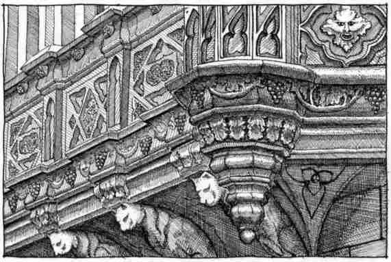
Parapet Detail, 1425-1433 W. Farwell
 A few years ago I found an amazing book called "The Concise Townscape" by Gordon Cullen. This
is a collection of essays published in 1961 and adapted from a series of articles printed in The Architectural Review after WWII.  Cullen was English, and worked as an illustrator, townscape consultant and planner.  His book is an extended exercise in documenting built environments and drawing out urban design principles which could inform the work of planners and architects.  Knowing these studies were created in the aftermath of the war gives a certain intensity to his work. Just to give a quick impression, his photos and graphics illustrate unusual concepts, including viscosity, insubstantial space, thereness, and deflection.  And there are many many more.

When I finished the book I wanted to recreate it using examples from my neighborhood to illustrate the dozens of principles Cullen identified.  It was a stretch.  Actually, it was impossible.  There's a big difference between a 120 year-old Chicago neighborhood built on a grid and a medieval English town (OK, multiple towns) which developed over hundreds of years.  But the exercise itself had some value, and it affected how I looked at the neighborhood.  I began to identify some interesting things I had never noticed before. 

Often  in a gridded city with rectilinear lots it's the negative space which creates unique effects.  This is never more true than with courtyard buildings, which create their own landscape and interior plaza, typically in densely developed neighborhoods.  Rogers Park is a mecca of courtyard buildings, with nearly 200 scattered throughout the neighborhood (yes, I've counted).  As far as I know, no one has done a definitive study of this building type.  While this is on my drawing board for the future, I want to take a closer look at a condition that's relatively rare--  two courtyard buildings of comparable size and character mirroring each other across a street, creating a secondary, axial path in the center of a block. This takes us to Farwell Avenue, directly west of the Red Line elevated train.

You can appreciate these courtyards best while standing in the middle of the street (briefly please).  Suddenly you're in a different city, where the streets are narrow and the buildings loom above.  There's a sense of enclosure and intricacy not usually found in Rogers Park (note the Cullenesque reference words!). I imagine the most interesting views would be from the third floor from the back of the buildings, where you can appreciate the entire 380 foot combined courtyard. 

Was this alignment accidental, or were larger forces of design and organization  at work within the grid? But first maybe a closer look at the spaces defined by the buildings.

The buildings themselves are so similar that it makes sense to talk about both of them at the same time.  Both are built on lots with 100' frontages and 175' in depth, and are 3 stories with a raised basement.  Both use a combination of face brick and stone (or cast stone) ornamental surrounds and accents.  They make use of false mansard roofs with Italian tile and have castellated bays that project into the courtyard, providing additional light as well as views to the street.   Both were built within a year of each other, 1422-1430 in 1927 and 1425-1433 in 1926.  And the final argument for intent rather than accident, both were designed by architect Anthony H. Quitsow. 

Some cursory online research (mostly the Chicago Tribune) shows that Quitsow was basically a specialist in the design of large, multi-unit buildings with eclectic details.  There are several in Rogers Park, and a number remaining in Evanston, just to the north. He's an architect who might be identified as typical of  the period, someone who worked with builders and developers to provide solid, predictable results with good curb appeal.  Not much information about him, except that he had offices downtown and at some point became a developer himself. 
Parapet Detail 1422-1430 W. Farwell

Why this block went from entirely single family homes in 1914 to accomodating several large, multi-unit buildings by 1937 (dates of the Sanborn Fire Insurance Maps) is difficult to say precisely, but it would make sense in the larger context of the neighborhood.  The 1920s saw Rogers Park develop from a suburban enclave to an urban neighborhood due to improved transportation (especially the elevated train) and an influx of new residents.  And there was an increasing acceptability of living in large multi-unit buildings, which had been considered "anti-family" by the previous generation.  A larger scale of residential development had become possible due to improved financial instruments, more standardized construction, and plenty of skilled (and cheap) labor.

But did Quitsow anticipate that combining courtyards (at least perceptually) would create a unique design feature?  Or did he just draw up the buildings based on the most profitable use of the lots permitted by city codes?  I like to think that both were considered and had their impact on the final result.  But it hardly matters.  Even in a neighborhood with limited history and tighly controlled development there will still be fortunate (and sometimes unfortunate) accidents.  I intend to explore a few more of these in the coming months.


Friday, February 4, 2011

Monumental Lighting #3- 212 W. Washington

This 1911 building has a lot in common with the one at 311 W. Washington.  Both were commissioned by the Chicago Telephone Company and both were designed in the historicist mode by their favorite architects, Holabird & Roche.  And of course, both have huge metal lanterns flanking their main entrance.  While 311 Washington was used for switchboards and mechanicals, this 20-story building was the administrative headquarters.  It has the same quasi-public feel that all of these phone company buildings assumed.
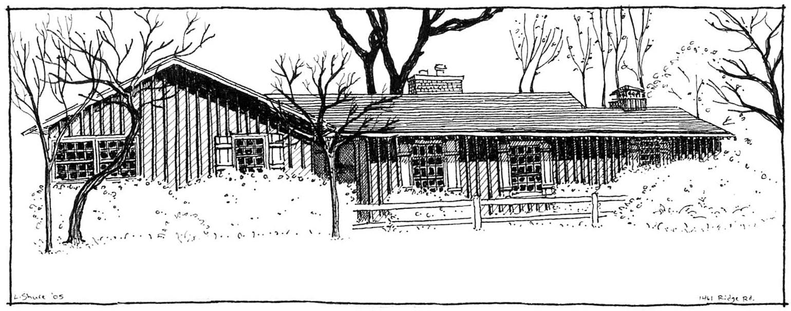
This view is a little narrower than I would have preferred (reference photo taken from the 12th floor of a nearby parking garage),but you can see that it's in keeping with the classic skyscraper formula of base, shaft and capital.  This has been somewhat obscured by hanging metal balconies along Washington, which accompanied the 1990s condo conversion.  It was a pleasure to eliminate these from the sketch.  Several of the lower floors were hollowed out to provide indoor parking, which they've made no attempt to hide.  It looks pretty odd from the street, although probably most people don't notice.
The main entrance to the building is indicated by these two story arched openings with decorative keystones.  Above are stone balconies hung with stone festoons.  The 3-story base is capped with a substantial projecting cornice.  The rusticated stone blocks really give the building a distinct identity.  The ornamentation is best described as a combination of Classical and Rennaissance Revival. 

Looking at this drawing I realize how much I've let this project get out of hand.  My first intention was just to focus on the decorative entrance lanterns in the Loop.  Then I thought, "Wouldn't it be nice if a reader could place these in context with the rest of the building?"  So I decided to include a couple of rough sketches.  This rough sketch took a week and a half to finish.

Of course the whole point was to look at the lanterns, and these are particularly good ones, weathered to a noble green patina.  Leave it to Holabird & Roche to get the details right, from the dome decorated with a leaf pattern (similar to the keystone design) to the acanthus patterns and scrollwork.  And the brackets that support the lights are works of art in themselves.  I'm also impressed that they accomodated the lantern attachment by eliminating a portion of the rustication to create a unbroken area of flat stone.  It also points out how artificial (a modernist might say unnecessary) the ornamental scheme is to the structure of the building. 

I think this will be the last entry in this series.  I have reference photos for one more building (on Washington, of course), but it's probably time to move on to some other things.


Thursday, January 13, 2011

Monumental Lighting #2, 311 W. Washington

311-27 W. Washington
This is the outline of the Franklin Exchange, built in 1915 and designed by the legendary Chicago firm of Holabird & Roche.  Their involvement in designing telephone exchanges is examined in Robert Bruegmann's excellent book, "The Architects and the City."  Holabird & Roche were responsible for dozens of these moderately-scaled exchanges, many of which can still be found in various neighborhoods, now retrofit for automated operations.  They're notable for their quality as well as their tendency to resemble public buildings, which must have been a branding choice made by the Chicago Telephone Company.  But in this case the design pretty much resembles a typical speculative office building in the Loop, built in a Venetian Gothic historicist mode.
Main entrance on Washington


To the right is the main entry on Washington, with its pointed arch and trefoil cornice.  The first floor  is clad with Bedford stone (granite), and the upper stories are mainly red brick.  The blocked windows suggest huge banks of computers at work.  Not much resemblance to the switchboards of 1915, but probably more delicate.  And of course, the entrance is flanked by a couple of huge copper lanterns.
Lantern flanking entrance


These lanterns are mounted below the spring point of the arch, and appear to be oxidized copper (maybe brass?) ornamented with cast leaves, rosettes and finials.  Many of these elements are cast in shapes to suggest wrought ornament. I must associate Gothic with church architecture, because these looks vaguely ecclesiastical to me.  The temple of the telephone?  Interestingly, the glass panes are prism glass, which was commonly used in storefront transoms to redirect and intensify light for retail spaces. Once again, these lanterns are in scale with the 2-story entry rather than the pedestrians.  I'm guessing they're about 5 feet high, from top to bottom. 

Just like 35 E. Wacker, I've never seen these lit.  I'm sure they were never intended to shed much useful light, but it would be nice to see them glowing in the evening.  Especially at this time of year, when it's dark at 4:30. 


Monday, January 3, 2011

1246 W. Pratt, 1927 (originally posted 3/28/06)


Since my series on monumental lighting is moving slowly I thought I would post some older blog entries.  This one is from my old MySpace account, viewed by at least half a dozen people.

This is a detail of a projecting terra cotta bay on a strange late Gothic Rennaisance Revival building in Rogers Park. Somehow the builders took a lot with a 50 foot frontage and dropped a 13 story building on it. To be fair, it's pretty nice looking, with some exceptional terra cotta details. And how about those cat brackets supporting the bays? Maybe they're supposed to be lions, but they look too lean. According to the Chicago Historic Resources Survey, the architects were Koenigsburg & Westfeld.  Every hear of them?  I'm guessing probably not.  This used to be the Pratt Lane Hotel.

I was thinking about people in the Lakeview neighborhood upset about new buildings next to them that are 2 or 3 stories taller. Imagine living in the single family home next this building in 1927 and seeing steel columns being sunk 6 inches from the property line. And construction continued for 3 years... Maybe the whole neighborhood would have followed suit if the Depression hadn't hit.

Looking at this again I realize that the scan is pretty crummy.  I may have to dig up the original and rescan. Or perhaps the original drawing is crummy. If that's the case, I'm out of luck.

Friday, December 10, 2010

Monumental Lighting #1- 35 E. Wacker


View from E. Wacker Drive

Recently I've been interested in the massive lanterns found on many historic skyscrapers downtown.  Sure they're lousy at casting any useful light, but they seem to pull their weight in other ways. I thought it would be interesting to examine a few of these buildings and their light fixtures to see if I could identify some controlling principles related to their size,  location, and design.
Just to set the stage, 35 E. Wacker Building has been a Chicago Landmark since 1994.  Originally known as the Jewelers' Building, it was completed in 1927. The main building is 23 stories tall and is topped with an 18 story tower.  The first floor is covered with grey limestone and the rest of the building is beige terra cotta.  The domed pavilions at the corners of the main tower originally concealed water towers for the sprinkler system.


Main Entrance on Wacker Drive

The portals at the second and third floors are masterpieces of ornamentation with carefully composed cornices, frames and decorative spandrels.  The Chicago landmark designation report identifies the ornament as primarily early Italian Renaissance, borrowing liberally from church designs.  It notes that typical decorative treatments in this style present the most aggressive decorations at the street level, becoming more sophisticated (restrained) at higher elevations.  That works for this building, at least until you hit the domes, which are like a Baroque hallucination. 

Original marketing material for the building indicates that the design "was based on that of the 15th century chapel for the monastery of the Certosa of Pavia..."  Sure, I can see that. Kind of. 
Lantern details


But that's not to ignore the the most important part of the building-- the four enormous brass lanterns projecting out from the second floor!  These things are massive.  From a distance they look in scale with the building,  but up close it's clear they could crush an elephant if they popped off the wall.  They're covered with classical ornament.  Fluted colonettes support an elaborate crown topped with shields, scrolls and tiny urns.  The finial is an eagle with spread wings (although from an angle it looks like a parrot).  Inside the shields you can see an intertwined JB for Jewelers' Building.

The lanterns almost look like scaled-up pieces of jewelry, which would be appropriate.  But they also resonate with the four domed pavilions and the dome on the main tower (see below).  Their scale works, but mainly because they've been elevated above the first floor where they can read as sculptural rather than functional. 

I'll be taking a look at a few other buildings with lighting standards in and around the Loop over the next several weeks.
North Elevation of 35 E. Wacker, 1925
Original can be found at the Chicago History Museum


Monday, November 15, 2010

More Unremarkable Buildings in Lorain, OH

Moving on slightly from Ashtabula to Lorain, Ohio, land of my birth.

When we were kids there were well-defined areas we were comfortable exploring.  But the most exciting ones were on the edge of our range.  To the east was Dairy Queen, but to the west it was Chapman's. 
Chapman's Food Mart was cool.  There were entire aisles of junk food.  Kids were not particularly welcome, probably because of shoplifting.  You could buy one slice of bologna for 10 cents.  I'm pretty sure my older brother introduced me to it, as he did most of the questionable experiences of my childhood.  For some reason I'm glad to see that it's still there, and possibly still under the same ownership.

It's good to see Ardick's Seafood is still around.  Unless you've lived close to Lake Erie it will be hard for you to understand the importance of perch in maintaining mental health.  I can't really explain it.  You can buy fish here or you can have them fillet your catch.  Despite living in Lorain for 18 years I never once caught a single fish worth eating. I try not to be bitter about it.

For the life of me I can't remember what this diner was called when I was a kid.  My Dad used to bring us here on walks in the winter.  We would drink hot chocolate at the counter and play their tabletop video game.  It was Popeye, which was state-of-the-art at the time.  Only now do I realize that these long winter walks were probably designed to give Mom a break from the three of us.  Probably four of us, including Dad.

Tuesday, November 9, 2010

Geneva-on-the-Lake, OH

Back to Ohio!  Maybe 2 more entries before I return to Chicago.

One of the more enjoyable destinations when visiting Ashtabula is a drive west to Geneva-on-the-Lake, which is basically an old cruising strip and linear carnival.  And if you're wondering where all the biker bars are in northeast Ohio, look no further.

This is the type of summer resort town that you might find on the east coast, not on Lake Erie.  There are wine gardens, putt-putt golf courses, arcades, water slides, hamburger joints and bars.  Lots of bars.  This is where local folks come to relax, especially those that can't afford an expensive vacation.  Given the current economy, I wouldn't be surprised if Geneva-on-the-Lake received a big bump in visitors. 

In addition to the strip, there are tiny cottages and bungalows that people can rent for extended stays. According to my wife, most of these were strictly seasonal (meaning uninsulated) until recently.  Unlike an amusement park, this is a real place, and must be a lot of fun late at night.

The buildings are worth a study in themselves.  Many of these look temporary, but must have been in place for 50 years or more.  Above are two connected Quonset huts.  These were a popular and cheap way of creating space after WWII.  Some of the buildings look like old frame houses converted to commercial uses, but others look like elaborate hot dog stands that just kept growing.

I can't help but wonder how a town like this develops.  There doesn't seem to be any rhyme or reason, but somehow it works.  Other, more modern developments have located on the edges of the district, but they're too far to impact the character of the area.  I have to wonder when the tipping point is reached- when there are too many cars and people to be absorbed into the network of spaces.  But I've been there maybe half a dozen times, and have yet to see it overwhelmed.  And sure, they don't have enormous roller-coasters, but no one is charging you $45 just to walk around.  And $45 can sure buy a lot of insanely sweet Ohio wine.

Friday, October 29, 2010

Ashtabula Harbour Commercial District, Ashtabula, OH

Getting away from Chicago for a bit, I'd like to talk about Ohio, where I grew up. More specifically, Ashtabula, Ohio, where my wife grew up. 

Ashtabula and my hometown, Lorain, share a surprising number of similarities.  Both exist largely because of their location at the intersection of Lake Erie and a major river. Just like the Black River in Lorain, the Ashtabula River created a natural harbor (later enhanced through dredging).  In the 1950s, the expanding chemical industry made the Ashtabula harbor one of the most important on the Great Lakes.  And also one of the most polluted. 
Ashtabula Harbor Commercial District
Before the area sank into depression (along with the rest of Ohio), some remarkable commercial districts were built.  One of the best is the Ashtabula Harbor Commercial District, which has been on the National Register since 1975.  This was a concentration of saloons and houses of prostitution back at the turn of the century.  It's become a bit more sedate since then. 
Ashtabula Lift Bridge- View looking northeast.
The Ashtabula Lift Bridge was completed in 1925.  It's always an odd thrill to drive under the 420-ton concrete counterweight hanging above the roadway.  You can tell a bridge intended for purely functional needs- it doesn't much care about blocking the views up and down the river.  This contrasts with the bridges on the Chicago River, where engineers put a lot of effort into minimizing visible support structures. But to be fair, there's not much height above the water to work with here. The bridge acts as a gateway into the historic district to the west.
Goodwill
Above is the Goodwill complex south of Bridge Street.  It's really a collection of buildings strung together, probably from the 1960s.  Not a particularly graceful combination, but since these are the newest buildings near Bridge Street, they give a good sense of the community's needs.  I've never visited Ashtabula without stopping at this Goodwill, and it's always busy.  While it may not be an engine of economic development, it does attract people to the area.
Italianate Commercial Buildings
The core of the district is an impressive block of 2-story brick buildings between Hulbert and Morton.  The frame buildings shown above are just to the west.  It's rare to find historic commercial frame buildings like this in decent condition. It looks like someone has been taking care of these, even to the point of a partial restoration.

I think this area has incredible potential.  It's already attracted several unique businesses and restaurants.  And because it's on the National Register, it's qualified for tax credit projects.  I think Ashtabula knows what it has here, but maybe could be more active in attracting investment.  After all, there aren't that many alternatives to strip malls left in the area...


Monday, September 27, 2010

Metalwork at Riverside Plaza


This is part of an air return grille at the southeast entrance of Riverside Plaza, also known as the Daily News Building (Holabird & Root, 1929).  This is another world-class building that has somehow escaped Chicago landmark designation.

I've drawn this grille 3 times- first in 1997, then in 2006, and now a couple of weeks ago.  I'm not exactly sure why I've been so drawn to this design.  It's a typical Art Deco theme, organic shapes in a rigid geometric framework.  Sunflowers maybe?  Hard to tell for sure. I'm also fascinated by the metal itself, nickel silver, which was popular for Art Deco designs.  Made from 75% copper, 20% nickel, and 5% zinc, it could be rolled, pressed, or cast.  Silver white was the most common color,  but it could take on tints with the addition of various other metals.

The building and its interiors are practically an encyclopedia of Art Deco themes and decorative techniques.  It's a shame the ceiling mural above the concourse was removed for restoration years ago and has yet to be returned.

Monday, August 30, 2010

One North LaSalle- Bronze Grille


This building has what may be the coolest lobby in Chicago.  Think black, gold and green. But the ornament surrounding the entrance is pretty amazing too.  The drawing to the left is a small detail taken from one of the entrance piers. I think I finished it in 2006. 

But some of the most interesting elements are the large bronze grilles  above the entrances. They're remarkably precise and seamlessly organic.  I'm still trying to figure out just how it achieves this effect.


The grid is created by starburst patterns comprised of four teardrop shapes, two large and two small opposing each other.  These create star shapes which alternate between horizontal and vertical orientation.  The points of the teardrops are connected to create either horizontally or vertically oriented diamonds.  Four of these diamonds are connected by a square rosette into a larger starburst pattern.  The triangular spaces between the large and small teardrops are filled with geometric patterns radiating inward.

 The small teardrops point towards each other creating a cross with tapering ends terminating at the square rosettes.  In the center of this shape is a large round rosette made out of petals and overlaid with  four blossoms. Fascias radiate out for this intersection, wrapped in vines, flowers and leaves.

I tried to capture a module of sufficient size to convey how the pattern would repeat itself.  Any larger and I would have gone a bit crazy.  I've also added a digital color overlay, although the original will probably get a watercolor wash at some point.

Have I mentioned that this building was designed by Vitzhum & Burns and completed in 1930?  I've got to work that in somewhere... Also, it's been a Chicago Landmark since 1996.

Monday, August 23, 2010

33 N. LaSalle- Grille Detail

Elevator surround detail at 33 N. LaSalle
When I first started to work downtown I was fascinated with the decorative metal elements found on so many of the buildings.  I did a series of close-up images of some of these, without much concern about the surrounding context or the decorative influences at work.  The drawings were 1" x 1".  I think I was more interested in testing my crosshatching ability more than anything else. 

But recently I've started to rediscover these grilles, screens, and elevator doors. And I find that I'm interested in going a bit more in depth, particularly in regard to the skyscrapers of the 1920s.  And where better to start than my own office building?  Well, I guess it's not really mine...

I had to get special permission from the building management to take some reference photographs of these air return grilles in the lobby.  I think taking photos is harmless, but apparently I don't think like a terrorist.

Air return grille

Anyway, this is one and a half modules of the pattern used for the air return.  It's amazing how a few simple elements can give the impression of remarkable complexity.  The best of this ornament creates a tension between the use of geometric and naturalistic themes.

Unlike many earlier eclectic-style buildings, these are unashamed of their height and seem to acknowledge that their design lends itself to mass production.  This can been seen in everything from the decorative spandrels, thin limestone veneer, and machine-fabricated interiors.  At the same time their decorative elements benefited from the work of artists and sculptors who adapted their work to accomodate mass reproduction.

These buildings may seem quaint now, but they represent the apex of technology and economy for their day.   Their stepped back form and height aren't the result of a whim.  They incorporate what can be built (permitted by zoning and technology) and what should be built (profitable with a minimum of risk).  While the major tenant usually had rights to the name of the building, no one organization could fill every floor.  The developers had to provide adaptable office space for a range of users.

Most of these offices have been cut up, and the natural light  has been drastically reduced by new mechanicals and drop ceilings.  But they still retain enormous functionality.  And in my opinion, quite a bit of charm.  Many have been given new life through careful restorations, often utilizing tax credits through government programs.  In Chicago LaSalle Street has the best colletion of these buildings, including the Field Building, the Chicago Board of Trade, and One North LaSalle.

 Interestingly, the same floral elements used to create the air grilles were modified to become light fixtures throughout the lobby.  It's a good way to retain some continuity in a space which has been greatly altered since its time as the Foreman Bank Building.  And looking at the old photos displayed in the lobby, I really miss the grand staircase that once led up to the banking floor.

That said, I'm not positive that the brass air return grilles (and light fixtures as well) are original to the building.  The more I compare these with the elevator ornament the more it seems like the work of a careful modern designer.  But even if they're not original, I enjoy how they key into the general decorative vocabulary of the building.

Tuesday, July 6, 2010

4550-4556 N. Beacon- Cornice Detail (initially posted 7/6/10)

In colored pencil.
I was out at Wilson and Beacon a few weeks back and had to admire this amazing prairie-style cornice.  This multi-family building is in the Sheridan Park National Register District and identified as the work of Samuel N. Crowen (also responsible for the Biograph Theater). It's adjacent to Chicago's Dover Street District, which basically carves out a few blocks from the larger National Register district.
In watercolor

I wish I could formulate some principles for good prairie-style ornament, but there are so many exceptions that it hardly seems worthwhile.  In this case it seems like classical elements have been warped and twisted, and there's some interesting manipulation of scale.  For some reason the brackets remind me of jointed bones or cow knees.  Does this thing even shed water?  Doesn't matter.  Somehow it just works.

Saturday, July 3, 2010

Teardowns in a North Shore Suburb (reprinted from AREA Chicago #8)

 Things have been pretty busy with the birth of our new son (June 25th!), so I'm posting an article that was included in the last issue of AREA Chicago.  It's on their website, but from some reason the illustrations weren't included.  This has bothered me, so I thought I would remedy it.  The theme of the issue was Peripheries, interpreted in various ways.  Some of these sketches are pretty old and kind of rough, so I apologize for that. 
_______________________________________________

The tension between the public interest and private property rights was front and center in Chicago’s North Shore suburbs during the housing boom of the early 2000s. These small towns and cities (including Evanston, Wilmette, Kenilworth, Winnetka, Glencoe, Highland Park and Lake Forest) are historic commuter suburbs that benefited from easy transit to Chicago while providing attractive lakefront access to those who could afford it. Over the years, these communities have become less exclusive but are still highly valued for their prestigious addresses and substantial community amenities. Property owners looking to profit from selling their houses often turned to developers who, in turn, demolished the existing buildings and constructed McMansions in their place. A climate of easy credit, quick turnarounds, and strong demand, in addition to decades-old zoning laws that permitted much larger buildings, made cities on Chicago’s periphery attractive for redevelopment. Once demolition of houses began, they clustered, partially due to zoning, but also because teardowns attract teardowns. Builders kept track of areas of new construction and new construction signaled to adjacent homeowners that it was time to cash out.

Communities that saw their character changing due to teardowns often addressed the issue through a variety of city boards, such as a plan commission, housing commission, or community land trust. There is nothing illegal about someone tearing down a home and building a new one in accordance with all building and zoning codes, but the loss of economic diversity and erosion of historic character was alarming to many. In response, many of Chicago’s older suburbs adopted demolition delay ordinances to determine if their communities were losing buildings of historic or architectural significance. Delaying demolitions between three months and two years enables a historic preservation commission to initiate proceedings to assess whether a building is deserving of historic landmark status. Whether a building can be landmarked in spite of intent to demolish depends on the language of the Historic Preservation Ordinance adopted by the particular community. Despite the efforts of planners and preservationists, North Shore cities, towns, and villages have lost hundreds of buildings since 2000. Some have been of historic and architectural importance, others not. Characters of streets, towns and whole communities have been altered. Some residents welcomed demolitions; others loathed the new buildings. Beneath the teardown trend, however, were the planning concepts and economic realities that have shaped community development for decades.

I was a liaison to a historic preservation commission in a North Shore suburb until 2006, and it fell to me to document, research, and recommend action for each residential demolition permit received. This put me in a unique position to witness this dramatic shift in the built environment, and on my own time I made the following sketches. They are just the tip of the iceberg, depicting some of the hundreds of buildings on Chicago’s suburban periphery that have been demolished since 2000. With the deflation of the housing market, I wonder how many of the new owners were able to maintain their huge mortgages and tax assessments. Have some communities traded streets of diverse housing for a row of expensive white elephants? Perhaps the real lesson is how little control was available to the municipal authority, or the startled residents, once the teardown trend hit. In many ways the cities finally began to resemble the zoning maps that were adopted decades earlier. These maps defined the height, setbacks, and floor area for a building on any given lot. This is a predictable, consistent, and common method of managing growth but not the best way to guide development for communities intent on maintaining a unique identity. Any real solution would have to be a combination of thoughtfully constructed regulation which can respond to unique conditions, coupled with a strong sense of those things within the community which are worth preserving. Combine this with a vision of the future and you have just the beginnings of a comprehensive approach.
This 1920s Craftsman style home was in the middle of its own forest. There had been numerous additions, but all very much in keeping with the character of the home.


When this rustic home was razed, the wooded areas in front were replaced with a lawn and a circular drive.

This 1950s ranch house was completely hidden from the street, but was a nice example of mid-century modern scaled for affordability. I especially liked the cantilevered roof shading the recreation room.


This 1920s French Eclectic mansion had a particularly dramatic view of Lake Michigan. It was demolished along with a nearby neighbor to accommodate the next generation of mansion, with a scale that made this look quite modest.


Rumor had it that this 1950s house was taken from a design in Popular Mechanics. I couldn’t confirm that, but it’s a nice solution to a hilly site. The owners said there were too many stairs.


This Craftsman style house (c.1915) was demolished to make way for a planned development. It was located on a lot that had been rezoned as multi-family. (Note:  This hasn't yet been torn down, probably due to the current economy.)


Very stylish 1960s ranch with angled roof. Too small to survive.


This turn-of-the-century Classical Revival home was actually in a National Register Historic District. The neighbors tried to organize a local historic district, but with no success. Only locally designated landmarks have protection from demolition.


This Dutch Colonial Revival was replaced by a French Country home. Those are the ones with the turrets.


This 1940s ranch house was particularly close to my heart. It was constructed in the part of town which still had some rural character after WWII. It approximated the board and batten look of the barns and livestock structures which would have been found in the area at the time.


Wednesday, June 23, 2010

Flatirons in Rogers Park #4- Paulina Building

This is the final flatiron building in the series, at the northwest corner of Howard and Paulina.  Just like the earlier Loyola flatiron, this one is defined by the diagonal line of the El tracks.  Howard is the last Chicago stop on the Northside and was once quite an entertainment district.  I'm assuming this building has its own elevator because of the huge override on the roof.  This would have been unusual for a 3-story building in the 1920s, and suggests that it might have been luxury apartments or offices at some point. Although being right next to the tracks wouldn't have been the most desirable location.

7600 N. Paulina
Built: 1929
Architects:  Newhouse and Bernham

The primary facade is clad entirely in terra cotta, which was a less common treatment by the 1920s, when architects and builders were more likely to use a combination of brick with terra cotta accents.  This was easier than detailing (and constructing) all of the steel attachments necessary for terra cotta.  This building has an almost festive use of cream and pink terra cotta, decorative spandrels and no lack of classical festoons. It probably looked old-fashioned the day it was completed.  I particularly like the simplified terra cotta columns spanning the second and third floors between the windows.

This is also the only flatiron building in this series to have received an "orange" rating in the Chicago Historic Resources Survey  (CHRS) which means that the building has some architectural significance in the context of the neighborhood.   Unfortunately the first floor has been remuddled mercilessly, and the generous storefront windows have been reduced to a 1970s strip. But you can still see the name, "Paulina Building" proudly displayed on the band below the cornice.

Because of the survey I know that the architects were Newhouse and Bernham.  I could have found this out by looking up the information in the ancient permit files on microfilm (available at the Harold Washington Library or the UIC Library).  But what I couldn't have done easily is identify three other buildings designed by Newhouse and Bernham.  Sure enough, they seem to have specialized in full terra cotta facades, although one of the buildings is a classically designed limestone-clad synagogue:

Only buildings identified as potentially significant were documented in the survey, so there's certainly more out there by the same team which have not been categorized.  This is a problem with windshield surveys, which only identify the most significant buildings.  If you want to understand the range of an architect, or see designs which may have preceded (or followed) better buildings it's very difficult to accomplish.  Of course it would have extended the CHRS survey period from 10 years to 50 years, so I understand the limitations.

Thursday, June 17, 2010

Flatirons in Rogers Park #3- Greenview, Howard and Rogers

I've finally found the Rogers Park equivalent of Times Square.  Sort of.  Seventh Street and Broadway create a New York-sized hour-glass as they scissor across each other.  Howard and Rogers create a Rogers Park-sized hour-glass.  This intersection acts as the east gateway to the sadly faded Howard Street commercial district.  The criss-cross allowed for the construction of two opposing flatiron buildings, the only instance of this happening in the neighborhood.  Because of the strange way that Howard shifts south as it heads east over Greenview these buildings seem to point at each other like huge arrows. 

Although I reference Rogers Avenue in a previous post, I didn't really go into any explanation of why there's such an uncharacteristic diagonal street cutting through the neighborhood.  In 1816 the Fox and Sauk tribes ceded a 20 mile corridor to the United States at the Treaty of St. Louis.  Everything outside of this corridor was owned by Native Americans until the Chicago Treaty of 1833.  At which point you were out of luck if you were a Native American.  Rogers Avenue represents the northern boundary of this defunct corridor, and continues from Lake Michigan to the southwest.  You can still find this line on plat maps.  Although it doesn't have much meaning nowadays, it's responsible for some unusual street and park configurations.  For a great entry about this check out Forgotten Chicago's website.
1509-1519 W. Howard
Buit: 1922
Architect: Leo Miller

On the west side of the intersection is a very handsome building with limestone facade, a classical parapet and flat-pedimented entry.  There's a really interesting antique and thrift store here which has been in the neighborhood forever.  I'm not sure if there are apartments above or additional storage.  The limestone has some condition issues, but you can tell that this building is very important to someone.


7601-7611 W. Rogers
Built: 1928
Architect: M.O. Nathan

This building on the east side of the intersection doesn't use its false mansard roof to the best effect.  But some interesting ornament is found on the side elevations, where elaborate parapets project above the roofline and contain decorative arched areas framing triple-ganged windows.  Unfortunately the first floor has been coated with a pebble stucco which has not aged well.  I think all the storefronts in this building are vacant.

Tuesday, June 8, 2010

Gable Apartments in Rogers Park (reposted from 6/1/09)

While I'm putting together more flatiron entries I thought I would revisit a post from 2009:

I've only found these in the southeast part of Rogers Park, near Loyola's lakefront campus. Basically they're typical 3-flats but with a projecting gable front flanked by two ground floor terrace areas. Most of them have Prairie or Craftsman detailing, often with some classical ornament thrown in. Some preliminary digging indicates construction around 1915.


1244 W. North Shore

 The gable front tends to minimize their mass and bring in more light . Maybe this is a localized sub-type of some sort. By the 1920s developers seem to have combined several lots to allow courtyard buildings, but these appear to fit on standard 25' wide Chicago lots. 


1130 W. North Shore
Built: 1915
and,
1128 W. North Shore
Built: 1915

Another thought is that these buildings were some of the first signs of increasing density due to the extension of the nearby elevated train and the associated increase in land cost.  The attention to detail and use of domestic symbolism may have made these buildings more acceptable to the single family homeowners in the area. 

1325 W. Arthur
Built: 1916
Architect: Carol Hoerman

Since I wrote this in 2009 I've found some more of these buildings in Hyde Park.  It would be interesting to do a real study to determine if this is a valid sub-type or a brief architectural fad. 

Tuesday, June 1, 2010

Flatiron #2- 1230-1234 W. Loyola

1230-1234 W. Loyola
Built: 1928
Owner: A. Kirschbaum
Cost: $120,000
Architect: Kuya (no first name given)

This building is opposite the Loyola stop on the Red Line.  If you set up a pulley system maybe you could swing onto the platform from your window. This is an uncomfortable, windswept section of Rogers Park, exaggerated by the massive concrete viaduct supporting the El tracks.  The blank modern buildings on the south side of the street don't help, and neither does the nearby surface parking and lack of street trees. But it has been improved in recent years by converting a vacant lot into a garden for the Chicago Waldorf School, which is a bit further to the west.

The building itself is a good example of the Italian Renaissance Revival style, with false mansards covered with clay tile, the occasional decorative cartouche, and first floor storefronts clad with vaguely gothic ornament. And surprisingly, the storefronts haven't been entirely mucked-up.  But I want to know why nearly every ecclectic architect in the 20s included fake Juliet balconies. Just let it be a window!

The main elevation shown above faces south.  Unlike the previous flatiron, this building doesn't make use of an interior court for light and air.  Although intended to have a zero lot-line with its west neighbor (now missing) there's an inset about 30 feet back from the front property line to allow for windows. Along the alley a couple of triangular light courts have been inserted for the same reason.  I'm sure the south-facing apartments are very bright and cheery.  For the others, probably less so.

The process of raising the El tracks began in the 1910s, but wouldn't be complete until the early 1920s. So the residents of this building have never been without the comforting rattle of the train.  But as a famous couple of brothers have said, the train comes by so often you won't even notice it.