Wednesday, August 31, 2011

Courtyard Apartments- Graphs and Charts!

When you're working with about 200 buildings it's natural to organize them into a list.  And of course, if you're making a list why not use Excel?   And as long as it's in Excel why not generate a few pie charts and line graphs?  And why not import that table into a free geocoding site and see what kind of maps it comes up with?  

Anyway, it was only a matter of time before I could inflict some abstract illustrations on the viewing public.  I believe I've already included a distribution map in an earlier post, but sometimes it's hard for me to stop fiddling.  


The above maps are good representations of the distribution of the various types of courtyard apartments.  The map to the left uses individual markers for each address, while the one on the right uses pie charts of various sizes to represent building clusters and distribution of types within the cluster.  Both clearly show the dominance of the U-Court building.  Not bad for free maps from BatchGeo.


Above a more comprehensive pie chart from Excel showing the courtyard type breakdown much more clearly.  Yep, the U-Courts win.  L-Courts are a distant second.  


But I'm also looking at the construction dates for these buildings.  Nice to know Excel can do such an clear chart showing total buildings by year and by type breakdown.  Took me a bit to figure this out, but I think it's worth it.  Still trying to get the total building counts placed at the top of the column...   Anyway, it's interesting to show that all building didn't end with the onset of the Great Depression.  Not until after 1933 does construction of these types appear to cease.


Click to actually read these numbers.
One of the things that I'm interested in showing is how drastically the density in Rogers Park increased during the time in which the courtyard apartment colonized the neighborhood.  Sure, the Census figures (and the Local Community Factbook) show that Chicago's population increased 150% between 1910 and 1930,  but the population of Rogers Park increased more than 800%.

Farwell between Greenview and Glenwood
It helps to illustrate the change with a snapshot of the block of Farwell bounded by Glenwood and Greenview.  The du/ac notation above indicates dwelling units per acre.  Coincidentally, it shows almost exactly an 800% increase.   

OK, that should do it for charts and diagrams, at least for the moment.


Friday, August 26, 2011

S-Court Apartments in Rogers Park

The Rogers Park S-Court apartment is the most irregular and the most predictable courtyard type.  Irregular because I can never estimate what sort of dimensions will work for an S-Court.  They can be located on lots ranging from 100' deep to 170' deep, and they might accomodate as few as 20 units or more than 40.  But one thing is sure--  if it's an S-Court you'll find it on a corner lot.

7001-7017 N. Wolcott


An S-Court is really the fusion of a U-Court with a more standard apartment building attached on one end and arranged to provide a narrow interior access court.  Rather than construct a single U-Court (which would provide a generous amount of central green space) the S-Court maximizes nearly every square foot of a lot. It does this partly by skimping on the central court,  which may read as uncomfortably narrow.  And unlike an L-Court, which can sometimes borrow the perception of space from the lot next door, an S-Court will be narrow forever.

Perhaps in compensation for not having views into the interior court the side wing will often have use of a front yard.  I've seen front yards that are very generous on some of these buildings, but also yards with barely room for a potted plant.

Here's my courtyard test:  If you can stand in your window and unintentionally watch your cross-court neighbor do something embarrassing then the court is too narrow.  As you might guess, I live in an S-Court building.

Friday, August 12, 2011

Entrances to Courtyard Apartments, #2

Click to enlarge.
In a previous post I introduced some examples of the decorative entrances of several courtyard buildings and talked about some of the ways these operate to define public, private, and semi-private spaces.  I even had a nifty graphic, which I'm recycling to the right.  But as usual, I have some more examples I'd like to include. 

7320-7330 N. Damen, 1930


Above is a brick and stone wall and fence combination with Craftmans details.  It seems likely that the fence section is a later addition, but it doesn't add much more security.  Even I could hop this one. Still, it's good to retain the visibility into the court.  I've seen some high solid walls which make a building look under seige.

7349-7355 N. Damen, 1926


This is a particularly good one, with some gothic touches.  The combination of very tall piers and very low walls is a bit unusual.  So again, not a real physical barrier, but it provides a psychological break between public and private space.


7381-7389 N. Damen, 1929

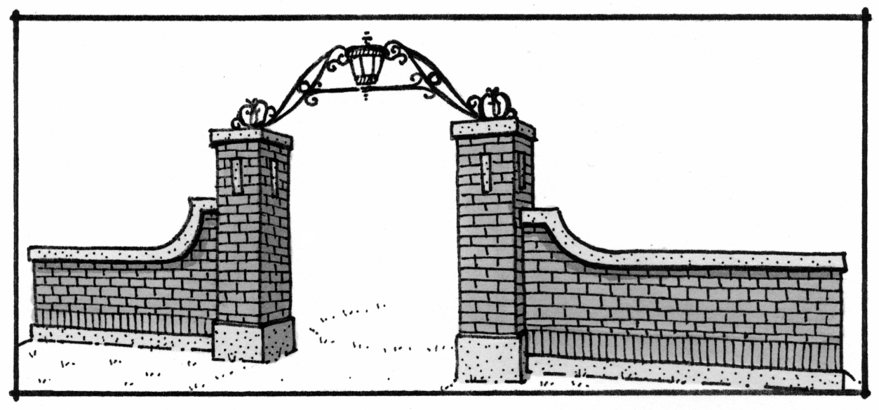
Sometimes you'll find these types of entrances, which use wrought iron to suspend a lantern.  This is an elegant treatment, but they don't age well.  It's difficult to keep something like this protected from the elements and operable.  Easier to chop off the metal and install lamps on the top of the piers. Or not at all.
6822-6828 N. Wayne, 1928


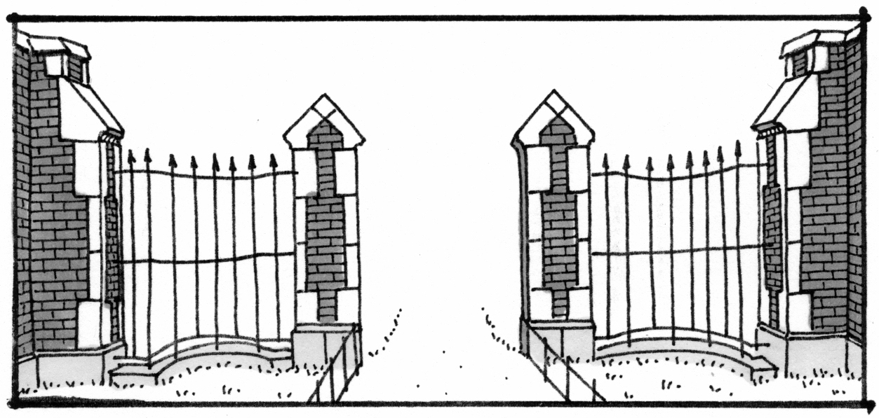
The most common materials used are brick and stone (or cast stone), so it's a bit unusual in Rogers Park to find a courtyard building with a significant amount of terracotta.  This entrance actually uses two types of terracotta, white and a dark green speckled base, which resembles granite. Nice adaptation of a gothic buttress form.
7400-7410 N. Damen, 1932

This is a good example of a different type of entrance incorporating a change in grade.  In this case the entire courtyard is elevated, probably creating a bit more basement storage.  There are also buildings which use a sunken courtyards, which can be even more effective in creating a semi-private space.


OK, that should do it for courtyard entrances, at least for a while.

Friday, August 5, 2011

U-Court Apartments in Rogers Park


"Tendencies in Apartment House Design: Part VII - Courtyard Plans,"
Frank Choteau Brown, The Architectural Record, Vol. LI, 1922, p.64.
U-Court apartments are generally what people think of as the classic courtyard building.  A single deep, semi-enclosed courtyard flanked with overlooking apartments.  Sometimes these courtyards open up to the street, and sometimes they're shaped more like a keyhole.  But in reality there's a remarkable variety in how these buildings utlize their lots and organize their space.  A previous post concerned with L-Court apartments introduced some of these principles. To the right is Frank Brown's 1922 graphic that I'm recycling from the L-Court article. But in this case it's the bottom row that's of interest.
As usual, click for a more legible version.
The above footprints are adapted from Sanborn Fire Insurance Maps.  The smaller grey shapes represent interior or exterior stairs. If you look carefully you can tell that every unit has a front stair and a rear stair.  Although these aren't necessarily accurate they're the best I can do without some serious trespassing.

1639-1649 W. Touhy, 1931
Note the variety in the front yard setbacks.  While this is sometimes due to zoning it's just as likely that a property is observing a subdivision setback,  recorded to the property prior to development.  This is definitely the case for 1617-1627 W. Fargo, which observes a 30' front yard setback.  You can see these clearly on the 80-acre maps of the area.  Front yards are also a function of lot size.  The smallest lot at 1615-1625 W. Columbia has a zero front yard setback, allowing more square footage to be crammed in. 

Just like the L-Courts described previously, these buildings have multiple front entrances serving six units, two on each floor.  Arranging them in a U shape around a central court provides cross-ventilation and light from at least two directions.  The court itself functions as a symbolic entrance and a landscaped centerpiece.  No matter how dense the neighborhood may become the central court remains a green oasis.  Generally.

I realize these are tiny.  Click for a larger version.
While the first grouping shows buildings arranged on rectilinear lots, the central courtyard type can be adapted to a variety of lot shapes.  The buildings to the right are on irregular lots shaped by some of the neighborhood's diagonal streets and rights-of-way.  The modular form of the courtyard apartment allows these lots to be utilized just as easily as one made up of right angles.  In fact, adapting a building to an irregular lot can provide a variety of apartment sizes and configurations, which may help the building appeal to a variety of renters with different budgets and spatial needs. 

The challenge for many of these buildings is to find a system of ornamentation elastic enough to accommodate and unify an irregular plan. At least a few future posts will investigate some of these ornamental schemes.

7401-7411 N. Hoyne, 1931
There's a great variety in the size of lots and the number of units in each of these buildings.  But in general the lots of my unscientific sample above range from 14,500 sq. ft. to over 19,000 sq. ft.  There are normally 25 to 40 units (sometimes more) in these buildings.  In the case of 1535-1555 W. Fargo (bottom left above) the Cook County Assessor estimated 59 units, which I put down to the atypical use of a double-loaded design on one wing of the building. And also tiny apartments.

Wednesday, July 20, 2011

1923 Zoning Code, Rogers Park, and Courtyard Apartments


Rogers Park, 1923 Zoning Ordinance
This is my colorized version of the Volume District map for Rogers Park, adopted as a part of the 1923 Zoning Code. There were five volume districts created throughout the city, but only districts 1, 2, and 3 were mapped in Rogers Park. 


I find zoning maps interesting, especially when they represent the first attempt of a city to get a handle on it's own development.  Does it reflect the neighborhood character or aspirations for the future?  Generally it's an interweaving of the two.


You can see that the greatest volume was assigned to the area adjacent to the lakefront.  This was a typical pattern for the 1923 code.   With a maximum permitted height of 195' the blue zone would have allowed 20 story buildings throughout the area.  It's hard to imagine what Rogers Park would be like if that had happened.  Even the least dense district 1 (yellow) would allow buildings around 6 stories. As the legendary Homer Hoyt once observed, if Chicago had been built-out to the extent permitted in the 1923 Zoning Ordinance it would have housed the entire population of the United States.

7062-7078 N. Wolcott, 1931
So what's really going on here?  One  answer is that the map represents the ideal distribution of land uses and densities over time. But ideal for who? 

The creation of these maps followed a survey and planning process where existing development was cataloged and future needs were anticipated.  The ordinance itself was shaped by volunteer commissioners, city planners (still a new profession), and members of the Chicago Real Estate Board.  As others have observed, city planning makes for an odd combination of entrenched financial interests and idealistic social scientists with an unshakeable belief in the power of rational land-use.  There are always disconnects between the two.  As developers know, there's some value in pointing to an official city document and assuring potential investors that they can build their 20-story apartment on the site.

This is my colorized Use District map for Rogers Park showing the locations zoned for industrial, commercial and residential development.  Rogers Park's major commercial thoroughfares were (and are) Clark, Devon, Morse, and Howard. If you're familiar with the neighborhood you'll notice several additional commercial areas.  Many of these never developed the way the zoning map envisioned, or at least not to the extent shown. 

A criticism of the 1923 code was that it didn't allot enough area as residential districts.  But by 1923 there were fewer single family homes being built in Rogers Park.  In fact, every major metropolitan area saw a surge in the construction of multi-family buildings.  But even if the entire neighborhood had been zoned to encourage the least dense development it would have still permitted the construction of 6-story apartment buildings side-by-side with single-family homes.  The 1923 code was not a tool intended to limit development, but rather to make it more predictable and consistent.


This is my attempt to geocode a list of courtyard apartments.  For the purposes of this study these are generally 3-stories in height with a raised basement built roughly between 1915 and 1930. Special thanks to BatchGeo.  Most of these buildings were built after the 1923 code, so it's interesting to see the wide distribution.  Based on the 1923 code there were no districts which would have prohibited their construction.  Although there are a few clusters, but they don't seem to directly relate to the zoning maps.  I suspect the most significant factors governing their location were economic.  But the distribution map provides a spatial sense of how these building types relate (or don't) to the formal zoning goals of the city. 


1638-1646 W. Farwell, 1929
I can't end this post without referencing Joseph Schweiterman's and Dana Caspall's book, "The Politics of Place:  A History of Zoning in Chicago."  They provide a coherent framework for understanding Chicago's zoning system, and much of the background information above was stolen from them.  Definitely worth reading.

Next week is vacation!  So the next post may be even slower than usual...

Thursday, June 30, 2011

7614-7616 N. Eastlake Terrace- Apartments of the Better Class #4

7614-7616 N. Eastlake Terrace
The assessor claims that this home was built in 1922, but here it is in "Better Class Apartments on the North Shore," which is dated 1917.  So either the asssessor is wrong (very common) or the booklet is misdated. In most cases I'm more inclined to believe the Avery Index of Architectural Periodicals, so for now I'll stick with 1917.
Anyway, this is a handsome brick and terra cotta apartment building nearly as far north as you can get before crossing over into Evanston.  The location is described as suburban, and I suppose it was in 1917 (or 1922).  Now this block of Eastlake is dense with small and large apartments.  Of course it still has spectacular proximity to the lake and to transit, as noted below:


And what is birch mahogany?  Is that birch stained to resemble dark mahogany?  Can you really call that mahogany?  And don't forget the convenient trash shoots.  These worked just fine in 3-story buildings.  Less so in anything higher than that.


This building is surprisingly intact.  It lost some ornament above the gable parapet, but it still has the tile mansard roof and the copper ornament above the entrance.  The windows are long gone, which is not unusual.  The historic image is dark, but I'm pretty sure the building has the original wood door and sidelights.


The projecting bays bring light into the main living spaces, while the building narrows to allow light from the side yards into the rooms at the rear.

The lot is trapezoidal in shape, with a 50' frontage and 150' in depth.  The bays are staggered but remain roughly parallel to Eastlake Terrace, which runs at an angle towards the northwest.  In addition, a 30' building line was recorded to the subdivision to provide a front yard for the block. Subdivision setback lines were one way in which developers could provide a measure of predictability to the areas they were trying to sell.  They weren't a very precise tool, but prior to adoption of the Chicago Zoning Code in 1923 they were better than nothing.


Even with the staggered bays the configuration of the units are very similar.  The differences in size probably permitted a range of rents.  Both units have maid's rooms at the rear, with easy access to the kitchen and pantry. Both plans allow for a small receiving hall.  And like most narrow apartments, they use a corridor to organize their circulation.  Not the fanciest apartment on the market at the time, but a solid design with a decent amount of space.


This building somehow avoided the condo craze, and is still in use as apartments.

Wednesday, June 22, 2011

111 W. Washington, Conway Building, 1913

I've always admired the Conway Building's richly molded terra cotta facade.  Sure, there were some awful things done to the lobby rotunda and the Washington entrance in the 1980s, but the exterior of the building is still impressive.  Last month I found myself on the roof of City Hall, and I had an amazing view of the ornament at the top of the building, including the band of lion and gargoyle heads.  The gargoyles are probably intended to be Green Men, but let's not split hairs. 


The building was designed by Frederick P. Dinkelberg of D.H. Burhman and Co., and reflects the Beaux Arts inclination of the firm following the World's Columbian Exposition (also found in the 1909 Plan of Chicago).  This was their last building before Daniel Burnham's death in 1912.  In many ways it resembles the more elaborate Flatiron Building in New York (1902) which was also primarily designed by Dinkelberg.  The building follows the typical skyscraper configuration of a base, shaft, and capital.  But somehow the Conway Building lost its terminating cornice... It leaves it looking somewhat unfinished. Not sure if this was a part of the 1980s renovation.

Anyway, in this drawing I wanted to show the texture of the ornament rather than the architectural characteristics of the building.  Anything more than a narrow strip, and I would have spent a couple of weeks frantically crosshatching.  Seeing it on-screen I realize that I could have pushed the lights and darks further.  Sometimes it's good to post these images just to find out if they're done.

Tuesday, June 7, 2011

Entrances to Courtyard Apartments

I'm going to try and do what I normally do with these courtyard apartments, which is take a complex element, distill some of the best examples, and try and draw some conclusions.  But first I thought it might be useful to create a simple social space map of a courtyard apartment to help illustrate how they differentiate various levels between public and private space.  (My apologies to Adrian Tomine for stealing one of his color schemes from a New Yorker cover.)

The grey tones represent the public areas, including the street, the parkway, the sidewalk, and the alley.  Everything outside of the public right-of-way is private.  But there are levels of privacy.  In practice, the front yard functions as a semi-public zone, where it's unlikely you'll be arrested if your dog wanders over to the rose bushes. 

But as the courtyard establishes itself the character of the space changes, and you may find yourself more reluctant to enter deeply without a good reason.  This is very natural, and reflects the growing social control of the space as conveyed by the landscaped features, easy visual proximity to living spaces, and increasingly obscured views of the street.  By the time you get to the end of a particularly deep courtyard you feel fairly conspicuous. 

The element that divides the semi-public space from the increasingly private is the gate, or entryway.  Sometimes this is only suggested by the shape of the building, but often there's a designed element intended emphasize and formalize this division.  The location, materials, design, and visual permeability of the gate are all messages which the architect (and later, owners) wanted to convey to those that pass by or inhabit the building.

7405-7415 N. Damen, 1927
 
This brick and stone arcade is a good example of a substantial entrance element in the Classical Revival style.  A broken pediment with central urn is supported by paired pilasters.  The round arches are spaced with circular stone elements (called tondi).  The bottom portions of the arched openings are partially filled with wrought iron.  Despite the level of detail this screen is less than one foot thick. The open arches invite views into the court, but don't necessarily encourage visitors.  The central stone entrance reflects the design used for the main entrances into the building.

1637-1642 W. Estes, 1929
 
This gate is a bit more traditional. The brick and stone piers with decorative ironwork is a time-honored way to say, "Hey, we live here!"  This is for a side-court building, which has less of a span to fill between the building and the side property line.  On the left you can see that there's a half-column.  This is where it attaches to the building. It looks a bit odd in isolation, but by cutting the column in half they were able to maintain the scale without making it seem cramped.

2014-2018 W. Estes, 1931

This is one of my favorite entrances of an L-court building.  While it presents a substantial appearance the central piers are lowered, becoming more welcoming.  I haven't seen these octagonal ornaments before, but they provide the perfect emphasis for the gate.


1919-1923 W. Estes, 1928

This is one of the more modest entrances I documented.  The low wall invites you to have a seat.  The built-in urns are intended for seasonal plantings, but could also be adapted for Halloween candy.  The limited size puts this squarely in the symbolic category.

6414-6420 N. Newgard, 1932

This is another fairly elaborate arched screen for a central court building.  While this approaches the look of a gatehouse, it's not quite there.  It's designed in the Italian Rennaissance Revival mode, just like the main building.  Again, the arches carefully frame views into the courtyard while conveying a sense of exclusivity. But the detail goes a bit far in this case, almost giving the entrance a toylike quality. 


Although these gates weren't primarily intended to function as actual security elements, many have been adapted for that purpose.  It doesn't take much to fill an arched opening with an iron fence and add an electronic security door.  Frequently there are fences installed right at the sidewalk in addition to beefing up the security of the historic entryways.  This creates almost an "airlock" feel on the street, as if the building is under seige.  The most peculiar treatment I've seen uses airlock fences as well as individual fences along the walkways leading to the first floor doors.  How those fenced areas are mowed, I have no idea.

The social space map above is really a best-case scenario.  As entrances are modified to address real or perceived security concerns the semi-public space and the sense of permeability disappears, giving a fortified look to the street.  The green spaces which are so much a part of the courtyard design give way to a less rich sensory experience, where only visual access is maintained.

I have about 5 more of these entrances to document in a future post.  But maybe time for a break from courtyard apartments...

Monday, May 30, 2011

Pratt Manor (1252-1262 W. Pratt) - Apartments of the Better Class #3

1252-1262 W. Pratt- South Elevation
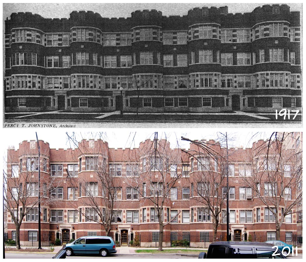
This is a big one.  Either the original photographer used a fish-eye lens, or they were able to take their photograph from a vacant lot across the street.  I had to stitch together several shots to approximate the image from 1917.  This is still a fairly attractive building, although it's lost the original windows and filled in others with glass block.

This building was designed (and owned) by our friend Percy T. Johnstone, who was also responsible for the apartment at Touhy and Paulina as described in a previous post.

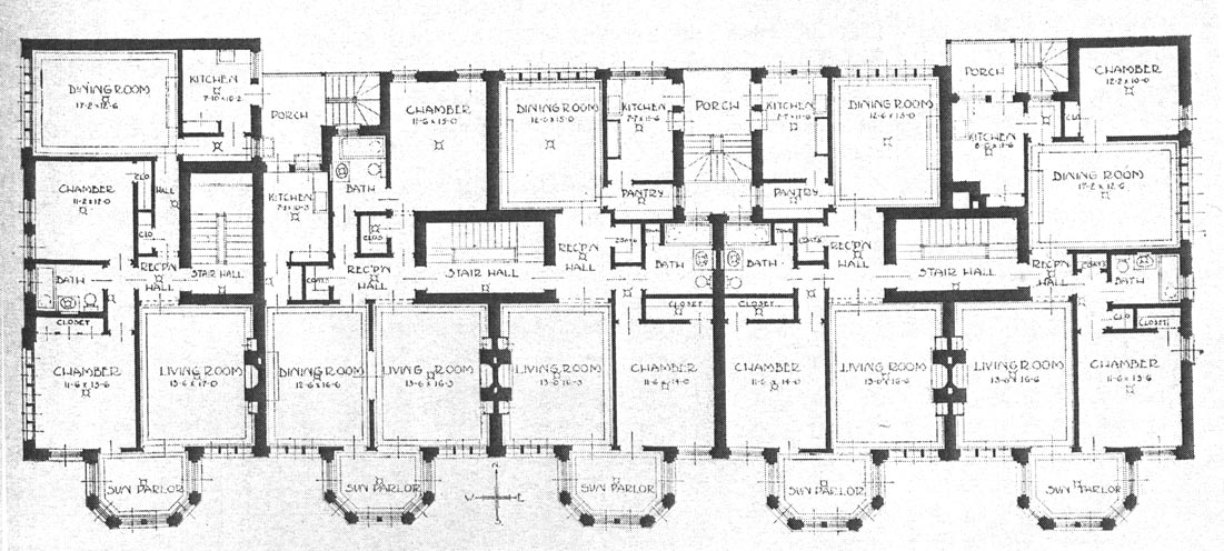
Units on the end had two bedrooms, while those in the middle had one. Bays front on Pratt.

The plan above illustrates the difficulty of squeezing numerous units (15 of them) on to a small lot.  Well, it's not really that small.  It's 57' along Lakewood and 134' along Pratt but the architect wants to squeeze out every inch.   The units on the end receive the best light.  The ones sandwiched in between have to make do with what they can capture with their projecting bays and the windows on the alley.  There are skylights to help illuminate the stairway and halls, but no light courts were incorporated into this building. At least they all have south exposures.

All living spaces were (and are) required by code to have a minimum of natural light and ventilation.  But when light only comes from one direction it has the effect of making objects seem flatter.  If you want a comfortable living space try to find rooms that provide light from at least two directions.  This is one of those things that registers on people subconsciously, but they may have a tough time articulating why one space feels so much better than another.


Vacuum cleaning system included!  And I like that recessed tubs are also a selling point.  Ivory enamel and mahogany still sounds kind of appealing.


I think the architect, Percy T. Johnstone, must have been a interesting guy in his day.  A quick search through the Chicago Tribune online archives shows that he was an owner and developer of buildings as often as he designed them.  His most ambitious project seems to have been a large hospital which was to have been built in West Ridge at about 6500 N. Ridge.  It never happened.  He had some other spectacular misfires in Uptown, where he planned a large hotel which also never came to fruition.

But below are interesting "before and after" images for an auto sales building he designed on Broadway south of Devon.  Special thanks to my wife for calling this to my attention.  At least one of us knows how to use Google correctly.


6335 N. Broadway, 1922.  "Architectural Record," Dec. 20, 1922.


6335 N. Broadway, 2011(?) Google Maps.
 The above image is from an ad for Northwestern Terra Cotta Co.  Sadly, it hasn't retained any of its amazing storefronts and entry.  But you can still see the griffins on the freize panel.

If you want to know more about auto showrooms in Chicago (you do, right?) you should read the designation report for the Riviera Motor Sales Building, which is located just a few blocks south.  And of course you should read the report for the Motor Row District on the near south side.  That one isn't posted, but I can email it if anyone requests it.

Anyway, if someone tracks down Percy Johnstone's obituary please drop me a line.

Saturday, May 21, 2011

Rear Parapets in Rogers Park #2

As warned, I have a number of these rear parapets to include in my courtyard apartment series.  For those of you who missed the triumphant first entry here's a link to it.
7345-7355 N. Damen, 1940

I'm not sure I trust the construction date for this property.  Not much building was going on in 1940, and the style seems wrong.  But there was quite a bit of construction in the northwest corner of Rogers Park in the 1930s, so maybe this is possible.   If I ever get over to the ancient building permit files (conveniently located on microfilm at the Harold Washington Library) I'll check.  The design itself is fairly minimal, with some basic castellations trimmed in stone.


7424-7436 N. Damen, 1928
This is another version of the Tudor Revival with twin-gables and half-timbering.  In this case the timbers are painted white and the bound areas are decorative brick patterns rather than the more common stucco panels.  Simple brackets  support the eaves.  These are the shallowest decorative gables I've ever seen.  And spanning the space between the peaks with brick really undercuts the illusion of a pitched roof.

7400-7410 N. Damen, 1932


Here's a Classical Revival design combined  with an Italian tile mansard roof.  I especially like the square hood molding around the large window, complete with little projecting ears.

So many of these buildings make use of decorative clay tile.  When it comes time for a major repair I always expect it to disappear.  We need a Chicago non-profit called "Save the Mansards." Any volunteers?

1409-1415 W. Farwell, 1927

The architect of this one went a bit crazy with the stone quoins.  If a little looks good a lot should look great, right?  Nice decorative stone panel that suggests iron work (scrolls and curves connected with straps).


1638-1645 W. Farwell, 1929

This is one of the simpler rear parapets, but the use of multi-colored clay tiles really gives it distinction.  The central windows probably held French doors at some point, but now only aluminum double-hung.  There's a building almost identical to this a few blocks north on Greenleaf. Same architect, same date of construction.


OK, I've got about 8 more of these, but maybe time to give the rear parapets a rest.

Friday, May 13, 2011

7210-7212 N. Paulina- Apartments of the Better Class #2

Northwest corner of Touhy and Paulina
This buiding is at the northwest corner of Touhy and Paulina in Rogers Park.  It's one of my favorites from the Directory to Apartments of the Better Class, as referenced in my previous post.  I remember admiring the arched brick and stone entrance on Touhy, and wondering why it was called "The Kenilworth," which I thought was pretentious.  It's still kind of pretentious, but it's because Kenilworth Avenue was the original name for Touhy.

I like that this building has retained it's original windows and the Italian tile roofs. 

This is also one of the few entries which uses a rendering of the building rather than a photograph.  It was fairly common to have a perspective rendering made for a speculative building in order to attract investors and tenants.  The real estate section of the Chicago Tribune would publish these, even for small buildings. The drawing above is pretty much dead-on, a testament to the skills of the draftsman.  I wonder if the original drawing is hanging on a wall somewhere.  Or more likely, long gone.

Click for larger version.
I'm impressed at how efficiently the architect has arranged this building to maximize the number of units on the lot.  Narrow light courts bring in air and provide alley access to the rear stairs.  Some of the larger units have space for maid's rooms, but most do not.  The design generally depends on the front bays to bring in light. 

This building features one of my favorite awkward realities of many Chicago apartments-- a wall of windows on the narrow interior court perfectly aligned with a neighbor's wall of windows.  In this case it occurs between the two dining rooms of the middle units fronting on Touhy.  I hope whoever lives there are on good terms.

It advertised close proximity to the Birchwood Elevated Station. I think this is now the Jarvis Station, unless Birchwood was another stop that was later removed.

Click for larger version.
Apartments offered the most modern amenities.  Changes and improvements in technology were rapidly incorporated into apartment construction.  This was a good way to attract high-class tenants who might otherwise look for a single-family home.  Gas heat, electricity, and refrigeration were all used the same way solid marble counter tops and sub-zero freezers are used today.

Showing overall page layout.
As usual, click for larger version.

I don't know much about the architect, Percy Johnstone, but I can at least share a couple more of his buildings identified in the Chicago Historic Resources Survey.  Photos are taken from the Cook County Assessor:
2200 W. Granville

1527 W. Touhy