Thursday, June 21, 2012

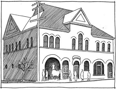
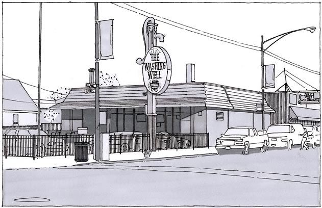
Clark and Estes, northwest corner 1900 and 2008

 
Combined Police Headquarters and Fire Department, c. 1900
In sad recognition of the recent closing of The Washing Well I'm reposting this from December of 2008.

The drawing to the right is adapted from a collection of historic Rogers Park photos published by the Rogers Park/West Ridge Historical Society.  I've done a number of these "then and now" pairings, but this is one of my favorites.

The police and fire station at Clark and Estes also operated as the Rogers Park Town Hall prior to annexation to Chicago in 1893.

The Washing Well Laundromat, 2008


Monday, June 18, 2012

North side of Lunt, between Clark and Ravenswood

Another reprint from the 2003 booklet:
For this project the streetscape was the basic unit of information, but that wasn't really enough to understand how the buildings relate to the space around them.  For that I needed some panoramic images, but not so large that the street would be distorted beyond recognition.
This image shows the relationship of the building on the far left to the metra tracks and overpass just to the west.
And this shows the alley beween the car repair shop and the second building from the left, along with a glimpse of the taller building to the right, which has frontage on both Lunt and Clark.  Nowadays I might have chosen to add streets names for clarity.
Above is some of the information taken from the ancient permit files and the criss-cross directories I found at the Chicago Historical Society.  Sometimes I was lucky enough to find a business description on the Sanborn Fire Insurance maps.

And I couldn't leave out this auto repair shop.  Here's what I wrote about it at the time:

This repair shop and filling station was built adjoining a large horse stable to the north.  For a while you could fill up your gas tank or have your horse groomed at the same place.  The stables were later converted to light industry (screen manufacturing) and eventually demolished.  The shape of the stables explains the oddly shaped parking lot behind this building.


Later I read John Jakle and Keith Sculle's great book, The Gas Station in America, which has a chapter analyzing the transition from horse-based service buildings to car-based. I wish I had read that first, but I'll come back to it some day.

The building on the far right (the Doland Block) was saved for a page of its own.

Thursday, June 14, 2012

1254-1256 W. Albion (from 2005)

As promised, here's my entry for an apartment on Albion and Lakewood, reprinted and reformatted from Doors! Of Rogers Park! .  In this booklet I tried to start with a small detail and expand the scope out from the building into the neighborhood.

1254-1256 Albion

Date: 1925
Architect: R. J. Johnson
Owner: G. E. Halberg
Permit: A100426
File: 96890
Ledger: North 33 Page 48
Cost: $60,000
Size: 27'x116'x40'

I love the shape of this building. Faced with a triangular lot, the architect created a triangular building with a key-hole courtyard to give sufficient natural light and ventilation.

The details of these large apartments are generally not surprising, but the layouts always fascinate to me. There’s a lot to be said for not depending on air conditioning and artificial lighting. Urban architects created some great spaces to comfortably accommodate the tenants in a large multi-unit building.

Of course there are failures, too. Anyone who’s been in enough apartments must remember looking across a dim light well into a neighbor’s living room, bedroom, or bathroom. Or maybe just a blank brick wall where everyone dumps their cat-litter.

Usually the architects who designed these buildings are little known, so it’s a  pleasure to track down their names in the permit files. I feel like I’ve done some small good just uncovering that bit of history. And who knows? It might lead to the R.J. Johnson Apartment Renaissance.


Wednesday, June 13, 2012

Doors! Of Rogers Park! - 2005

The next Ultra Local Geography booklet published was in 2005.  It focused on a somewhat random assortment of apartment buildings doors in the neighborhood.  But it had a pleasant introduction, which I'm inserting below with a few minor edits:

I’m sure you’ve seen these. Maybe in an airport gift shop, or at a poster shop… maybe at a museum? They’re fairly predictable—Doors of Dublin, Doors of Philadelphia, Doors of Berlin. And of course, it’s exactly what it claims to be- doors. Sometimes there are dozens of them, usually arranged in a grid pattern. They’re old, or architecturally distinguished, or representative of a particular regional style. And I have to admit, they’re fascinating. Sometimes the images are so appealing that they’re shrunk to the size of a postcard and the details approach illegibility.

But they seem to promise more than they deliver. I wonder why they look the way they do, how old they are, what their neighborhood is like… But they’re still fascinating. Maybe it’s the sheer creativity of applying unique solutions to the same problem again and again.

But there was another element about these posters that I began to resent. A door can be a work of art, but it’s also an example of the functional beauty that surrounds us every day. What would it be like to treat these elements as relevant aspects of our everyday life? Basically, this booklet is an alternative to those posters.

[I'll be posting some of the booklet pages in the future.]


Monday, June 11, 2012

West side of Clark, between Lunt and Greenleaf, 2003


My first Ultra Local Geography publication was a xeroxed 'zine that I sold in Rogers Park for $3.  It was a history of the block bounded by Clark, Lunt, Ravenswood and Greenleaf.  I still think it was a good idea, but the drawings and organization could have been improved.  At the time I remember thinking how great it was.
I doubt anyone has seen this image for a while.  And it doesn't exactly lend itself to the vertical format of a blog.  And the last time I printed up new copies of the booklet was in 2006. 

It's interesting to see how much the block has changed since 2003.  Businesses have come and gone, facades have been repair or altered, signs and awnings have gone up (and down).  A severe fire resulted in new storefronts and brickwork for a portion of the strip.  Maybe I need to do an update on this block every 10 years or so...

Friday, May 18, 2012

6225 N. Fairfield, 1923

Here's an unusual alley building spotted by my wife on one of our innumerable drives down Granville.  She thought it might be a coach house, something I've never seen in West Ridge.  It's actually a rear lot residence and garage. Its front yard on Fairfield looks a bit like an overgrown forest.  And it's not a remnant of early development in the area either.  It was built in 1923, about the same time that the rest of the block was filling up with apartment buildings. 

There have been numerous additions over the years, so it's become an odd amalgam.  Most of it is brick, but there are several frame dormers and a tile additon on the front. There's even a little turret that's not visible in this image.

According to the permit record there was some type of carnival (with four unspecified rides) permitted on the front portion of this lot in the Fall of 1952 and 1953.  The lot to the north would have been vacant at that point, so that makes more sense. 

I remember seeing family photographs of my aunts and uncles riding ponies in their neighborhood in the 1950s . Perhaps these were the areas where local festivals were held- vacant (or underutilized)  lots on otherwise developed blocks.

Wednesday, May 9, 2012

Farwell and Oakley, 1928

Chicago owes a lot to small-scale neighborhood developers.  This role is generally unsung, despite being responsible for the overwhelming percentage of buildings throughout the city.

Adapted from the Sanborn Fire Insurance Map
To the right is a site block plan of Kennett's Subdivision, recorded in January of 1928.  The depth is about 125' (typical for Chicago) and the frontages on Farwell range from 50' to 58'.  The corner lot has  a larger frontage of 77'.  Corner lots are typically larger in order to offset the loss of a private backyard and the exposure to traffic from two directions.  In urban areas the corner lots are often used to develop a greater number of less expensive units.  This development consisted of five 6-flat buildings and one 18-flat building, although some of the 6-flats have since been subdivided. 

Emma Kennett was the head of Kennett Construction Company and an experienced developer by 1928.  The Chicago Daily Tribune wrote a number of articles about her, in part because of the novelty of a woman succeeding in the construction industry. By 1928 she had developed more than 80 buildings in the Jarvis-Ridge-Howard area while raising three young children.  Mrs. Kennett worked in the office of a builder prior to marrying James Kennett, a Chicago building contractor.  When the marriage ended Mrs. Kennett re-entered the building profession to support her young family.  And apparently also her husband, who was receiving checks from her as late as 1935, when he disappeared in California under assumptions of foul play. 

By the late 1920s she had begun developing clusters of buildings.  This subdivision is in West Ridge, but most of her work is found in Rogers Park. 

North side of Farwell, west of Oakley
In one article she notes her horror of long barrack-like apartments, which she attempts to avoid using various eclectic architectural styles popular at the time. Above you can see examples of Tudor Revival, Italian Rennaissance Revial, and Spanish Mission Revival.   She claimed to have designed these buildings herself, although she worked with architects to make the plans technically correct. I don't put this beyond her at all.  In fact, she seems to have relished the details of construction, including the interior decor, lobby ornamentation and landscaping.  Officially Arthur Bucket is listed as the architect of record for the corner building and J.T. Fortin for the 6-flats.

One thing which baffles me is her assertion that the buidings she creates resemble private homes.  And the writer totally agrees.  Maybe it's the distance of 80 years, but in no way do these look like individual homes.  They look like apartment buildings.  Even 1920s single family homes of comparable square footage (I'm thinking of the North Shore) wouldn't resemble these.  Still, the attempt to create unique buildings that avoid regimentation is certainly accomplished.

Entrances along Farwell (in order)
You have to admire the level of detail that went into these buildings.  But one of the reasons I started with this group is not because of their quality, but because their constuction and appearance is so typical for this area and this time period.

As I investigate more of these clusters I want to examine Emma Kennett's team, which included investors, architects, contractors, and even an illustrator who created perspective renderings for publication.  My guess is that her body of work will be just as consistent as that of an architect working in the same period on similar types of buildings.
____________________________

I recently received some research performed by a hugely generous reader who investigated some of the open questions in this post.  A special thanks to Marsha Holland of Edgewater, who provided the following accounts, distilled from US Census records and other primary sources accessed through Ancestry.com.  And she even found some useful Tribune articles I had overlooked.  (inserted 10/25/12)
____________________________

Herbert Richter more or less disappears after his World War II draft registration in 1942.  He seems to have drifted after his work with Emma Kennett.  At the time of the 1940 census he lived in Baltimore, Maryland, and worked as a carnival waiter.  His home in 1940 apparently was a large transient structure, perhaps the train cars that carried the circus equipment (let me know if you want me to send a pdf of the actual census pages).  He is not in the Social Security database, either because he died young or never paid in. 

Emma C. Kennett was truly a remarkable woman.  I was able to find out a good bit about her husband James’ family background but her own family of origin remains a mystery.  Her maiden name was Anderson, her parents were born in Norway, she apparently grew up in or near Chicago, and a Tribune article that I do not reference in the attached file indicates she had a sister named Mable living in Los Angeles at the time of her husband’s murder in 1935.  Someone needs to write a short biography of her for the Rogers Park and Edgewater Historical Societies, since she can be claimed by both communities as a resident.  She definitely left her mark on the city.  [Agreed! ed.]

Chicago Tribune, 23 August 1935, page 10

Article about the murder of James C, Kennett by a confessed serial killer. Kennett, who was “in the mountains for his health,” met the 21 year old man in Roseville, about 15 miles from the mine shaft in the Serra Nevada mountains where Kennett’s body was found. The killer, an itinerant prospector, said the two had met and decided to camp together, and that the murder occurred as a result of a quarrel over supplies. He claimed to have murdered 24 other people. [He was convicted and hung in May, 1936.]

Chicago Tribune, 30 August 1935, page 18
Rites Here Tomorrow for J.C. Kennett, Slain in the West
The ashes of J.C. Kennett, Sr., retired Chicago contractor, who was slain in a mining camp near Auburn, California, about two months ago, are being returned to Chicago, it was learned yesterday. Services will be held at 2:30 p.m. in the Mount Olive chapel, Irving Park Boulevard and Narragansett Street. Kennett is survived by his wife Emma of 6341 Sheridan Road, from whom he had been divorced; by two sons, James Jr., 21 years old, and Maynard, 19 years old, and a daughter Joyce, 15 years old.

Wells Street Bridge

Wells Street Bridge, 1922
Back in 2009 I did a series of drawings of the bridge-houses in the Loop.  This was one of my favorites, so I thought I would repost. It was more an exercise in representation, so there's limited historic information.

Built: 1922
Thomas Pihlfeldt, engineer
Clarence Rowe, engineer

This is a view of the Wells Street Bridge looking northwest across the Chicago River. That round thing in the water is called a dolphin, and protects the bridge house from meandering barges. I recently spent 20 minutes in the rain waiting for this bridge to lower as various yachts motored past. In the fall people bring their sailboats in from Lake Michigan to the dry docks on the south branch. It's a good time to hang around Wacker Drive and yell abuse down at them.

Wednesday, April 25, 2012

Clark, Greeneaf, Ravenswood and Estes, Part 3

A few months ago I did a series of posts about "backstage spaces," including some views through alleys focusing on rear lot structures.  But if I wanted to crack open a city block to see what makes it tick I couldn't have done a better job than removing the Adelphi Theater at Estes and Clark, which had been on the site since 1912.

I was at home (a block away) when the Adelphi came down in February of 2006.  I remember walking over to watch.  They always demolish these buildings from the back.  There are probably structural and safety reasons for this, but it also means that once the demolition is noticeable it's almost complete.

Early modernists claimed to prefer the backs of buildings rather than the ornamental front facades, since that was supposedly where the true structure was expressed.  What you see here would likely please any number of architectural theorists from the 50s and 60s.
It is fascinating to see how these buildings developed over the years.  I've tried to make them visually intelligible, but it's a tricky job. 

If a building is only visible from a street the architect can focus the design (and dollars) on the front facade. Once something is demolished it reveals the areas intended to remain hidden.  If it happens enough it changes the entire feel of a block, making it look slapped together, run-down and ready for the bulldozer.  It may be all of those things, but usually what you're seeing is just the architectural vocabulary for functional spaces. 

In the foreground is the foundation of a new condo building which was intended to replace the Adelphi Theater.  The development stalled in the economic downturn and has remained vacant ever since.

Thursday, April 19, 2012

Combining Styles, 2449 W. Devon and 1028 W. Chicago

Sometimes buildings change according to established patterns, like a sun-porch added to a farmhouse or a side wing on a mansion.  But less work has been done on analyzing how historic commercial buildings change over time.  In general the preservation community is focused on finding the best unaltered examples of building types.  But there are many patterns which are just as valid in understanding the history of a property, even when they're not particularly picturesque.  Take these 1-story additions to older 2-story commercial buildings.

The older portions of these buildings observe two of the eclectic styles popular in the 1920s, Classical Revial and Italian Renaissance Revival.  When the owners saw an opportunity for expansion they switched from the earlier style to new styles popular at the time.  To the right they've chosen Art Deco, using glazed terra cotta blocks with fluted bands and geometric ornament.  Below they've gone with stacked brick and permastone.  There's absolutely no concern with matching the ornamentation of the older portion, or even aligning the new storefronts with the existing geometry.  Why is that? A few thoughts:

1. The whole idea was to update the building, make it seem competitive and modern. Maintaining the original ornamentation wouldn't signal the desired excitement.

2. In the 20 years between initial construction and enlargement the entire building industry reoriented around new styles and new materials.  The more traditional architectural treatments would have required a custom approach and therefore would have been much more expensive.

3. Advertising has changed, and the creation of large sign bands takes precedent over any "nostalgic" treatment.  By extending the new storefront into and over the old portion the amount of advertising could be doubled to accomodate larger, more aggressive signage.

4. Many businesses in traditional commercial areas (Main Street) found that the space on the upper floors wasn't being utilized as intended.  Living units above commercial spaces are generally less desirable than those on quiet streets.  And despite the space added, it's still more expensive to build a two-story building.  Expanding only the commercial space on the first floor is a reasonable solution.

Interestingly, the newer portions of the buildings were both from 1940s (as far as I can tell).  Perhaps this was the last gasp of Art Deco and the first breath of 1950s Modern.

I'm on the lookout for more of these buildings which have expanded in interesting ways.  I imagine putting together a booklet titled, "Messed Up Storefronts," although that might sound a bit prejudicial.  So please email me if you know of any in your neighborhood.

Monday, April 16, 2012

Huge Crayfish on Clark and Wallen, 2006

I'm sorry to say that the giant crayfish is gone.  These images were originally posted in 2006.  The life of a taqueria on Clark is either wildly successful or very short.  Mostly very short.  This repost is my memorial...

Wouldn't it be interesting if all restaurants were required to incorporate their most popular dish into their signage? That would be useful for all of the Rogers Park tourists.  There are Rogers Park tourists, right?


This huge crayfish started out a cheerful red, but the sun weathered it to a light orange.

Friday, April 13, 2012

Hamburger King, 3435 N. Sheffield

Today's post is courtesy of Harvey Pekar and artist Gary Dumm, from Pekar's "American Splendor #3," published in 1978.  I never expected to find Hamburger King alive and well at Sheffield and Newport, but there it remains.  The next time you're in Wrigleyville stop by, have a hamburger, and remember Harvey.  He died in 2010.

Also, I have no rights to this work, so if anyone asks me to take it down I will. 

Friday, April 6, 2012

Clark, Greenleaf, Ravenswood and Estes- Part 2

Anybody who studies American cities knows the value of the Sanborn Fire Insurance Maps.  These were created by the Sanborn Map Company to help insurance adjusters evaluate risk.  Copies of all maps were deposited with the Library of Congress, and were later microfilmed for distribution to local libraries.  An agreement with ProQuest put scanned versions of the microfilmed maps (660,000 of them) online for subscription access.

The Chicago Public Library makes these maps available, so at least access is broadening.  Many of the denser areas in Rogers Park were included in several editions.  When these are compiled it provide a portrait of development through time.  These maps are crammed with information, and the problem is often choosing which type of information is most useful to highlight. 

In this case the maps are focused on heights, with the light grey, dark grey and black showing 1, 2, and 3 stories respectively. It's also possible to focus on type of construction (frame, masonry veneer, steel reinforced concrete) or type of use.  Cross reference this with extensive title research, census records, and phone directories and you can build up a fairly precise history of a block.  In theory that block would reflect the larger trends of the neighborhood.  But I still have to manage a job, a family and a life, so the next step may just be a somewhat closer look at each of these dates.

Bird's Eye Aerial from Bing. Probably 2008.


Wednesday, April 4, 2012

7600-7602 N. Sheridan - Apartments of the Better Class

OK, last one!  It's taken me nearly a year to post these seven Rogers Park apartment buildings featured in Partridge and Bradley's 1917 catalog, "Directory to Apartments of the Better Class on the North Side of Chicago".  Why are they better class?  I'm not really sure. But here's my imagined list of titles they considered yet ultimately rejected:

Apartments for Awesome People
Classy Classy!  Apartments!
Not a Flophouse

As Partridge and Bradley explain in their introduction, they focused on people who could choose to live in a private house but prefered the luxury and economy of apartment buildings.  And many of these apartments really were luxurious, with individual laundries, wine cellars, private garages, elevators, electric appliances, etc.  The largest apartment represented had 15 rooms.  Rogers Park contains the more modest examples.

The view shown above is at the Northwest corner of the Sheridan and Howard.    Except for the loss of the tall casement windows and roof tile on the front gables it looks pretty much as it did.  It nearly fills the entire lot, with no room reserved for garages or green space.  Here's the desciption:

So if it was trying to appeal to commuters who used public transit maybe it didn't need garage space.  And with only steps to Lake Michigan who needs a yard, right?  Like many of these apartments it advertises an interior scheme of mahogany and white enamel.  The woodwork was probably birch, which was popular for its ability to take stains and finishes.  And it was cheap.  Saying that it had light on all four sides seems to be a bit optomistic, since the photo shows there was already a close neighbor on the North.  As a corner lot it certainly has more light, but that also comes with more noise.


Click for larger version.

So it looks like there are three apartments per floor, with the smaller apartment located at the rear.  The front units have a maid's room.  All share a rear stair system, which may have also functioned as a light court. 

The subdivision map shows that there was a 30 foot building line along Sheridan, so perhaps that explains the angles of the front porches.  The units on Sheridan are classic Chicago apartments, with rooms arranged in a linear, cellular fashion.

I imagine the sunrooms were popular in the summertime, when the casement windows could be opened on all sides to catch the breezes from Lake Michigan. 


Wednesday, March 28, 2012

Clark, Greenleaf, Ravenswood and Estes, Part 1

The biggest property disaster that I know of in Rogers Park was a fire that burned down nearly the entire block bounded by Clark, Greenleaf, Ravenswood and Estes.   It was documented in the Chicago Tribune with a map of the burned area and a line drawing showing the destruction.  I recreated the map in order to add labels, but I can't improve on the drawing, which somehow came through microfilming (and then scanning) with a good amount of its detail intact.  Welcome to Rogers Park, 1894.

Looking Northeast through the burned area. From the August 9th, 1894 Chicago Tribune.

The article mentions that 14 buildings were lost, including stores, factories and dwellings.   It even provided a table itemizing the losses.  I've done my best go through the description and map out where I believe everything was located, but I'm only about 70% sure of my accuracy.

But so what? There was a big fire in Rogers Park over a hundred years ago and a bunch of people lost their homes and businesses.  How does that impact the neighborhood today? To investigate this maybe we need to go back another Chicago fire that's become a defining element in the conception of the modern Chicago.

After the fire of 1871 Chicago didn't rise from the ashes with dozens of skyscrapers stretching upward. The first steel frame skyscraper wasn't even constructed until 1884.  Instead Chicago rebuilt itself much as it had been, except that the city government scrambled to adopt new building codes and regulations to minimize the chances of another catastrophic fire.

It took years to adopt the regulations for new fire-resistant and fireproof construction and property owners and builders screamed the entire way.  (I definitely recommend Margaret Garb's "City of American Dreams" which describes this era vividly.)  One outcome of this assertion of governmental responsibility was an overall strengthening of the administrative policies of Chicago related to building.  This came to influence the look of the city far more than any fire.  Height limits, minimum construction standards, setbacks,  exiting requirements, etc. all became a part of the modern Chicago.

Rogers Park was annexed to Chicago a year before the fire, in 1893.  This meant that any new development on the damaged block had to conform to the new construction standards.  So this disaster provides me with something useful-- a clean slate.  Periodically I'm going to be taking a closer look at how this block developed post-fire, and what it might reveal about Rogers Park in particular and about Chicago in general.


Sunday, March 25, 2012

2200 block of Estes, 1916

To the right is a very nicely maintained Craftsman-style home on Estes, between Ridge and Western.  I'm not giving an exact address because this is a commissioned home portrait and I don't want to freak out the owners. Although with a little investigation you could figure it out.

I don't usually do commissions of any sort, but now and then I'll donate a drawing for a good cause. In this case there was silent auction to benefit my son's new school, Stone Academy.  Stone does an amazing job supplementing its curriculum in technology and the fine arts, and much of that is through parent-led fundraising.  So this is my small contribution to that effort.  The winner of the bid got to choose whatever they wanted to include in the drawing.

It's been a while since I've focused on a single building.  It makes me think about technical issues rather than historical ones.  For instance, what's the best way to match the scale of the drawing to the level of detail needed? What's the correct balance of black and white?  What's the proper relationship between realistic and impressionistic detail? What's the best way to focus attention on the house while still suggesting street context? All of these are important to the overall effect, and I haven't even touched on the distribution pattern of Craftmen-style homes throughout the West Ridge neighborhood.  Maybe next time.

Tuesday, March 20, 2012

Sheridan and Albion, 1937

OK, here's the last of my images adapted from the IDOT photo archive of Chicago intersections.  This filling station at the Northeast corner of Sheridan and Albion was a particularly solid design, and I'm struck  by how similar it is to modern gas stations.  There are drive-through pumps accessible on either side for motorists who just need a fill-up,  and garage bays for more in-depth servicing.
This is one of those images that benefits from the site plan (courtesy of the Sanborn Fire Insurance Map of 1937).  The sales area and the service bays sort of pinwheel against each other, with the underground gas tanks at the rear.  I imagine the space behind was for storing cars.

If you look in the drawing you can see the outline of the adjacent house to the North, along with two huge billboards angled towards the street.  These were located on the vacant lot between the house and the filling station.  Compared to the 1930s we get off easy when it comes to signage.  Anyone with plot of land could apparently erect an enormous sign if they could find someone willing to pay for it.  Now you can't put up a sign larger than 100 sq.ft. without an order from City Council.  But I'm not a huge fan of billboards, so I'm not complaining.

It makes sense to place filling stations on the corner, where it can have access to two streets.  But why did the station itself have to be located in the center of the lot?  If I could go back in time and make a few suggestions it would be to locate gas stations on the corner of the lot and have the pumps and service areas in the back.  This would be an especially good treatment in dense urban areas, where the service station disrupts the streetscape.  This gas station was on the corner of a residential block and at least tried to retain a little grassy area near the sidewalk. 

So this might be the last gas station for a bit, although I found another good one on Clark and a tiny one on Sheridan.  I'm trying to limit thematic postings to three.  For now.  Until I return to Sheridan Road please enjoy this great pictorial  that makes use of the same IDOT photos I've been admiring.

Thursday, March 15, 2012

Monopoly Houses in Evanston, #2

A few months back I posted about some mid-century Evanston homes on Crawford designed to evoke the traditional housing form (a box with a gable roof) while giving a nod to popular mid-century design.  So in keeping with that investigation here's another grouping of minimal traditional homes on Main and Dewey.


From the 1950 Sanborn Map
My first thought was that these homes represented an early planned development, which would have allowed them to be arranged around a single parcel of land.  But in fact they're all located on individual lots.  The central houses have been pushed back to provide large front yards, while the houses at the ends are rotated and moved forward to create a sort of communal courtyard. One front fence would pretty much spoil the effect, but perhaps there are agreements in place to avoid this. There are two distinct groupings, but for clarity I only drew the one on the east.

The Cook County Assessor estimates the construction date as 1952 for all of these homes, but I found their footprints in the 1950 Sanborn Map of Evanston.  No insult to the assessor, but I'm going to go with the Sanborn Map.  Upon construction all of these homes were nearly identitical, but they've been altered and enlarged differently over time.  Still, even the largest is only around 1,100 sq.ft. 

Friday, March 9, 2012

The Gage House, 1251 W. Farwell

Last Spring I started to document various buildings in Rogers Park that had been included in historic journals, brochures, and other publications. Every time I think I've found them all I come across a digitized source that proves me wrong.  That's the case with the Gage House, at the southeast corner of Farwell and Lakewood.  It was built in 1903 and published in the 1912 edition (Vol. 2) of the Cyclopedia of Architecture, Carpentry and Building
No address was given in the encyclopedia, but I've walked by this building often enough to recognize it.  It looks mostly unchanged, although there are some window alterations and the side porch was enclosed at some point.  It still has the original stucco at the first floor and wood siding above.  And it hasn't lost the distinctive pent roof that divides the first and second floors.

Every now and then I run into a building with a pedigree.  This house was designed by John B. Fischer, chief draftsman for the Chicago offices of Shepley, Rutan and Coolidge, perhaps best known here for their 1897 Chicago Public Library (now the Chicago Cultural Center).  Fischer is credited with designing the Harper Memorial Library as well as many gothic buildings on the campus of the University of Chicago.  The Ryerson Burnham Library at the Chicago Art Institute contains his papers.  After 1910 he was affiliated with the firm Postle and Fischer.  Below are some of John Fischer's designs identified in the Chicago Historic Resources Survey.  I'm especially impressed by the design to the far right, which reminds me of a previous post.

Photos from the Cook County Assessor
But getting back to the 3-bedroom house on Farwell,  it's a very compact design and reminds me of the affordable house plans popular in the 1920s.  The two big-ticket items for modern houses, kitchen and bathroom, were miniscule.  And there's only the one bathroom for both floors.  Still, the use of bays to bring in additional light and the living-room chimney that doubles as the master bedroom chimney are nice touches.

Both sides of the living room
The enclopedia provides something else uncommon when looking at modest homes of this vintage-- interior photos. 

Adapted from Sanborn Maps
I think of these interiors as "Craftman Light" making use of decorative timbers and contrasting colors and textures.  The living room almost has a rustic feel, which was probably appropriate in Rogers Park in 1903.  I especially like the change in level between the dining room and the living room.  It makes the space feel a bit more private.  And the diamond pane bay windows are essential to establishing the protected character of the space.  The photos have reproduced poorly, but it still more information than I would have expected outside of an architectural journal.

I put together a simplified map chronology to show how the character of the block changed over time, the home eventually being hedged-in by larger multi-family buildings.  While many streets of single family homes survived in Rogers Park (especially west of Clark), what you see here is more typical.  By 1964 this home became yet another remnant of an earlier era in the neighborhood. 

Monday, March 5, 2012

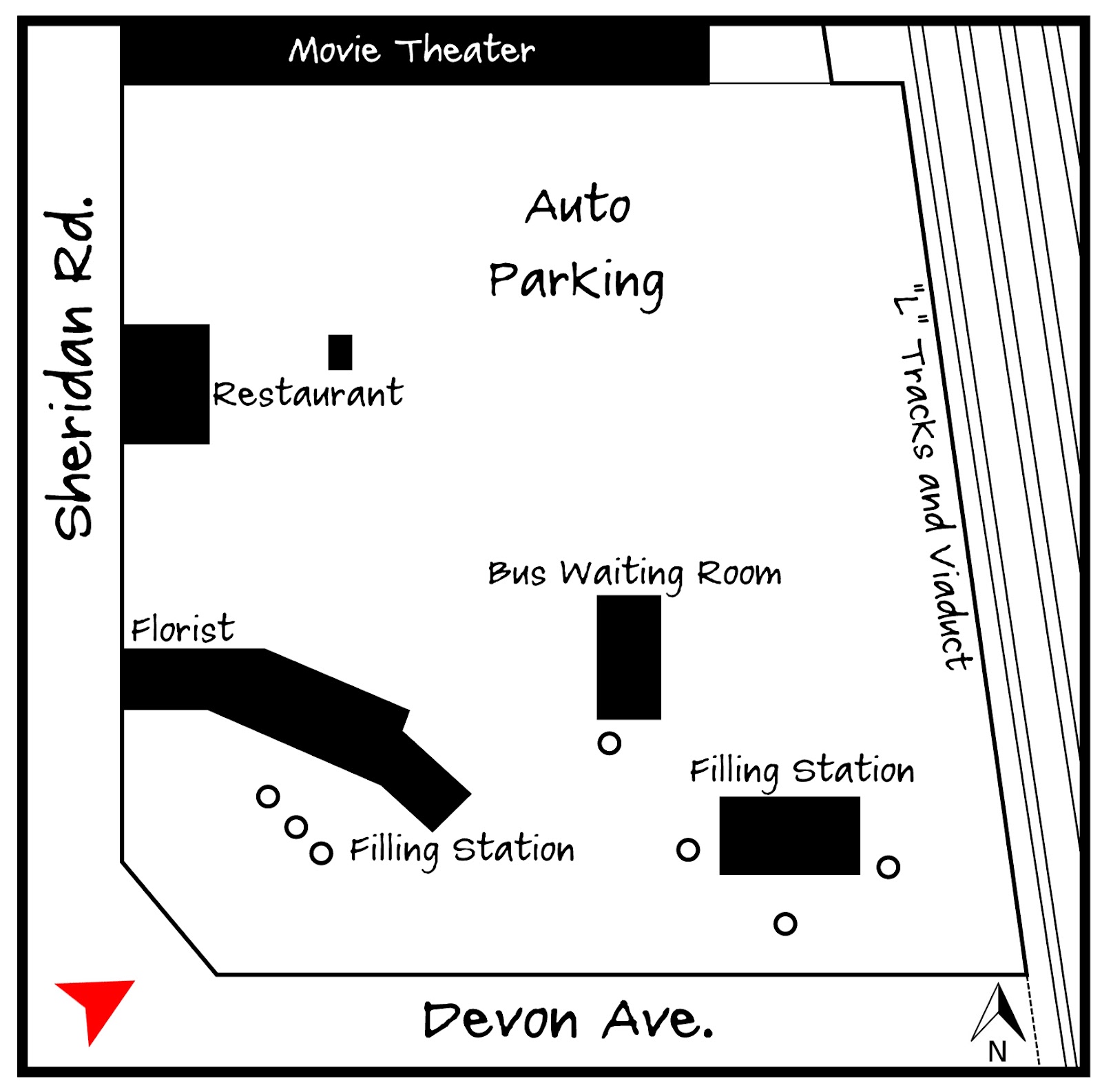
Sheridan and Devon, 1938

Detail of Mobilgas Station at Sheridan and Devon, 1938
To the right is another image adapted from the IDOT photos of Chicago intersections of the 1930s, accessed through the CARLI collection.  These photos have an amazing amount of detail, and someone could spend years sifting through them.  The intent was to document existing traffic conditions in order to plan for future improvements, but the information contained in them goes far beyond that.  For now I'm focusing on another auto-related image.

Sheridan is probably the most irregular road in Chicago, and definitely along the North Shore.  It zigs and zags, primarily running North-South, but sometime jogging East or West.  My impression is that it was cobbled together from various existing roads as it was extended North. So it's not unusual to have an intersection at Sheridan and Sheridan.  This location is at the Northeast intersection of Sheridan and Sheridan in Rogers Park.  But it's also the origin of Devon Avenue, so that's how I'll refer to it.

Adapted from the 1937 Sanborn Fire Insurance Map

You can see the old Mobilgas sign with the  Pegasus, which was the company's symbol through the early 1960s.  The station itself keys into the cottage styles that had been popular since the 1920s, complete with a small canopy over the entrance  and carved timber lintels.  In the background a portion of a gable roof is visible.  Luckily there was a Sanborn Map created for 1937, so I can tell that this is a waiting room for the bus.

There was quite a bit going on in this lot.   This filling station actually had two similar portions with hipped roofs on either end, and a flat-roofed area in the middle for the service bays.  Interestingly, a florist located in the portion closest the road.

Within a hundred feet is another competing filling station, similar to the conditions at Sheridan and Juneway.  These auto services tended to cluster close to each other.  To the north is a small restaurant, and behind that tons and tons of parking.  Not really sure about the small structure behind the restaurant.  Perhaps it was a kiosk to collect fees for the parking lot?  The late (and lamented) Grenada Theater was located to the north, and I'm sure the parking helped to accommodate their crowd.  Do you see the little jog in the "L" viaduct behind the theater?  I wondered about that, but it makes sense given the history of the property.
Click for a larger version.
As late as 1914 this area was a depot for the Waukesha Lime & Stone Company.  I'm used to seeing evidence of the old industrial rail connections on the Metra tracks to the west, but not along the North Side elevated. Perhaps I just didn't know where to look.  The commuter rails had been extended to Howard in 1908, but they weren't elevated until 1914 or 1915  (There's a good photo of this happening in Chicago's Far North Side, dated around 1915.)  I wonder how many other spur lines were in use before the commercial or residential value of the area won out.  The Waukesha Lime & Stone Company is still around (well, in Wisconsin), although I think they mainly supply material for road construction projects.  They probably established this depot to sell to local contractors.  Anyway, the little jutting out portion of the viaduct was constructed for these spur lines, although I'm not sure how long they were needed before giving way to the structures shown in 1937.  Regardless, the irregularity remains.
Bird's-eye view looking North

In 1965 and 1966 the entire property was redeveloped with large concrete and brick apartment buildings with commercial uses on the first floors. These buildings can be best described as aggressively unattractive.  The little buildings along Sheridan are one-story commercial buildings added recently, which have helped to make the stretch a little less alienating.