Wednesday, April 25, 2012

Clark, Greeneaf, Ravenswood and Estes, Part 3

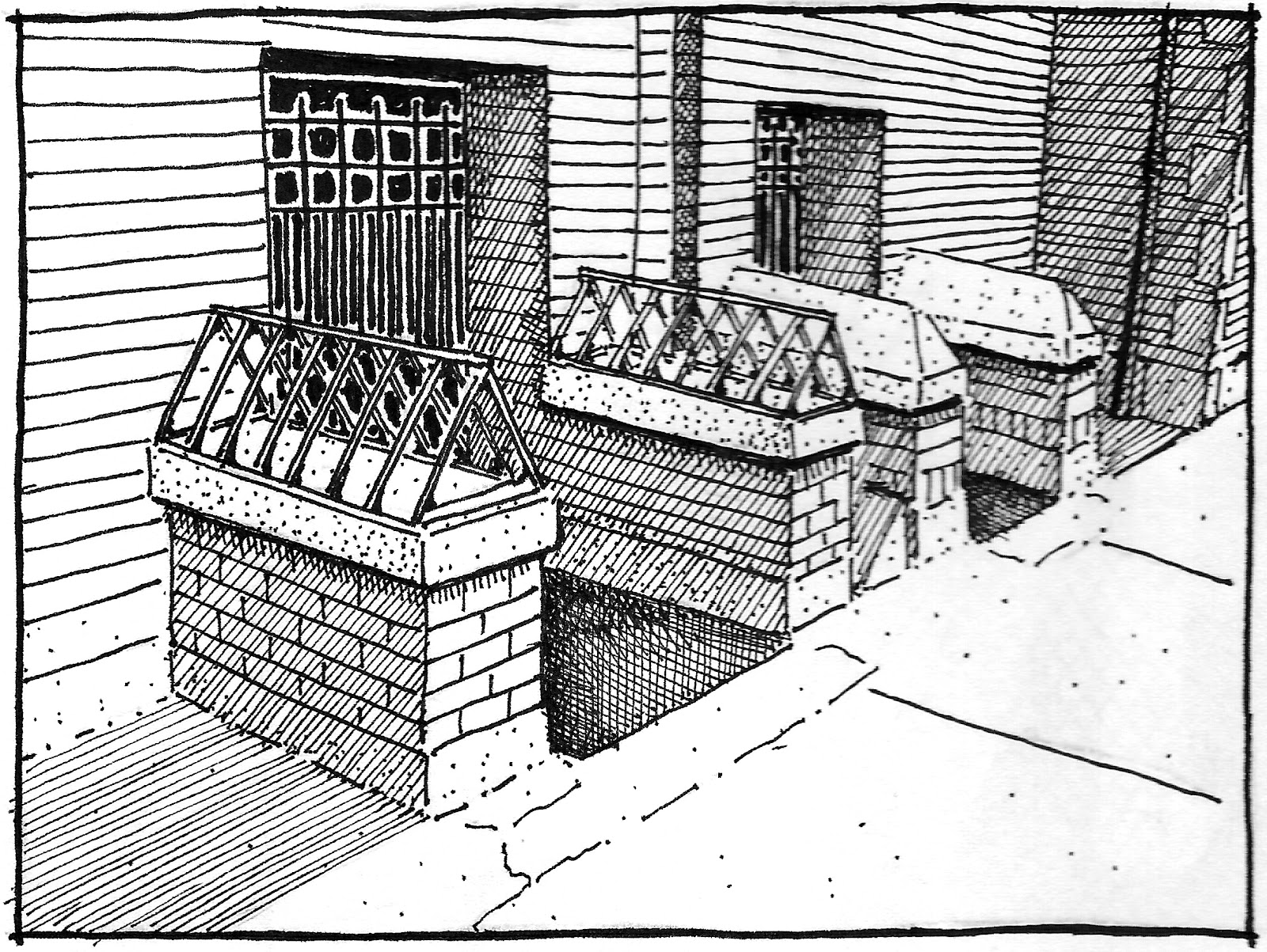
A few months ago I did a series of posts about "backstage spaces," including some views through alleys focusing on rear lot structures.  But if I wanted to crack open a city block to see what makes it tick I couldn't have done a better job than removing the Adelphi Theater at Estes and Clark, which had been on the site since 1912.

I was at home (a block away) when the Adelphi came down in February of 2006.  I remember walking over to watch.  They always demolish these buildings from the back.  There are probably structural and safety reasons for this, but it also means that once the demolition is noticeable it's almost complete.

Early modernists claimed to prefer the backs of buildings rather than the ornamental front facades, since that was supposedly where the true structure was expressed.  What you see here would likely please any number of architectural theorists from the 50s and 60s.
It is fascinating to see how these buildings developed over the years.  I've tried to make them visually intelligible, but it's a tricky job. 

If a building is only visible from a street the architect can focus the design (and dollars) on the front facade. Once something is demolished it reveals the areas intended to remain hidden.  If it happens enough it changes the entire feel of a block, making it look slapped together, run-down and ready for the bulldozer.  It may be all of those things, but usually what you're seeing is just the architectural vocabulary for functional spaces. 

In the foreground is the foundation of a new condo building which was intended to replace the Adelphi Theater.  The development stalled in the economic downturn and has remained vacant ever since.

Thursday, April 19, 2012

Combining Styles, 2449 W. Devon and 1028 W. Chicago

Sometimes buildings change according to established patterns, like a sun-porch added to a farmhouse or a side wing on a mansion.  But less work has been done on analyzing how historic commercial buildings change over time.  In general the preservation community is focused on finding the best unaltered examples of building types.  But there are many patterns which are just as valid in understanding the history of a property, even when they're not particularly picturesque.  Take these 1-story additions to older 2-story commercial buildings.

The older portions of these buildings observe two of the eclectic styles popular in the 1920s, Classical Revial and Italian Renaissance Revival.  When the owners saw an opportunity for expansion they switched from the earlier style to new styles popular at the time.  To the right they've chosen Art Deco, using glazed terra cotta blocks with fluted bands and geometric ornament.  Below they've gone with stacked brick and permastone.  There's absolutely no concern with matching the ornamentation of the older portion, or even aligning the new storefronts with the existing geometry.  Why is that? A few thoughts:

1. The whole idea was to update the building, make it seem competitive and modern. Maintaining the original ornamentation wouldn't signal the desired excitement.

2. In the 20 years between initial construction and enlargement the entire building industry reoriented around new styles and new materials.  The more traditional architectural treatments would have required a custom approach and therefore would have been much more expensive.

3. Advertising has changed, and the creation of large sign bands takes precedent over any "nostalgic" treatment.  By extending the new storefront into and over the old portion the amount of advertising could be doubled to accomodate larger, more aggressive signage.

4. Many businesses in traditional commercial areas (Main Street) found that the space on the upper floors wasn't being utilized as intended.  Living units above commercial spaces are generally less desirable than those on quiet streets.  And despite the space added, it's still more expensive to build a two-story building.  Expanding only the commercial space on the first floor is a reasonable solution.

Interestingly, the newer portions of the buildings were both from 1940s (as far as I can tell).  Perhaps this was the last gasp of Art Deco and the first breath of 1950s Modern.

I'm on the lookout for more of these buildings which have expanded in interesting ways.  I imagine putting together a booklet titled, "Messed Up Storefronts," although that might sound a bit prejudicial.  So please email me if you know of any in your neighborhood.

Monday, April 16, 2012

Huge Crayfish on Clark and Wallen, 2006

I'm sorry to say that the giant crayfish is gone.  These images were originally posted in 2006.  The life of a taqueria on Clark is either wildly successful or very short.  Mostly very short.  This repost is my memorial...

Wouldn't it be interesting if all restaurants were required to incorporate their most popular dish into their signage? That would be useful for all of the Rogers Park tourists.  There are Rogers Park tourists, right?


This huge crayfish started out a cheerful red, but the sun weathered it to a light orange.

Friday, April 13, 2012

Hamburger King, 3435 N. Sheffield

Today's post is courtesy of Harvey Pekar and artist Gary Dumm, from Pekar's "American Splendor #3," published in 1978.  I never expected to find Hamburger King alive and well at Sheffield and Newport, but there it remains.  The next time you're in Wrigleyville stop by, have a hamburger, and remember Harvey.  He died in 2010.

Also, I have no rights to this work, so if anyone asks me to take it down I will. 

Friday, April 6, 2012

Clark, Greenleaf, Ravenswood and Estes- Part 2

Anybody who studies American cities knows the value of the Sanborn Fire Insurance Maps.  These were created by the Sanborn Map Company to help insurance adjusters evaluate risk.  Copies of all maps were deposited with the Library of Congress, and were later microfilmed for distribution to local libraries.  An agreement with ProQuest put scanned versions of the microfilmed maps (660,000 of them) online for subscription access.

The Chicago Public Library makes these maps available, so at least access is broadening.  Many of the denser areas in Rogers Park were included in several editions.  When these are compiled it provide a portrait of development through time.  These maps are crammed with information, and the problem is often choosing which type of information is most useful to highlight. 

In this case the maps are focused on heights, with the light grey, dark grey and black showing 1, 2, and 3 stories respectively. It's also possible to focus on type of construction (frame, masonry veneer, steel reinforced concrete) or type of use.  Cross reference this with extensive title research, census records, and phone directories and you can build up a fairly precise history of a block.  In theory that block would reflect the larger trends of the neighborhood.  But I still have to manage a job, a family and a life, so the next step may just be a somewhat closer look at each of these dates.

Bird's Eye Aerial from Bing. Probably 2008.


Wednesday, April 4, 2012

7600-7602 N. Sheridan - Apartments of the Better Class

OK, last one!  It's taken me nearly a year to post these seven Rogers Park apartment buildings featured in Partridge and Bradley's 1917 catalog, "Directory to Apartments of the Better Class on the North Side of Chicago".  Why are they better class?  I'm not really sure. But here's my imagined list of titles they considered yet ultimately rejected:

Apartments for Awesome People
Classy Classy!  Apartments!
Not a Flophouse

As Partridge and Bradley explain in their introduction, they focused on people who could choose to live in a private house but prefered the luxury and economy of apartment buildings.  And many of these apartments really were luxurious, with individual laundries, wine cellars, private garages, elevators, electric appliances, etc.  The largest apartment represented had 15 rooms.  Rogers Park contains the more modest examples.

The view shown above is at the Northwest corner of the Sheridan and Howard.    Except for the loss of the tall casement windows and roof tile on the front gables it looks pretty much as it did.  It nearly fills the entire lot, with no room reserved for garages or green space.  Here's the desciption:

So if it was trying to appeal to commuters who used public transit maybe it didn't need garage space.  And with only steps to Lake Michigan who needs a yard, right?  Like many of these apartments it advertises an interior scheme of mahogany and white enamel.  The woodwork was probably birch, which was popular for its ability to take stains and finishes.  And it was cheap.  Saying that it had light on all four sides seems to be a bit optomistic, since the photo shows there was already a close neighbor on the North.  As a corner lot it certainly has more light, but that also comes with more noise.


Click for larger version.

So it looks like there are three apartments per floor, with the smaller apartment located at the rear.  The front units have a maid's room.  All share a rear stair system, which may have also functioned as a light court. 

The subdivision map shows that there was a 30 foot building line along Sheridan, so perhaps that explains the angles of the front porches.  The units on Sheridan are classic Chicago apartments, with rooms arranged in a linear, cellular fashion.

I imagine the sunrooms were popular in the summertime, when the casement windows could be opened on all sides to catch the breezes from Lake Michigan. 


Wednesday, March 28, 2012

Clark, Greenleaf, Ravenswood and Estes, Part 1

The biggest property disaster that I know of in Rogers Park was a fire that burned down nearly the entire block bounded by Clark, Greenleaf, Ravenswood and Estes.   It was documented in the Chicago Tribune with a map of the burned area and a line drawing showing the destruction.  I recreated the map in order to add labels, but I can't improve on the drawing, which somehow came through microfilming (and then scanning) with a good amount of its detail intact.  Welcome to Rogers Park, 1894.

Looking Northeast through the burned area. From the August 9th, 1894 Chicago Tribune.

The article mentions that 14 buildings were lost, including stores, factories and dwellings.   It even provided a table itemizing the losses.  I've done my best go through the description and map out where I believe everything was located, but I'm only about 70% sure of my accuracy.

But so what? There was a big fire in Rogers Park over a hundred years ago and a bunch of people lost their homes and businesses.  How does that impact the neighborhood today? To investigate this maybe we need to go back another Chicago fire that's become a defining element in the conception of the modern Chicago.

After the fire of 1871 Chicago didn't rise from the ashes with dozens of skyscrapers stretching upward. The first steel frame skyscraper wasn't even constructed until 1884.  Instead Chicago rebuilt itself much as it had been, except that the city government scrambled to adopt new building codes and regulations to minimize the chances of another catastrophic fire.

It took years to adopt the regulations for new fire-resistant and fireproof construction and property owners and builders screamed the entire way.  (I definitely recommend Margaret Garb's "City of American Dreams" which describes this era vividly.)  One outcome of this assertion of governmental responsibility was an overall strengthening of the administrative policies of Chicago related to building.  This came to influence the look of the city far more than any fire.  Height limits, minimum construction standards, setbacks,  exiting requirements, etc. all became a part of the modern Chicago.

Rogers Park was annexed to Chicago a year before the fire, in 1893.  This meant that any new development on the damaged block had to conform to the new construction standards.  So this disaster provides me with something useful-- a clean slate.  Periodically I'm going to be taking a closer look at how this block developed post-fire, and what it might reveal about Rogers Park in particular and about Chicago in general.


Sunday, March 25, 2012

2200 block of Estes, 1916

To the right is a very nicely maintained Craftsman-style home on Estes, between Ridge and Western.  I'm not giving an exact address because this is a commissioned home portrait and I don't want to freak out the owners. Although with a little investigation you could figure it out.

I don't usually do commissions of any sort, but now and then I'll donate a drawing for a good cause. In this case there was silent auction to benefit my son's new school, Stone Academy.  Stone does an amazing job supplementing its curriculum in technology and the fine arts, and much of that is through parent-led fundraising.  So this is my small contribution to that effort.  The winner of the bid got to choose whatever they wanted to include in the drawing.

It's been a while since I've focused on a single building.  It makes me think about technical issues rather than historical ones.  For instance, what's the best way to match the scale of the drawing to the level of detail needed? What's the correct balance of black and white?  What's the proper relationship between realistic and impressionistic detail? What's the best way to focus attention on the house while still suggesting street context? All of these are important to the overall effect, and I haven't even touched on the distribution pattern of Craftmen-style homes throughout the West Ridge neighborhood.  Maybe next time.

Tuesday, March 20, 2012

Sheridan and Albion, 1937

OK, here's the last of my images adapted from the IDOT photo archive of Chicago intersections.  This filling station at the Northeast corner of Sheridan and Albion was a particularly solid design, and I'm struck  by how similar it is to modern gas stations.  There are drive-through pumps accessible on either side for motorists who just need a fill-up,  and garage bays for more in-depth servicing.
This is one of those images that benefits from the site plan (courtesy of the Sanborn Fire Insurance Map of 1937).  The sales area and the service bays sort of pinwheel against each other, with the underground gas tanks at the rear.  I imagine the space behind was for storing cars.

If you look in the drawing you can see the outline of the adjacent house to the North, along with two huge billboards angled towards the street.  These were located on the vacant lot between the house and the filling station.  Compared to the 1930s we get off easy when it comes to signage.  Anyone with plot of land could apparently erect an enormous sign if they could find someone willing to pay for it.  Now you can't put up a sign larger than 100 sq.ft. without an order from City Council.  But I'm not a huge fan of billboards, so I'm not complaining.

It makes sense to place filling stations on the corner, where it can have access to two streets.  But why did the station itself have to be located in the center of the lot?  If I could go back in time and make a few suggestions it would be to locate gas stations on the corner of the lot and have the pumps and service areas in the back.  This would be an especially good treatment in dense urban areas, where the service station disrupts the streetscape.  This gas station was on the corner of a residential block and at least tried to retain a little grassy area near the sidewalk. 

So this might be the last gas station for a bit, although I found another good one on Clark and a tiny one on Sheridan.  I'm trying to limit thematic postings to three.  For now.  Until I return to Sheridan Road please enjoy this great pictorial  that makes use of the same IDOT photos I've been admiring.

Thursday, March 15, 2012

Monopoly Houses in Evanston, #2

A few months back I posted about some mid-century Evanston homes on Crawford designed to evoke the traditional housing form (a box with a gable roof) while giving a nod to popular mid-century design.  So in keeping with that investigation here's another grouping of minimal traditional homes on Main and Dewey.


From the 1950 Sanborn Map
My first thought was that these homes represented an early planned development, which would have allowed them to be arranged around a single parcel of land.  But in fact they're all located on individual lots.  The central houses have been pushed back to provide large front yards, while the houses at the ends are rotated and moved forward to create a sort of communal courtyard. One front fence would pretty much spoil the effect, but perhaps there are agreements in place to avoid this. There are two distinct groupings, but for clarity I only drew the one on the east.

The Cook County Assessor estimates the construction date as 1952 for all of these homes, but I found their footprints in the 1950 Sanborn Map of Evanston.  No insult to the assessor, but I'm going to go with the Sanborn Map.  Upon construction all of these homes were nearly identitical, but they've been altered and enlarged differently over time.  Still, even the largest is only around 1,100 sq.ft. 

Friday, March 9, 2012

The Gage House, 1251 W. Farwell

Last Spring I started to document various buildings in Rogers Park that had been included in historic journals, brochures, and other publications. Every time I think I've found them all I come across a digitized source that proves me wrong.  That's the case with the Gage House, at the southeast corner of Farwell and Lakewood.  It was built in 1903 and published in the 1912 edition (Vol. 2) of the Cyclopedia of Architecture, Carpentry and Building
No address was given in the encyclopedia, but I've walked by this building often enough to recognize it.  It looks mostly unchanged, although there are some window alterations and the side porch was enclosed at some point.  It still has the original stucco at the first floor and wood siding above.  And it hasn't lost the distinctive pent roof that divides the first and second floors.

Every now and then I run into a building with a pedigree.  This house was designed by John B. Fischer, chief draftsman for the Chicago offices of Shepley, Rutan and Coolidge, perhaps best known here for their 1897 Chicago Public Library (now the Chicago Cultural Center).  Fischer is credited with designing the Harper Memorial Library as well as many gothic buildings on the campus of the University of Chicago.  The Ryerson Burnham Library at the Chicago Art Institute contains his papers.  After 1910 he was affiliated with the firm Postle and Fischer.  Below are some of John Fischer's designs identified in the Chicago Historic Resources Survey.  I'm especially impressed by the design to the far right, which reminds me of a previous post.

Photos from the Cook County Assessor
But getting back to the 3-bedroom house on Farwell,  it's a very compact design and reminds me of the affordable house plans popular in the 1920s.  The two big-ticket items for modern houses, kitchen and bathroom, were miniscule.  And there's only the one bathroom for both floors.  Still, the use of bays to bring in additional light and the living-room chimney that doubles as the master bedroom chimney are nice touches.

Both sides of the living room
The enclopedia provides something else uncommon when looking at modest homes of this vintage-- interior photos. 

Adapted from Sanborn Maps
I think of these interiors as "Craftman Light" making use of decorative timbers and contrasting colors and textures.  The living room almost has a rustic feel, which was probably appropriate in Rogers Park in 1903.  I especially like the change in level between the dining room and the living room.  It makes the space feel a bit more private.  And the diamond pane bay windows are essential to establishing the protected character of the space.  The photos have reproduced poorly, but it still more information than I would have expected outside of an architectural journal.

I put together a simplified map chronology to show how the character of the block changed over time, the home eventually being hedged-in by larger multi-family buildings.  While many streets of single family homes survived in Rogers Park (especially west of Clark), what you see here is more typical.  By 1964 this home became yet another remnant of an earlier era in the neighborhood. 

Monday, March 5, 2012

Sheridan and Devon, 1938

Detail of Mobilgas Station at Sheridan and Devon, 1938
To the right is another image adapted from the IDOT photos of Chicago intersections of the 1930s, accessed through the CARLI collection.  These photos have an amazing amount of detail, and someone could spend years sifting through them.  The intent was to document existing traffic conditions in order to plan for future improvements, but the information contained in them goes far beyond that.  For now I'm focusing on another auto-related image.

Sheridan is probably the most irregular road in Chicago, and definitely along the North Shore.  It zigs and zags, primarily running North-South, but sometime jogging East or West.  My impression is that it was cobbled together from various existing roads as it was extended North. So it's not unusual to have an intersection at Sheridan and Sheridan.  This location is at the Northeast intersection of Sheridan and Sheridan in Rogers Park.  But it's also the origin of Devon Avenue, so that's how I'll refer to it.

Adapted from the 1937 Sanborn Fire Insurance Map

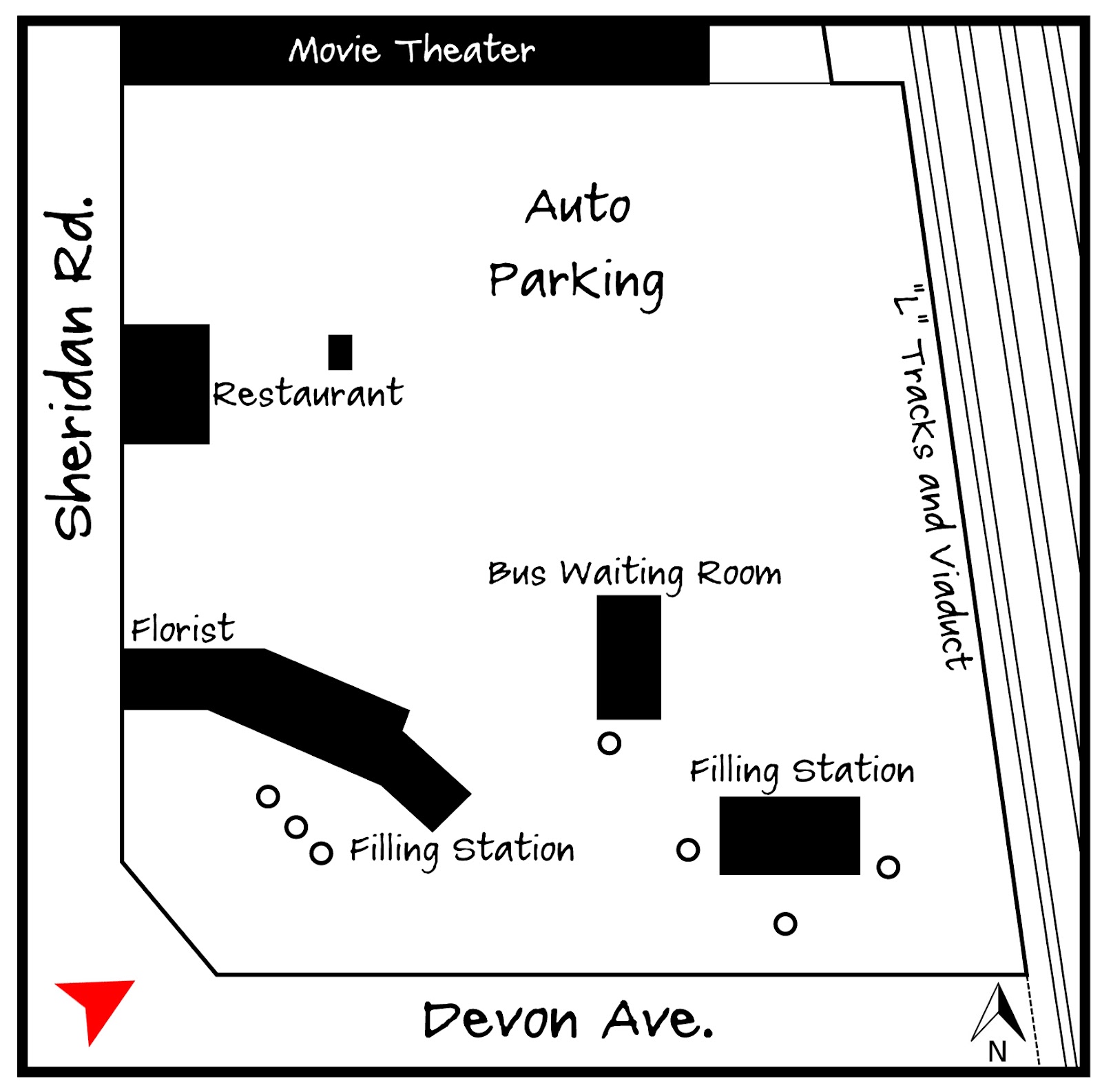
You can see the old Mobilgas sign with the  Pegasus, which was the company's symbol through the early 1960s.  The station itself keys into the cottage styles that had been popular since the 1920s, complete with a small canopy over the entrance  and carved timber lintels.  In the background a portion of a gable roof is visible.  Luckily there was a Sanborn Map created for 1937, so I can tell that this is a waiting room for the bus.

There was quite a bit going on in this lot.   This filling station actually had two similar portions with hipped roofs on either end, and a flat-roofed area in the middle for the service bays.  Interestingly, a florist located in the portion closest the road.

Within a hundred feet is another competing filling station, similar to the conditions at Sheridan and Juneway.  These auto services tended to cluster close to each other.  To the north is a small restaurant, and behind that tons and tons of parking.  Not really sure about the small structure behind the restaurant.  Perhaps it was a kiosk to collect fees for the parking lot?  The late (and lamented) Grenada Theater was located to the north, and I'm sure the parking helped to accommodate their crowd.  Do you see the little jog in the "L" viaduct behind the theater?  I wondered about that, but it makes sense given the history of the property.
Click for a larger version.
As late as 1914 this area was a depot for the Waukesha Lime & Stone Company.  I'm used to seeing evidence of the old industrial rail connections on the Metra tracks to the west, but not along the North Side elevated. Perhaps I just didn't know where to look.  The commuter rails had been extended to Howard in 1908, but they weren't elevated until 1914 or 1915  (There's a good photo of this happening in Chicago's Far North Side, dated around 1915.)  I wonder how many other spur lines were in use before the commercial or residential value of the area won out.  The Waukesha Lime & Stone Company is still around (well, in Wisconsin), although I think they mainly supply material for road construction projects.  They probably established this depot to sell to local contractors.  Anyway, the little jutting out portion of the viaduct was constructed for these spur lines, although I'm not sure how long they were needed before giving way to the structures shown in 1937.  Regardless, the irregularity remains.
Bird's-eye view looking North

In 1965 and 1966 the entire property was redeveloped with large concrete and brick apartment buildings with commercial uses on the first floors. These buildings can be best described as aggressively unattractive.  The little buildings along Sheridan are one-story commercial buildings added recently, which have helped to make the stretch a little less alienating.


Thursday, February 23, 2012

Building Paranoia in Rogers Park

A few years ago I found a great collection of essays in a book titled, Architecture of Fear (1997), which contained the article “Building Paranoia,” by Steven Flusty.  It was adapted from a paper published for the Los Angeles Forum for Architecture in 1994 and develops a vocabulary for describing the kinds of spaces he saw being created throughout the L.A. region.  I remember reading this chapter, shuddering, and being thankful that I don’t live in L.A. Here's a quick summary:


Stealthy Space
Space that is obscured and cannot be found.

Slippery Space
Space that cannot be reached, due to contorted, protracted, or missing paths of approach

Crusty Space

Space that cannot be accessed, due to obstructions such as walls, gates, checkpoints, etc.

Prickly Space
Space that cannot be comfortably occupied.

Jittery Space
Space that cannot be utilized unobserved.

South side of Estes West of Sheridan
But soon I started to spot the same things in my own neighborhood.  Perfectly nice corners were being transformed into miniature prisons.  Storefronts were installed that could withstand medieval sieges.  Homes and apartments destroyed their beauty in the name of security. 

Chicago’s grid tends to discourage the creation of Stealthy and Slippery Space.  These seem to be more common in suburban areas, or large redeveloped areas.  But I’ll bet anyone can think of a few Crusty, Prickly, and Jittery Spaces in their own neighborhood.  Following are a few examples that I found uncomfortably close to home.


North side of Estes, East of Sheridan
What you see here are steel and concrete modifications to eliminate a potential gathering or resting spot.  One set is welded iron, and the other is cast concrete.  In another era maybe they would have set broken glass on the surfaces. I wonder what was going on out here that had to be eliminated.  Noisy kids?  Vagrants?  Criminal activity?  Whatever it was did these devices put an end to it.  I would argue that these actually make the block less safe by removing "eyes-on-the-street".  As Jane Jacobs observed, well-used sidewalks and public places are an important deterrent to crime.
Glenwood and Morse
     
You should see how lush the grass gets behind this wall.  It’s like a shag carpet.  This is a good example of prickly space. But the jokes on them!  You can sit on this wall if you don’t mind straddling the iron spikes.  At least until your legs go numb… Across the street the security gates remind you to walk a little faster.


East side of Clark, between Estes and Touhy.


It never occurred to me that people might be hopping from roof to roof illicitly.  Judging from these deterrents it must be common. Did someone break into a storefront through a skylight?  Is that something that's likely to happen again and again?  Sometimes these things are a permanent solution to a rare event.   This wins the prize for the most diversity in materials:  chain link, razor wife, and a starburst of sharp steel spikes.


Morse and Glenwood


Rogers Park also has plenty of Jittery Space.  This is a video camera in a box at the northwest intersection of Glenwood and Morse.  It has a blue strobe light and the police insignia, in case you were in danger of overlooking it.  Glenwood and Morse has a reputation (not-unearned) of being a trouble-spot.  But cameras can’t see around corners.  

Close-up detail


High tech surveillance never makes me feel safer.  I know that somewhere in an accounting department someone is trying to figure out how many cameras equal one police officer.   


Clark and Greenleaf


This is one of the older commercial buildings in Rogers Park.   The owners have done everything possible to blind the building to anything happening at ground level.  Glass blocks fill the windows, and the security door is protected with a steel grate.  Just in case, an additional wrought iron gate guards the 3 concrete steps leading to the door.  And it works!  People rush by this building.  I doubt they even see the “No Trespassing” sign posted high on the wall.  This used to be one of Roger Park’s post offices.


The sad part is that there's often reason for these modifications.  How many times can you chase away drug dealers before you fence off your property?   How many times will you have your business or home broken into before the steel door and padlocks go up?  But there needs to be some type of balance at work.  I don't want Rogers Park to become one of those neighborhoods where you can't sit down without being expected to buy something.  Or have those streets where you never see a single human because of all the fences and walls.  We're all in this neighborhood together, even if we don't want to admit it.  And sometimes uncertainty is the price you pay for maintaining community.

Wednesday, February 15, 2012

Sheridan and Juneway, 1937

There are many collections on CARLI but it's hard to beat the IDOT Chicago Traffic Photographs, which document hundreds of streets and intersections from the 1920s through the 1950s.  And of course there are a few from Rogers Park.  Well, more than a few.  Because the photos relate to traffic I thought it might be interesting to focus on early auto facilities in the neighborhood and see where that might lead.
N. Sheridan Road and Juneway Terrace, 1937
This sign was amazing.  It looks about 4 stories tall.  At this point Sheridan Road makes a sharp right to skirt between Calvalry Cementary and Lake Michigan, so this sign effectively terminated the view north.  In a city of regular grids it's difficult to find elements like this, which are prominent from a long way off.  Bowman Dairy was huge in Chicago, but I had no idea they had their own radio program.  I couldn't find anything online about it, but I believe the Bowman archives are at the Chicago History Museum.

Adapted from the 1937 Sanborn Map
I'm guessing that the Colonial Revival house on the left was built between 1915 and 1920.  This portion of Juneway Terrace developed with single family homes in the 1920s, while the blocks to the west were dominated by large courtyard buildings.  The owners probably were not  pleased to find themselves next to the Rogers Park auto strip, which was fully developed by the time this image was recorded.  This house was demolished some time between 1962 and 1974 and replaced with a multi-family building.

Building #2 is the primary (or at least the largest) gas station/service station in the strip.  Their gas was supplied by Shell (see the sign?) and the building had interior bays for washing and repairs.  The circles represent underground gas tanks.  The national gas chains had been building stations in a variety of traditional styles since the 1920s. These were intended to standardize the experience of the driver and develop their corporate image in a neighborhood-friendly way.  But this design, with its peculiar Mediterranean charm,  seems to be unique.

 Building #3 was an auto-oriented snack shop for hungry drivers making their way to (or from) the North Shore."Demetre from Wilmette" made me think of Plaza del Lago, the formerly unincorporated portion of the lakefront near Wilmette which became a popular entertainment district and watering hole amidst the dry North Shore.  Sure enough, there was a "Villa Demetre" serving barbequed chicken sandwiches at Plaza del Lago (then known as No-Man's Land), although it was apparently destroyed by the 1932 fire which signaled the decline of that area.  Watch the video here! The Villa Demetre sign had the number "2" above it, while this building had the number "1" above its sign.  Did this tiny snack shop come first?  Possibly.  I'm also baffled by the tiny glass enclosure at the front of the building.  Was this so you could eat your lunch and watch the traffic whizz by without choking on the fumes?  Very odd.  Plaza del Lago made use of a Spanish Mission Revival style, and this building seems to make a nod in that direction as well.

Sheridan and Juneway as it looks today.
Building #4 is another service station, this one providing gas from Texaco.  It incorporates the Spanish tile roofs seen on the other structures, and some arched details as well.  Difficult to say if this is brick or stucco. 

There was another gas station just to the east, but it wasn't included in the image from 1937 so I left it out.  But it's interesting that these auto-related businesses began to cluster from the very start.  You could see this early on in Chicago's historic Motor Row and later at the used-car lots and motels strips to be found throughout the city.  They seemed to thrive on proximity and competition.

As a side note, there was still a gas station at this location when my wife moved to an apartment half a block away in 1997.  That night their moving van was broken into and she walked over to that gas station to make a police report from their pay telephone.  Ah, the memories.

Friday, January 27, 2012

Monopoly Houses in Evanston

I don't usually write about the suburbs.  Which is odd, since I find myself there so frequently.  Anyway, this row of houses is near the two major institutions of our life as parents- Felix and Theo's pediatrician and the drive-through Starbucks at Central and Crawford.  There are others, but sadly these two remain constant.

2200 block of Crawford, Evanston, IL
These houses always catch my eye.  There are at least a dozen of them concentrated in this area, built in 1952 and 1953 according to the Cook County Assessor.  The gable form is about the most traditional residential shape possible, but there are some subtle modernist touches.  There's no concern with creating a symmetrical facade.  Instead the architect has located small windows higher where privacy was desirable and opened up the front of the homes with floor to ceiling windows for the primary family spaces. 

Interestingly, these homes have become more traditional-looking over time.  Many of the original undivided windows have been replaced with multi-pane colonial-type windows.  The one on the far right was renovated into a half-timbered Tudor Revival knockoff. 

View of the back of the houses, looking West. Note the various rear additions.
Even though these homes are similar in regard to massing there are significant additions at the back.  The shape of these buildings lend themselves to the traditional ways to add space, such as dormers, porches, and wing additions.  The second house from the right even doubled in size, but it's difficult to see that from Crawford.

The arrangement of the homes is a standard technique of mid-century developers.  Find a profitable design, then flip or rotate the plans until there's an impression of variety.  It doesn't fool anybody, but it still often succeeds in creating a subdivision with an interesting use of space. 

Tuesday, January 24, 2012

New York Kosher, 2900 W. Devon (originally posted 2/18/10)

Just realized that this sign has been removed!  Sad. According to Jewish News Online it was sold on Ebay and a documentary crew filmed the removal.  The owner received a letter from the city requiring that he get a permit for it.  It had only been hanging there for 40 years... Instead he chose to get rid of it.

The West Ridge neighborhood (also called West Rogers Park) has the unusual distinction of being the center of two types of Jewish communties at different times.  Back in the 50s and 60s this was a heavily conservative/reform Jewish neighborhood.  Now it's the center of an orthodox Jewish community.  But there are a few remnants from the old neighborhood that have remained and seem to function just as they did.  This kosher deli is one of them.  On the opposite corner is Levinson's bakery, which falls into the same category.

It's hard to see with this scan, but there's a number 48 in the oval sign on top. I believe it refers to USDA Establishment 48, which is Best's Kosher inspection designation.  Oddly, Best's Kosher is now owned by Sara Lee.

Friday, January 20, 2012

Backstage Spaces #3 (6954 N. Clark)

Sometimes a vacant lot opens up a window into the interior of a block.  In this case the empty parcel at the northwest corner of Morse and Clark reveals a rear brick building with a gable roof attached to the flat-roofed building fronting on Clark.  This corner has been used as a parking lot for the bank across the street for at least 50 years, so the view is nothing new for Rogers Park residents.


It's not really blue.  I added that.

When I first noticed this building I assumed that it must have pre-dated the commercial building at the front of the lot by at least 10 years.  Its setback and design is consistent with early brick residences in the neighborhood. Unfortunately the Sanborn Maps didn't help me to figure out the exact gap in time between the two buildings.  In 1894 there's nothing on the lot, and in 1905 you see both buildings attached as they are today.  It's possible the rear building was built in 1895 and the front building in 1904.  This would give a maximum time spread of 9 years.

But even if we can assume the maximum spread that's not very long before a major addition was built.  It indicates a commercial district that was rapidly developing.  But this isn't a surprise. After its annexation to Chicago in 1893 Rogers Park could utilize metropolitan utilities and infrastructure.  The neighborhood began attracting more residents and new stores were needed to satisfy the demand.  If you can keep the older building on the lot while catering to that increase why wouldn't you?

Today the little building remains residential, as far as I can tell.  And judging by the attached satellite dishes there are at least 3 units in there.


Wednesday, January 18, 2012

6757-6765 N. Sheridan - Apartments of the Better Class

This marks the continuing documentation of the Rogers Park buildings featured in "Directory to Apartments of the Better Class along the North Side of Chicago."  This is entry #6, for those keeping count.


This corner remains mostly unchanged from its 1917 entry.  The more noticeable difference is that Sheridan Road was widened, resulting in a narrower parkway. And of course the car styles have changed.  A little.

At first glance this appears to be a single building using the same dark red face brick, inset geometric stone ornaments and pressed-metal cornice.  But there are some definite differences.  For instance, the sun porches to the right are much more closely spaced than the ones on the left.  And the first floor on the right is clad with stone, rather than brick.  Even the window configurations on the porches are different.  The floorplans confirm that these are two distinct buildings even though they share design similarities.


Click for larger version.  Or just get really close to the screen.

Image from Bing's Bird's Eye Views
This is the first time the floor plans in "Better Apartments" actually give a false impression of a space.  The building below is twice as big as the one above.  I can only assume that they squeezed the plan so it would take up less space on the page.  That would also explain why the room labels in the lower image are nearly illegible.  The oblique aerial photo to the right gives a better impression of the relationship, showing how the rear courts work together to create an complex interior court.  You can see that the two buildings (maybe three?)  form a sort of "L" configuration, with a 1-story garage taking up the space along the alley. 

These are basically two or three bedroom apartments with a few extras, such as reception halls.  Maybe half of the units have a bedrooms labeled as a maid's room.

Click for larger version
According to the blurb they built enough garage space for 16 cars.  Of course the cars were a bit smaller back then, but even in 1917 garage space would have been a big benefit as the density of the neighborhood increased. 

The sun-porches overlook Sheridan rather than Pratt.  In 1917 Sheridan was more of a pleasure road rather than the busy thoroughfare we now know and love.  And like many of the apartments in this publication, mahogany and white enamel was used for the interior scheme.  This must have suggested luxury and cleanliness all in one.  The mahogany was probably stained birch, but let's not split hairs.  For $77.50 a month I'm sold.  

Friday, January 13, 2012

Haymarket Square Map Chronology

Last year I put together a map chronology of Haymarket Square for AREA Chicago.  Normally they publish a small-format newspaper on local issues related to arts and political activism.  I'd contributed illustrations previously, and even an article a few years back.    This edition was to commemorate the 125 year anniversary of the Haymarket Tragedy (otherwise known as the Haymarket Riot).  The graphic was only intended to show how the area changed over the years, and it wasn't presented with any analysis.  But there's no reason I can't remedy that here, right?
Des Plaines and Randolph looking North, 2011

In a nutshell, the Haymarket Tragedy refers to the events of May 4, 1886, where a crowd of workers were demonstrating at Des Plaines and Randolph for an 8-hour day.  As the speeches were winding down 176 police officers marched to disperse the crowd.  At that point someone threw a bomb, killing a police officer.  The police then opened fire.  Sixty officers were wounded and eight died.  It's not clear how many in the crowd were killed or injured. The person responsible for the bombing was never found.  The Haymarket organizers were arrested, and after one of the most unjust trials in American history four of the defendants were hanged.  Another committed suicide in prison.  You can read more about it here and here.

There hasn't been much in the way of commemoration of this area, although there is a plaque, a sculpture, and a Chicago Landmark designation for a portion of Des Plaines and part of the alley to the east.  Nearly all of the buildings associated with that night have been demolished.

A lot has been written about the Haymarket Tragedy, but not much about the physical characteristics of the area where it occurred.  There were five of these open-air markets in Chicago at the time, where workers went to buy food directly from farmers.  You can see that Randolph St. widens to accommodate the market.  The speaker's wagon was north of Randolph (1), in part to avoid interfering with the market and attracting a police presence.  And the police weren't far away.  Their station was just south on Des Plaines (4). 

You can see the vitality of the area in the number and configuration of the buildings. Most of these would have been two or three-stories with commercial uses on the first floor and residential above.  Many of the lots have rear buildings with alley access.  These were often coach houses or businesses.  At that time alleys were much more important in the life of the neighborhood.  And this was a real neighborhood.  There was a complex mix of commercial, retail, industrial and public uses all swirled together. 


By 1906 several of the smaller buildings have been demolished and replaced with larger structures taking up two or more lots.  Many of the rear lot buildings have been removed.  Construction is masonry, as required by Chicago building codes.  The scale of the neighborhood begins to change.


By 1950 the consolidations have continued.  Buildings have been demolished but not replaced.  The Haymarket has fallen on hard times.  There's a more homogenized feel in the area.  Commerce has moved away from the street, and the residential quality of the area has declined.  The map doesn't show it, but the expressway cuts through the Haymarket to the west, severely limiting it's ability to regenerate.  The area is becoming part of Skid Row.


By 2011 surface parking has eaten up large swaths of land.  The lots are empty from 5 p.m. to 8 a.m., giving the intersection the feel of a ghost-town during the after-work hours.  But at the southwest corner is a new 40-story condo building, replacing the second wave of replacement buildings and dwarfing those that remain.  Some of the nearby light industrial buildings have been converted into condos as well.  A high-end restaurant has located on Randolph.  There's a sense that the area's proximity to the downtown may finally be attracting some investment. 

The shouts and gunshots of a cold May night in 1886 feel very far away.

Des Plaines and Randolph looking West, 2011